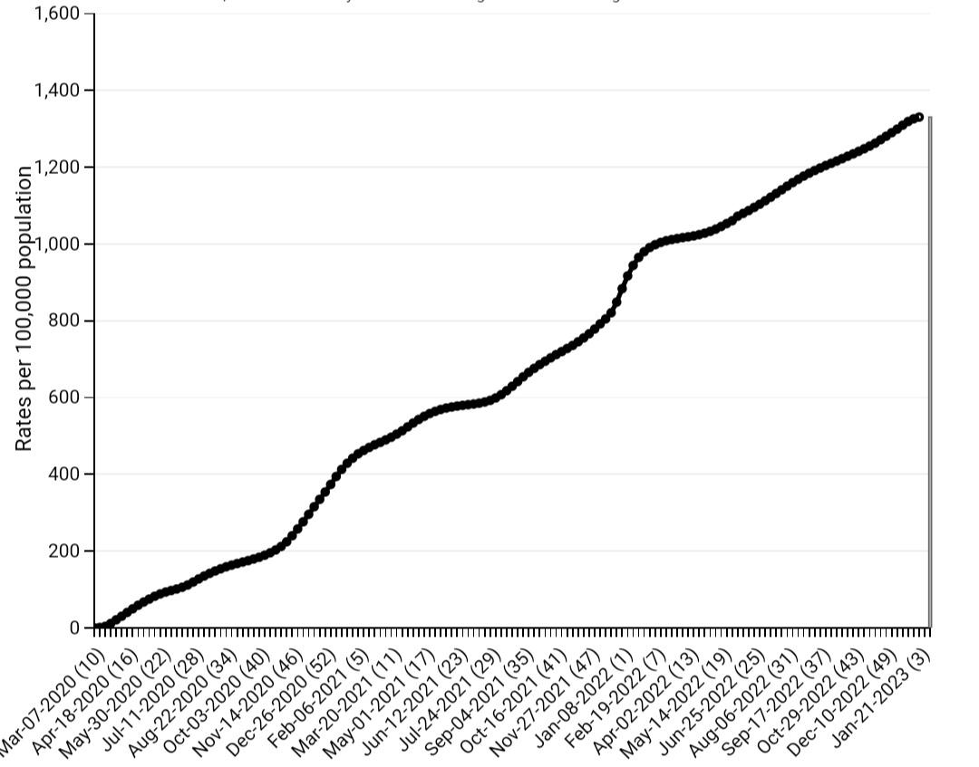
Submitted by Fundshat t3_10q87ii in dataisbeautiful
Comments
anisotropicmind t1_j6pjn9n wrote
I would plot the derivative of this (e.g. daily or monthly hospitalizations) to make it easier to see the waves. Cumulative (of course) always goes up monotonically, and you have to visually look for higher-slope times to figure out when things are especially bad.
leigh094 t1_j6oj6nb wrote
For the X axis - why and how did you choose the dates you did?
monteqzuma t1_j6oft2s wrote
USA! USA! USA! We can do it.
Fundshat OP t1_j6oeuh3 wrote
Source - https://gis.cdc.gov/
Tool - d3.js
Fundshat OP t1_j6oflzg wrote
The total appears to be approximately 4.5 million hospitalizations with no signs of the hospitalizations per unit time decreasing.
(1,350 hospitalizations / 100,000 people) × (330,000,000 people) = 4,455,000 hospitalizations
mburke6 t1_j6okunq wrote
The spike up at Oct-Jan 2020/21 and 2021/22 is missing for 22/23
jh937hfiu3hrhv9 t1_j6ohb2p wrote
Government: Nothing to see here. Look away folks.
[deleted] t1_j6ozvik wrote
[removed]
shewel_item t1_j6phz20 wrote
almost symmetrical around july 20th 2021
stirrd_nt_shkn t1_j6ogapu wrote
Yeah, it’s totally not over-reported.
Fundshat OP t1_j6oib2o wrote
Excess deaths indicate an underreporting.
India https://ibb.co/Ypw32b1
Italy https://ibb.co/7tvwFjC
Spain https://ibb.co/tM3RTvQ
Brazil https://ibb.co/zsxnSDD
Netherlands https://ibb.co/0Bjf0fX
Japan https://ibb.co/YQrRqTc
South Africa https://ibb.co/H24g7K9
Afghanistan https://ibb.co/zfFtydZ
Egypt https://ibb.co/2h5MqHB
Pakistan https://ibb.co/ByN5cdx
South Korea https://ibb.co/zJkRBS5
Norway https://ibb.co/P180Ntv
Portugal https://ibb.co/C2jJZL5

pantaloonsofJUSTICE t1_j6oqcay wrote
A count can’t be a rate. If you want to look for a slowdown why not post the rate instead of the count? Or fix the y axis label.