Comments
YakEvery4395 t1_j4uimjv wrote
It feels like the points are behind bars. We need so save them
irtsaca t1_j4ujr3r wrote
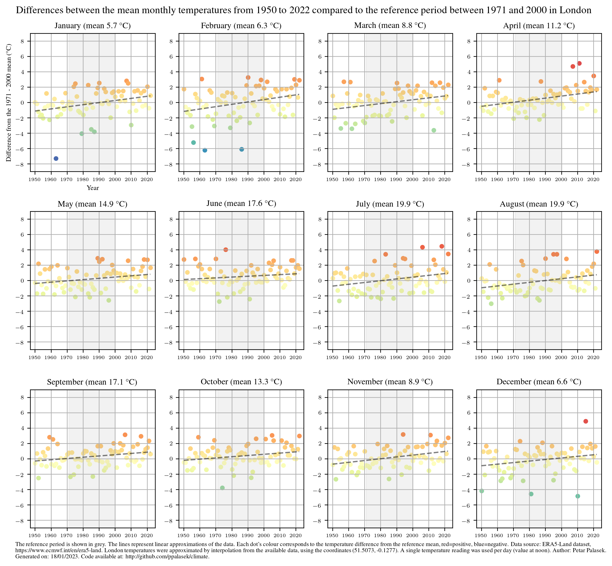
Interesting plot. The mainstream narrative would indicate this to be due to climate change. However, in the specific case of London, we must consider the significant reduction of co2 emissions during the last decades due to the coal usage ramp-down.
stickybuttflaps t1_j4vg94s wrote
What I think you're saying is that the daily temperature depends on air quality with more CO2 resulting in lower temps. Can you explain how that works?
kvothe_10 t1_j4w935n wrote
Greenhouse gas effect is of a global nature.
wukwukwukwuk t1_j4yk621 wrote
Maybe they are implying less soot in the air has lead to more sunshine and more warming.
insufferablyaverage t1_j51erjf wrote
Only way to do that is to make the following year the hottest or coldest by a mile so that it shifts the entire bar so much that it remains well above or well below the rest of the datapoints, evem absolutely 0 won't be enough to shift the bar majorly so we should throw the earth into the sun to free the data points
screaming_bagpipes t1_j51i7c5 wrote
What about the grid?
tyuiopassf t1_j5dwre0 wrote
Heat generation variable= population increase + hvac

ppalasek OP t1_j4u70x7 wrote
Data from: https://www.ecmwf.int/en/era5-landhttps://cds.climate.copernicus.eu/cdsapp#!/dataset/reanalysis-era5-land?tab=overview
Tools used: Python, cdsapi (https://cds.climate.copernicus.eu/api-how-to), matplotlib
Code at: https://github.com/ppalasek/climate/
We can clearly see some extremes, e.g.: