Comments
useibeidjdweiixh t1_j2rnqs1 wrote
One of the best visualisations I've seen in a long time.
neilrkaye OP t1_j2r0tbj wrote
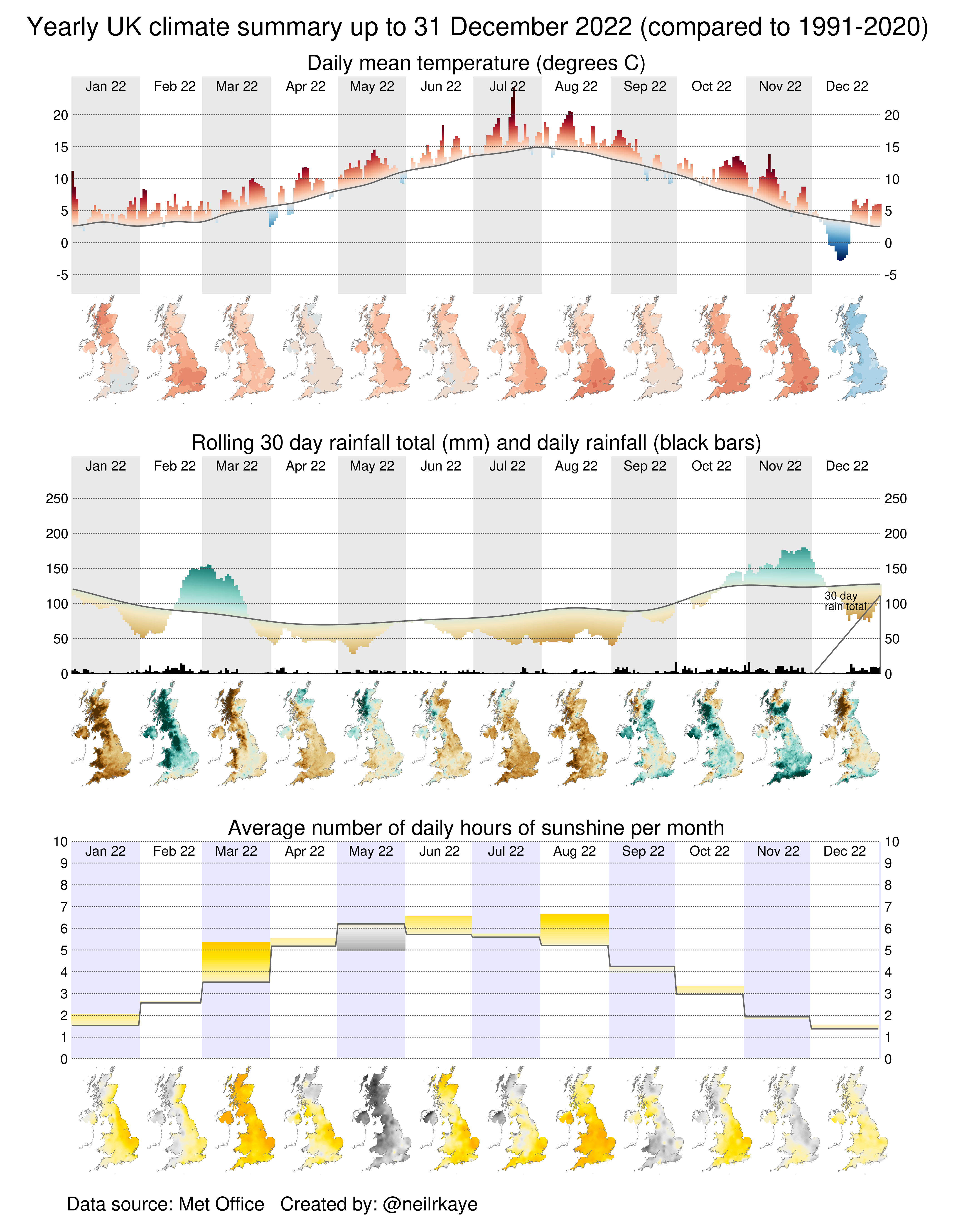
Created using ggplot in R and stitched together using image magick. Uses UK Met Office climate data.
canadian_crappler t1_j2rff6t wrote
That's fantastic! Could you say which Met Office dataset you're using? There's so many of them
SirBillPetre t1_j2r5t53 wrote
When London got so warm we had to go to the tube to cool off in July…
[deleted] t1_j2rbsdt wrote
[removed]
SomethingMoreToSay t1_j2uel7k wrote
This is a really super visualisation. Great work.
I have one quick question about the data, which was inspired by the little maps showing the regional differences. I hope you don't mind me asking because I can't find a clear answer by Googling it.
Are the national average figures weighted by population or by area?
I expect it's probably by area. Unfortunately, since England has about 80% of the UK's population in about 50% of the area, this can lead to situations where the national average picture (as in your line charts) is not consistent with what most people actually experience. The sunshine in July would seem to be an example of this, where the line chart suggests "about average" but the map shows that most people would have experienced "well above average".
Disastrous-Singer416 t1_j2v571s wrote
Who cares about the visual, we are killing our planet and our grandchildren are going to slowly burn to death
bongsound t1_j2r1pq0 wrote
Yes but the highest temperature was recorded at Heathrow runway, when a fighter jet was taking off.
SirBillPetre t1_j2r5z83 wrote
Coningsby In Lincolnshire was the record spot, it does have an RAF base but it’s a bit rural.
bongsound t1_j2r655f wrote
Terrainaheadpullup t1_j2r7ifu wrote
That was published before the record temperature was recorded in Coningsby
bongsound t1_j2rii9p wrote
Citation needed
SirBillPetre t1_j2rvqmn wrote
[deleted] t1_j2s0mx9 wrote
[removed]
itsalonghotsummer t1_j2te680 wrote
This is wrong in so many different ways it's almost funny.

picadorcriminal t1_j2rhvxl wrote
Really nice visualization! Excelent job!