Comments
highcharts OP t1_j1u3bw8 wrote
Genuine question: Why do you think so?
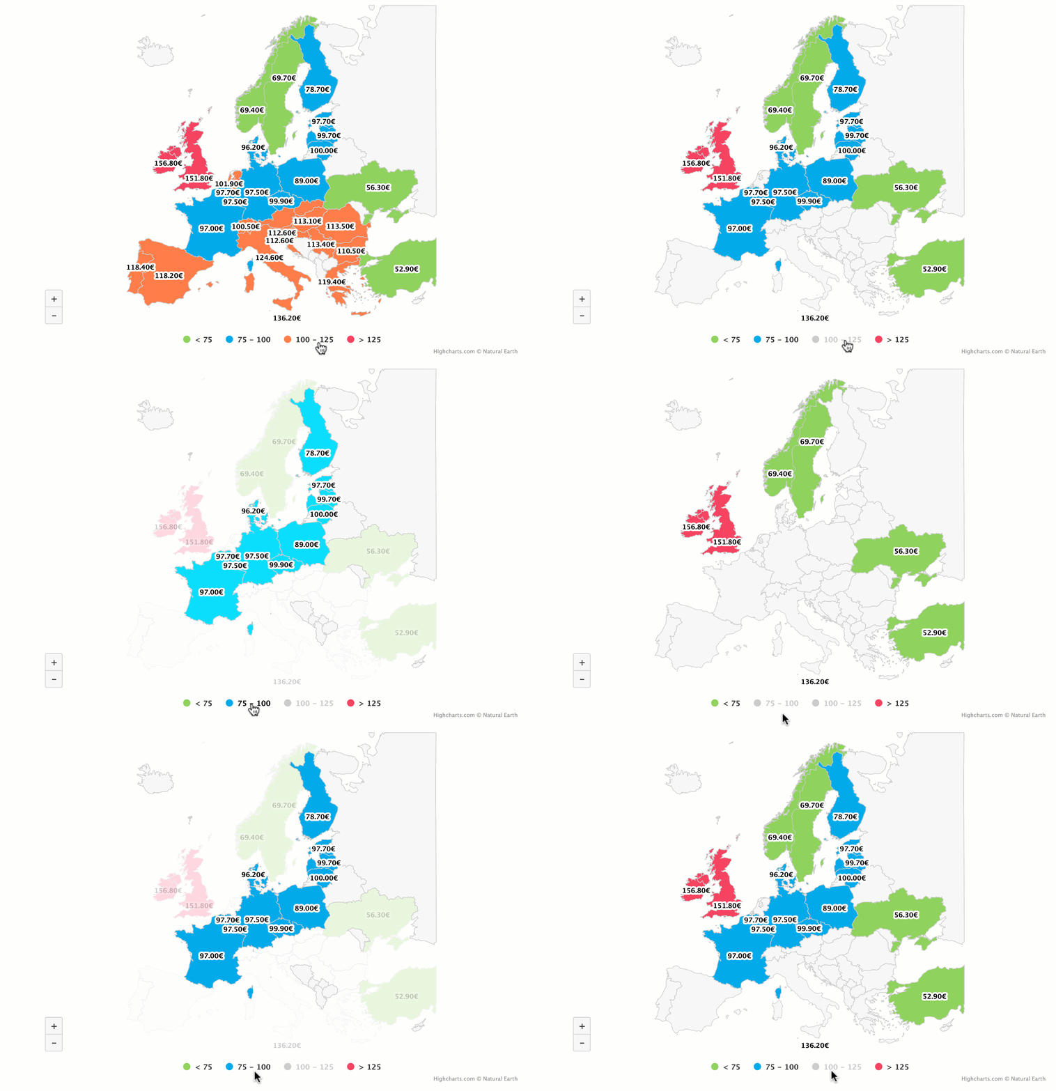
The idea is to make it easier to explore the map, and check countries with similar or different prices.
SignificantDigits491 t1_j1u4l80 wrote
Having the map you're trying to read partially flicker out of existence every few seconds does not make it easier to explore it.
highcharts OP t1_j1yhhfo wrote
Thanks for the feedback :)
Somehow-Still-Living t1_j1uaidz wrote
The selections are inconsistent and have no rhyme or reason to them other than showing that you can interact with them. If you insist on using a gif, start blank and then reveal in a comprehensive order (ie: Lowest to highest), then give a longer period after all are revealed so that people can take in the full chart. Though, for such a small change, I’d honestly suggest just using a flat image.
highcharts OP t1_j1yhibx wrote
Good point, and thx for the feedback :)
Bokbreath t1_j1tmpqp wrote
What do you mean by baseload prices ? Baseload is the minimum load required to keep the grid running. I'm not sure why those prices are relevant.
highcharts OP t1_j1tn47c wrote
Yes, you are right. The idea is to make it on an interactive chart to be better displayed and get better interaction, such as showing countries within the same range.
s33d5 t1_j1v6mql wrote
Appreciate the effort, however I see why people dislike it - the animation is unnecessary as you can easily get all the info from the easy to read colouring.
Re post without animation and it will be much better received!
highcharts OP t1_j1yhkr5 wrote
I am open to feedback, and thx a lot for your feedback :)
[deleted] t1_j1tug75 wrote
[removed]
JourneyThiefer t1_j1vkpog wrote
Why is UK and Ireland so expensive?
a-plan-so-cunning t1_j20kx4r wrote
Ireland is linked to the uk price. Uk has little to no gas storage and has a large reliance on gas.
mxlevolent t1_j21asui wrote
Yeah, we're in a bad way in the UK...
highcharts OP t1_j1tme77 wrote
I used Highcharts to create this European map to display the average wholesale baseload electricity prices in Q3 2021. SourceQuarterly report On European electricity markets
knowknowknow t1_j1tww05 wrote
That report is for 2021?
highcharts OP t1_j1u0k82 wrote
You are right, thx :)

SignificantDigits491 t1_j1u1q6b wrote
Unnecessary gif is unnecessary.