Submitted by whatweshouldcallyou t3_ztjxbn in dataisbeautiful
Comments
porsche_radish t1_j1dxqxn wrote
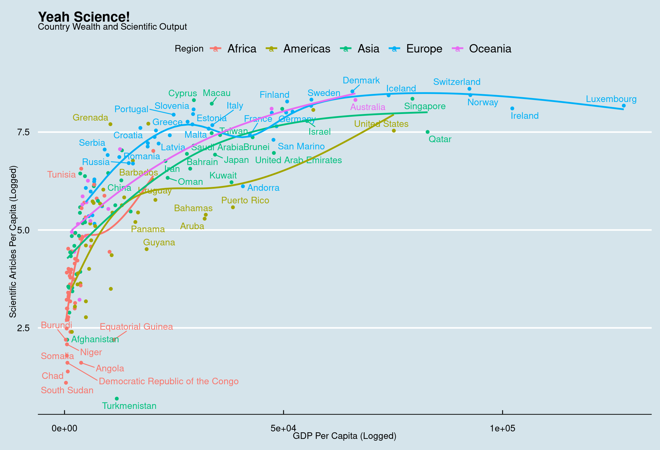
Why polynomial trend lines?
whatweshouldcallyou OP t1_j1dzhe6 wrote
Used GAM since the relationship is nonlinear.
[deleted] t1_j1e0e8f wrote
[removed]
porsche_radish t1_j1e7lqs wrote
This looks like too many degrees of freedom.
How much better does this perform over linear?
whatweshouldcallyou OP t1_j1e9c0l wrote
Linear Model without region effects: R2 ~ 50%
Linear Model with region effects: ~ 63%
With random slope: ~ 70%
​
Polynomial model with random intercept: ~ 71%
Polynomial model with random intercept & random slope: ~ 74%
So...maybe worth it.
manolokopter t1_j1edf62 wrote
Is there any reason why Grenada has so many papers per capita?
[deleted] t1_j1egf5g wrote
[deleted]
porsche_radish t1_j1eksq5 wrote
I meant vanilla linear regression. GAM are beyond overkill here.
These lines imply really bizarre relationships (the blue line dipping near france, the red line flattening out right below 5) that aren’t in these data.
whatweshouldcallyou OP t1_j1elaii wrote
Yeah I do agree that there is overfit both for Europe around the point that you specify as well as for the Americas. Oceania and Asia fit quite nicely.
[deleted] t1_j1em6xl wrote
[removed]
Savings-Ad-9713 t1_j1f82xw wrote
Can someone explain please?
nowlistenhereboy t1_j1fpxtl wrote
Would be interesting to see how many of the non-US based research and development projects have financial ties to US sources of funding and/or expect to make money on their products by selling at higher prices in the US.
I remember looking this up years ago and basically found that the vast majority of biomedical research in the world had ties to the US health industrial complex in some major financial way.
[deleted] t1_j1fvpjc wrote
[deleted]
fred_fotch t1_j1g9zbq wrote
Causation might be going the other way. Places with high GDPs have more money to fund science. Qatar and other oil countries being the prime example.
SerialStateLineXer t1_j1gi9nr wrote
The range is compressed by use of a log scale. The y axis is ln(papers per million people). Switzerland has five times as many papers per capita as Japan, but on a log scale it's 8.6 vs. 6.9.
Edit: This was in response to a comment expressing surprise that there was very little difference in output among wealthy countries.
Soviet_Llama t1_j1gk92o wrote
Mo' money, Mo' problems..... that are funded to be researched and published
Gustav2095 t1_j1gm7no wrote
You should’ve added U.S. states if you’re gonna add a U.S. Territory to the mix.
Javerlin t1_j1h72f1 wrote
Just because your r squared is better does not make your prediction better. You should check with cross validation.
Adding more freedom to your trend lines makes it fit your current data better sure. But just “joining the dots” fits the best.
Javerlin t1_j1h77pd wrote
They fit quite nicely to your eye sure, but look at the lack of data points you have for the higher gdp in those continents. This is just bad practice.
Javerlin t1_j1h7cp5 wrote
Fully agree. As is typical of data is beautiful, there’s a lot of bad data analytics practice here.
SerialStateLineXer t1_j1hmqeu wrote
Definitely. Since scientific papers are released internationally and every country is able to benefit from the discoveries, it doesn't make sense for differences in scientific output to be driving differences in economic development.
[deleted] t1_j1ioztr wrote
[removed]
cosmicowl_h t1_j1rsdy5 wrote
Hi Bro, May I just use it to tweet?
whatweshouldcallyou OP t1_j1rsvj8 wrote
Sure, go ahead.

whatweshouldcallyou OP t1_j1dskes wrote
Data: https://en.wikipedia.org/wiki/List_of_countries_by_number_of_scientific_and_technical_journal_articles
https://en.wikipedia.org/wiki/List_of_countries_by_GDP_(nominal)_per_capita
Tools: R, ggplot