Submitted by PlanetElement t3_zy9feg in dataisbeautiful
Comments
tessthismess t1_j24iiau wrote
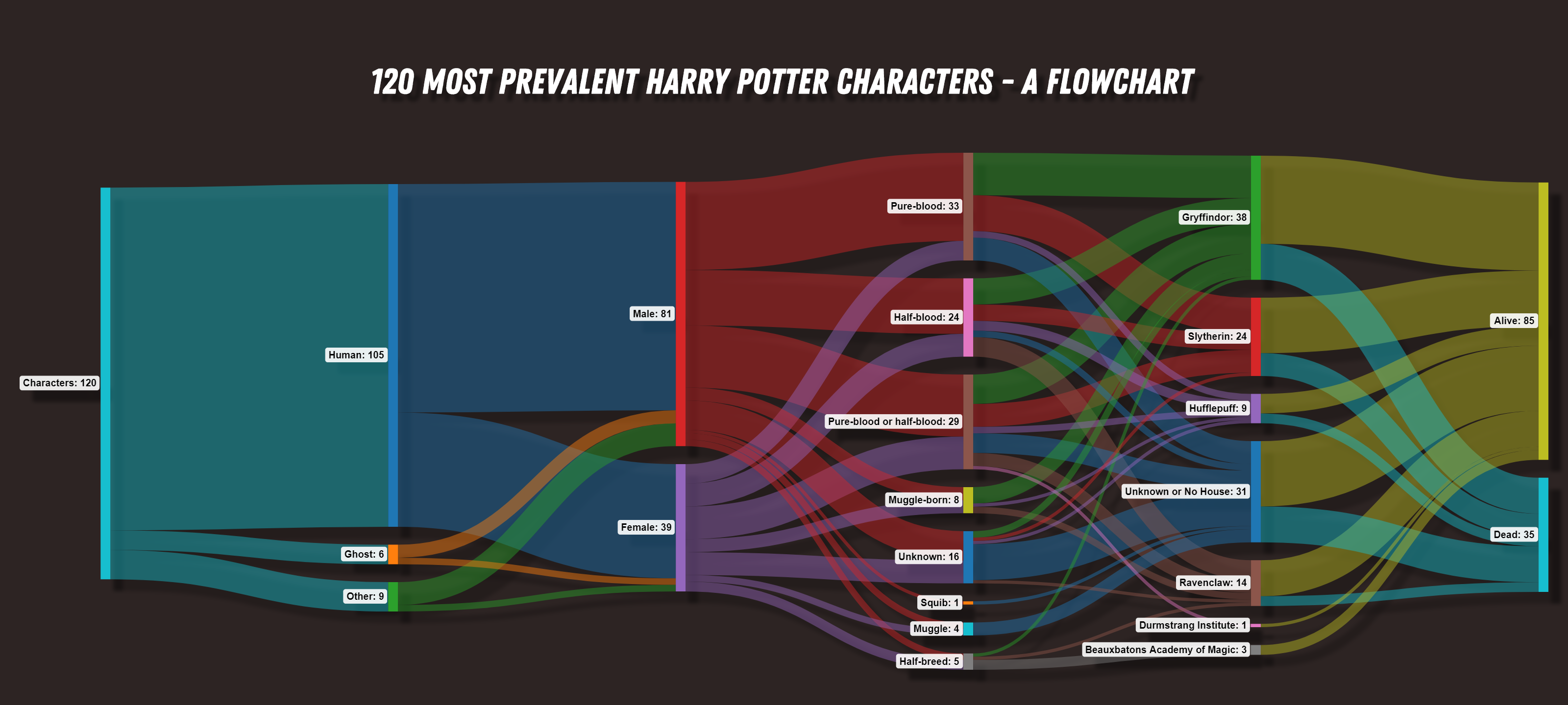
Kinda neat I guess. I would personally put "Pure-blood or half-blood" between half and pure-blood. Also kinda weird that category exists when unknown exists.
Also why is Unknown/No house between Hufflepuff and Ravenclaw?
PlanetElement OP t1_j24jpga wrote
>Also kinda weird that category exists when unknown exists.
I included this category since there are so many characters that are either pure-blood or half-blood (but definitely nothing else), for example: Peter Pettigrew.
>Why is Unknown/No house between Hufflepuff and Ravenclaw?
No reason, I thought it looked better that way.
Chudopes t1_j24k8be wrote
Gryffindor is green and Slytherin is red. Do you wanna start a war or what?
Mark_Kutte t1_j24l9vn wrote
Guess she was just below the cutoff line of being "Prevalent"
Gotto do that somewhere, since people like Frank Bryce or the muggle prime minister both had a couple minutes of screen time and are not in this graph. How many minutes or how much text makes you prevalent is pretty debatable
OldGloryInsuranceBot t1_j24ne1t wrote
With splitting AND merging, that’s not what this type of chart is used for. This shows me how many purebloods are griffindor, and how many griffindor are alive, but I’m unable to determine how many purebloods are alive.
PlanetElement OP t1_j24ny92 wrote
Yeah, I agree this chart isn't very useful in image format. The JS-based web version, however, is a lot more useful as you can drag your mouse over every path and the tooltips give you each individual metric.
Tioben t1_j24wixr wrote
Also weirdly splits pure blood, half-blood, and one or the other. As if you could be pure blood without being one or the other, or half blood without being one or the other.
[deleted] t1_j24x6sa wrote
[deleted]
quick20minadventure t1_j25h28f wrote
What did you use to make it?
[deleted] t1_j25osml wrote
[removed]
seeareuh t1_j262pq1 wrote
I find it interesting that you separated by Type first and then stuck them all back into Male/Female when that one had less choices.
And the colors on your Houses.
Not very beautiful imo
mattyboykneale t1_j26cet1 wrote
I’m going to say the ghosts are in the dead category
makerofpaper t1_j26jqie wrote
only 1 squib? Surprising Mrs. Figg doesn't make the top 120.
Dear_Spring7657 t1_j271ax7 wrote
What do the splits represent and why is it ordered in this way?
Typically, this sort of diagram is used to go from least specific to most specific left to right, with the ones on the right being dependent on the ones on the left.
The slices in this diagram seem to be pretty much completely independent of eachother (they merge), I think this data would be much more easily consumed in a series of pie charts.
Commercial-Living443 t1_j295vzx wrote
Strangely there isn't a pure blood ravenclaw
Commercial-Living443 t1_j295wu0 wrote
It is new year holidays
Aln76467 t1_j2ayka6 wrote
That's what I'm wondering

diemos09 t1_j24hu9g wrote
Well, they missed Arabella Figg.