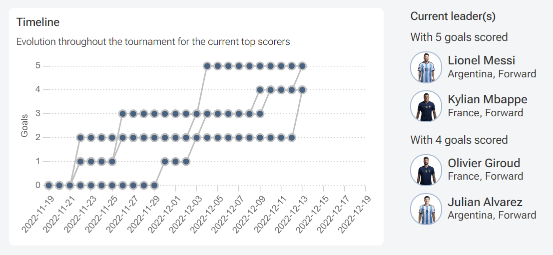
Submitted by laurentmolter t3_zlouyc in dataisbeautiful
Comments
Galimkalim t1_j06d8bc wrote
Would've been great if instead of grey dots you had flags + shirt number.
laurentmolter OP t1_j06dc82 wrote
Agreed, I tried but it's too complicated. You can get the details on the interactive version (hover): https://www.workwithdata.com/fifa-world-cup-2022
BadassFlexington t1_j06ebto wrote
France can still lose and mbappe be golden boot
ThePeoplesResistance t1_j06fivz wrote
This is hard to read and not beautiful
underlander t1_j06nj8f wrote
what even is this
[deleted] t1_j06tcx2 wrote
[deleted]
underlander t1_j06ts7n wrote
all the dots are connected..
Gigawrench t1_j07au7r wrote
This graph makes it impossible to discern the progression of goals over time for a specific player which is what it appears to be intending to showcase. If it was keyed by colour with a clear indicator when values overlap, this would be communicated.
itstommygun t1_j0a834r wrote
Unfortunately, half of Messi’s have been pens.
nameorfeed t1_j0azv8l wrote
Lmao i lrgit can't read this

laurentmolter OP t1_j06csdb wrote
Data from FIFA (including player's pictures), chart made with python and chartjs.
Interactive graph: https://www.workwithdata.com/fifa-world-cup-2022
Messi and Mbappe are leading, with Giroud and Alvarez one goal behind. All of them have still one more game to play and two for the French players. Or is it going to be a surprise, including a Moroccan player (a bit behind right now)?