Submitted by brave_loaf t3_zhlji9 in dataisbeautiful
Comments
brave_loaf OP t1_izmtu2b wrote
Also something I found funny was that the movie with the lowest star ratings in the data set was An Unremarkable Christmas. Fitting name for the movie that is tied for the lowest star rating on IMDB between the years 2016-2022
brave_loaf OP t1_izmvl50 wrote
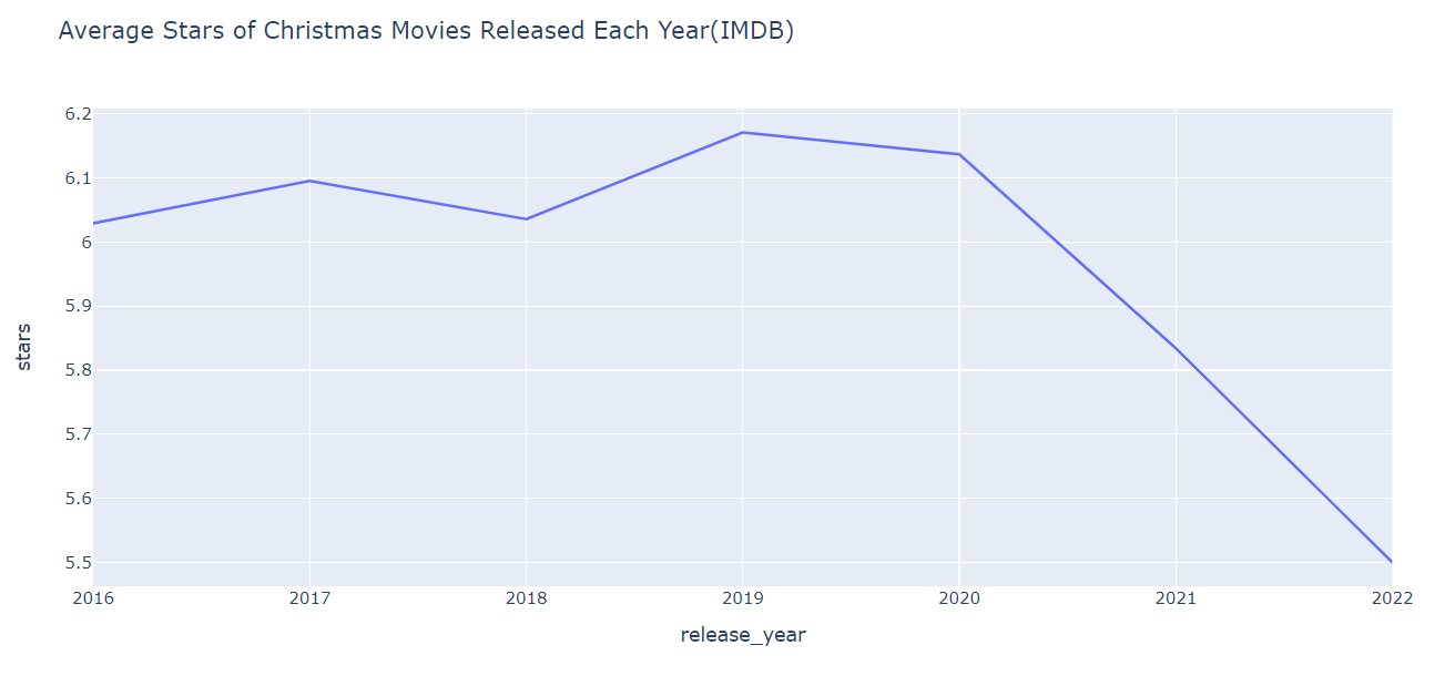
Sorry about that. That was how python automatically formatted it when it got graphed so that was how I left it. There definitely still is a decline overall in the average rating of Christmas movies though in the graph. Would it have been better to show a range from 0-10 on the side? I feel like it would be difficult to view the differences between each year if I had changed the range to that but I would love to hear your suggestions.
internetperson94276 t1_izmvtnr wrote
You knew what you were doing
brave_loaf OP t1_izmvwfl wrote
Sorry this is my first time posting and I'm a beginner with data science. That was how the python library automatically formatted it when I calculated and graphed the mean for each year so that was how I left it. Would it have been better to show a range from 0-10 on the side? I feel like it would be difficult to view the differences between each year if I had changed the range to that but I would love to hear your suggestions.
st4n13l t1_izmwc84 wrote
If the ratings are from 1-10 then that should be the range of the graph. If that means you can't really see a big difference between years...then there's not a big difference between years.
Might also be interesting to graph both the average and median scores
JCPRuckus t1_izmx9zq wrote
Well, yes, it would be hard to see the difference in the full 1-10 range. But that would accurately reflect the small change in that full context. If you really think it's important to show that detail though, then I would say that you should include both graphs and indicate that one is a cropped and zoomed detail from the other.
brave_loaf OP t1_izmy8w9 wrote
That was as far as the data set went. it's from Kaggle. I didn't create the data set myself else I would have gone farther to see if I could see any larger/more apparent trends in the data.
LesterGironimo t1_izmz0ic wrote
Would also like to see the number of movies released on a 2nd axis in appropriately festive shades.
brave_loaf OP t1_izn2p5t wrote
Hey I just wanted to say thank you for the advice and help. I re-graphed it with the y axis range being 0-10 and with the median and mean lines on it. I apologize for the poor initially graph as graphing it this way shows that it really isn't as drastic as a change as a cursory glance would indicate. I also graphed all the movies as a dot plot to see if there where very much of a discernible trend there. Here is the graphs that I made if your interested. https://imgur.com/a/PWOJHua
brave_loaf OP t1_izn2u1o wrote
Thank you for your advice. I re-graphed the original graphs and included a median line along with the mean line across the graph. Here is the link to it if your interested. https://imgur.com/a/PWOJHua
brave_loaf OP t1_izn2zl8 wrote
Due to peoples suggestions I have remade the graph adjusting the y axis range to 0 to 10 and also including a median line along with the mean line. I also graphed a dot plot of each individual star rating of the movies by year. Attached here are the graphs: https://imgur.com/a/PWOJHua
Thank you all for the advice and helping me improve.
Martinned81 t1_iznduc8 wrote
Or, alternatively, movies' ratings tick up over time, in the years after their release.
himmmmmmmmmmmmmm t1_izne2vu wrote
That would be a better chart. A comparison of all movie reviews versus Christmas themed movies.
himmmmmmmmmmmmmm t1_iznecmc wrote
I would like to see a fifth order polynomial plot of the future trajectory of the reviews if all production was moved to Idaho
HankRivera t1_izobi0q wrote
Now plot it with the increased production of Christmas movies!

brave_loaf OP t1_izmtm9k wrote
Data Source used was from Kaggle IMDB Dataset of All Christmas Movies 2016-2022: https://www.kaggle.com/datasets/adityak957/imdb-christmas-movies-from-20162022?resource=download
Tools Used: Python, Pandas Library, Plotly Express
Would love to hear feedback or any questions you have.