Submitted by hcrx t3_zexbri in dataisbeautiful
Comments
twothingsatthetime t1_iz8y57k wrote
A meme with the skeleton on bottom of the swimming pool would be fitting here for Norways consistent 98% renewable energy.
BourboneAFCV t1_iz90ac2 wrote
Well done Uganda, we believe in you
Alternative-Sea-6238 t1_iz92nxj wrote
Thing is, if the base number is small, it is a heck of a lot easier to achieve a significant increase to a less small number, than to start with a big number and achieve a small increase.
hcrx OP t1_iz92vgw wrote
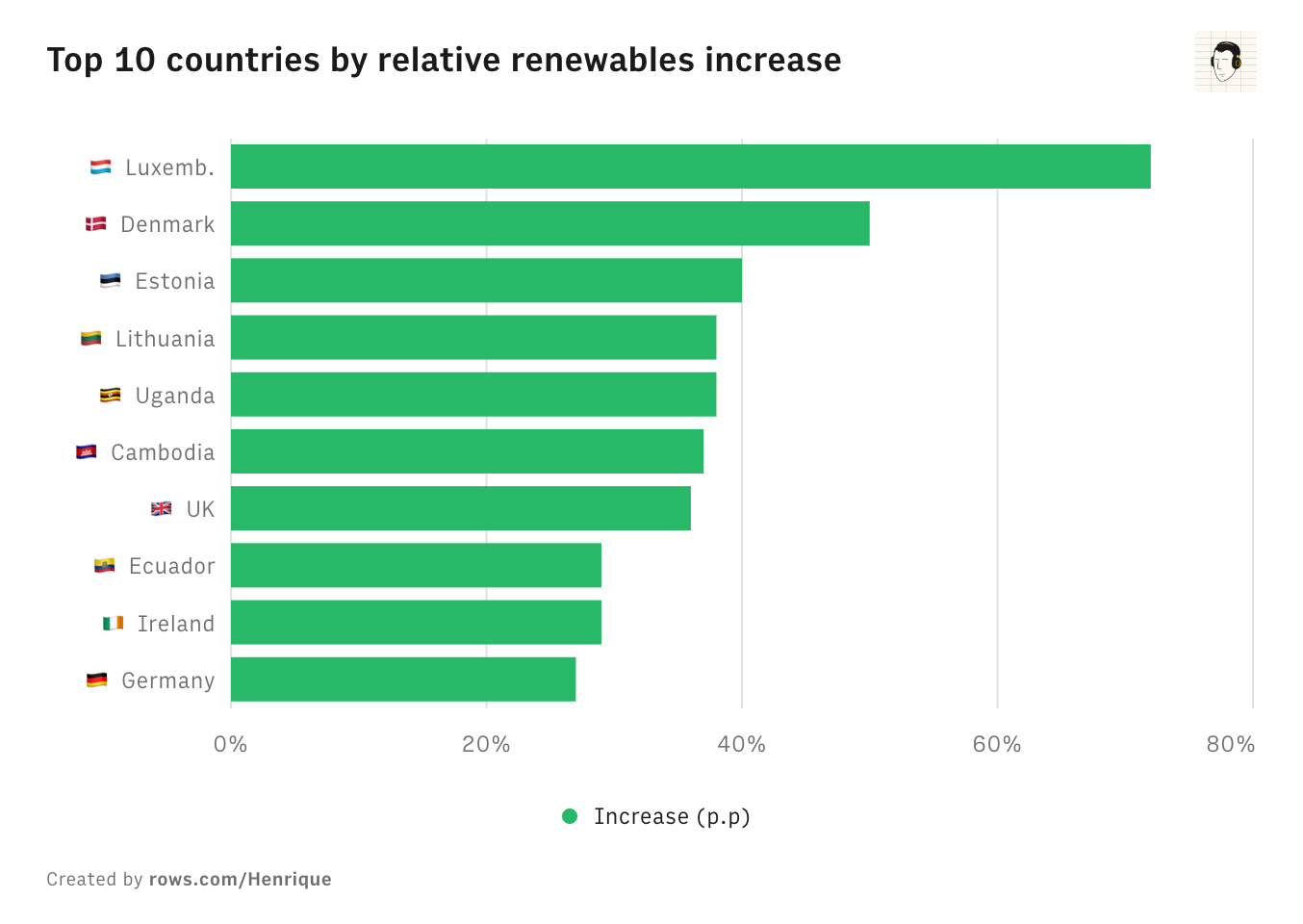
It is true. Still, there are the top 10 and the increases are in percentage points. So even if you start from 0, going to 70% (like Luxembourg) is impressive.
Alternative-Sea-6238 t1_iz93cqo wrote
My point is, taken in isolation this data can be very misleading. If Luxembourg previously only had 1% of their energy from renewable sources and increased to 1.7% (70% increase), they would have the same place on the chart, but who would give them kudos for 98.3% non-renewable energy?
ollafy t1_iz95kmb wrote
That still doesn’t mean the graph is bad. I see this kind of thinking in this subreddit all the time and it’s killing me inside. If you were to write an article about the changes that occurred this year in renewable, this graph could easily be there mixed in with multiple others as well. You’d have one that was just raw numbers by wattage and maybe a few breakdowns by type of energy. There’s nothing misleading about this graph. It says it’s relative and that’s what it delivered.
Romanitedomun t1_iz9go2g wrote
Luxembourg? do you call Luxembourg a country? it's smaller than my neighborod...
hcrx OP t1_iz9hby9 wrote
Again, the chart is in absolute percentage points increase, not in %. So if Luxembourg had gone from 1% to 1.7% it would have increased by 0.7 p.p and would not have made it to the top 10.
Alternative-Sea-6238 t1_iz9sko7 wrote
Ah, I misunderstood then. The word relative in the title of the post made me interpret the data as being relative percentage points, not absolute. My bad, I suppose.
hcrx OP t1_iz9sqa0 wrote
Got it, I see the confusion. Shouldn't have added the word relative there. Clear, thanks!
Alternative-Sea-6238 t1_iz9swrw wrote
Didn't say the graph was bad. Just that taken in isolation it can be misleading. Also, I apparently misinterpreted the title - I have replied to OP on this. Basically, OP says it * isn't* relative, it's absolute. Despite the title.
40for60 t1_iz9xap1 wrote
All the Euro countries are on the North Sea and can leverage the shallow water wind. Deep water wind will start coming on strong in a few years. The US goal was to have 30 GW by 2030 and 80 GW by 2050, currently there are 40 GW in the pipeline.
TisButA-Zucc t1_izdvgkn wrote
Still much higher carbon emissions per capita compared to rest of Northern Europe, especially Sweden. So at what cost?

hcrx OP t1_iz8xiot wrote
Source
Tool