Comments
Geographist OP t1_iyof8ni wrote
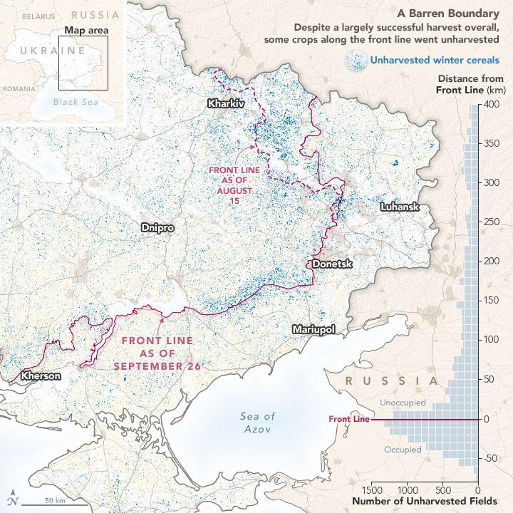
Tools: Python, Bash, QGIS/GDAL
Data: Analysis from NASA’s Harvest Program
More info and satellite imagery: https://earthobservatory.nasa.gov/images/150590/larger-wheat-harvest-in-ukraine-than-expected
Stoolpijin t1_iypin5k wrote
Immediate upvote. Original and well presented.
Hellcat826 t1_iyrezje wrote
I thought they had retreated much further.
AlmostProfessionalFM t1_iysr755 wrote
This front line is from September. The Kherson offensive has meant that Ukraine controls much more in the South West of this map than is shown, generally up to the major river at Kherson.
Embarrassed-Loss-118 t1_iyvqdmu wrote
Thought they didn't retreat as much
teamongered t1_iyulh8b wrote
Really interesting! Took me a bit to figure out, though. My only critique is I feel the figure on the right could be more define/separated from the map visualization.
SquishyBatman64 t1_iyououy wrote
Maybe all the blood scarifice will help the soil produce better crops next season

Tordoix t1_iyozcnq wrote
This is really well made. A good selection of data that tells a story and a very clean and easy to understand visualization of it.