Submitted by pmocz t3_1001umv in dataisbeautiful
Comments
chalybesmith t1_j2f0ukg wrote
awesome plot! I like this style of visualization!
[deleted] t1_j2f3v6t wrote
[deleted]
pmocz OP t1_j2f58v5 wrote
Thank you!
[deleted] t1_j2fc7kc wrote
[removed]
MycelialNetworking t1_j2frp7u wrote
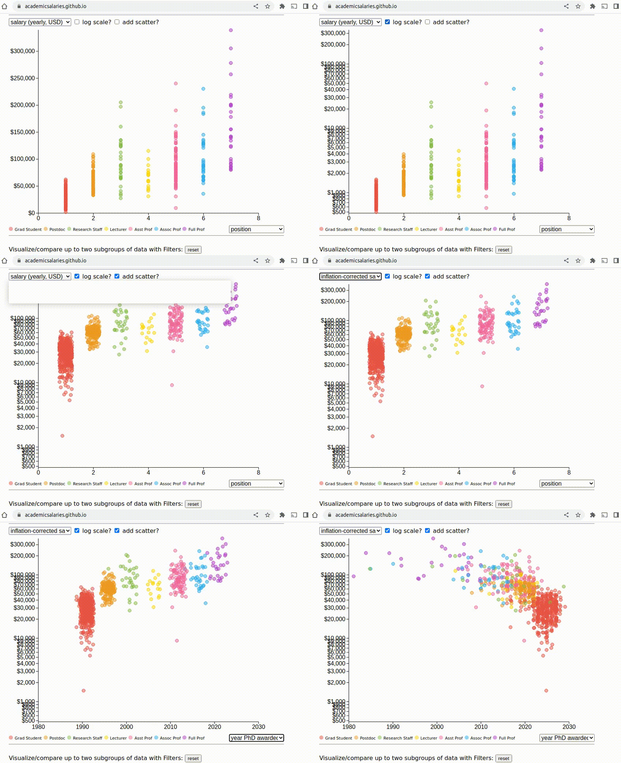
Why would you plot salary on a log scale?
AManAboutNothing t1_j2fxgf3 wrote
This is very cool! Thanks for sharing Pmocz!
One thing you might consider adding into this data set is that some states in the USA publish state university employee salaries. For example, both Wisconsin and Minnesota share the salaries for lecturers, faculty members, etc. which would substantially grow your salary count without waiting for individuals to find your site and upload their own data. What may be challenging, is connecting the additional details like date of PHD and department. And of course, this method would skew your data set towards public institutions substantially.
Best of luck with this project!

pmocz OP t1_j2eyavn wrote
I fixed the blurriness of my previous post (https://www.reddit.com/r/dataisbeautiful/comments/100141q/oc_improved_growing_interactive_visualization_of/)
​
http://academicsalaries.github.io/
Check out the growing database/visualization at the link above, that is helping promote academic salary transparency.
The visualization uses D3 and the source-code and dataset are free at: https://github.com/academicsalaries/academicsalaries.github.io