Submitted by pmocz t3_100141q in dataisbeautiful
Comments
SnazzzyCat t1_j2eucl3 wrote
Ngl that made me sad when you switched it for inflation
pmocz OP t1_j2evq7f wrote
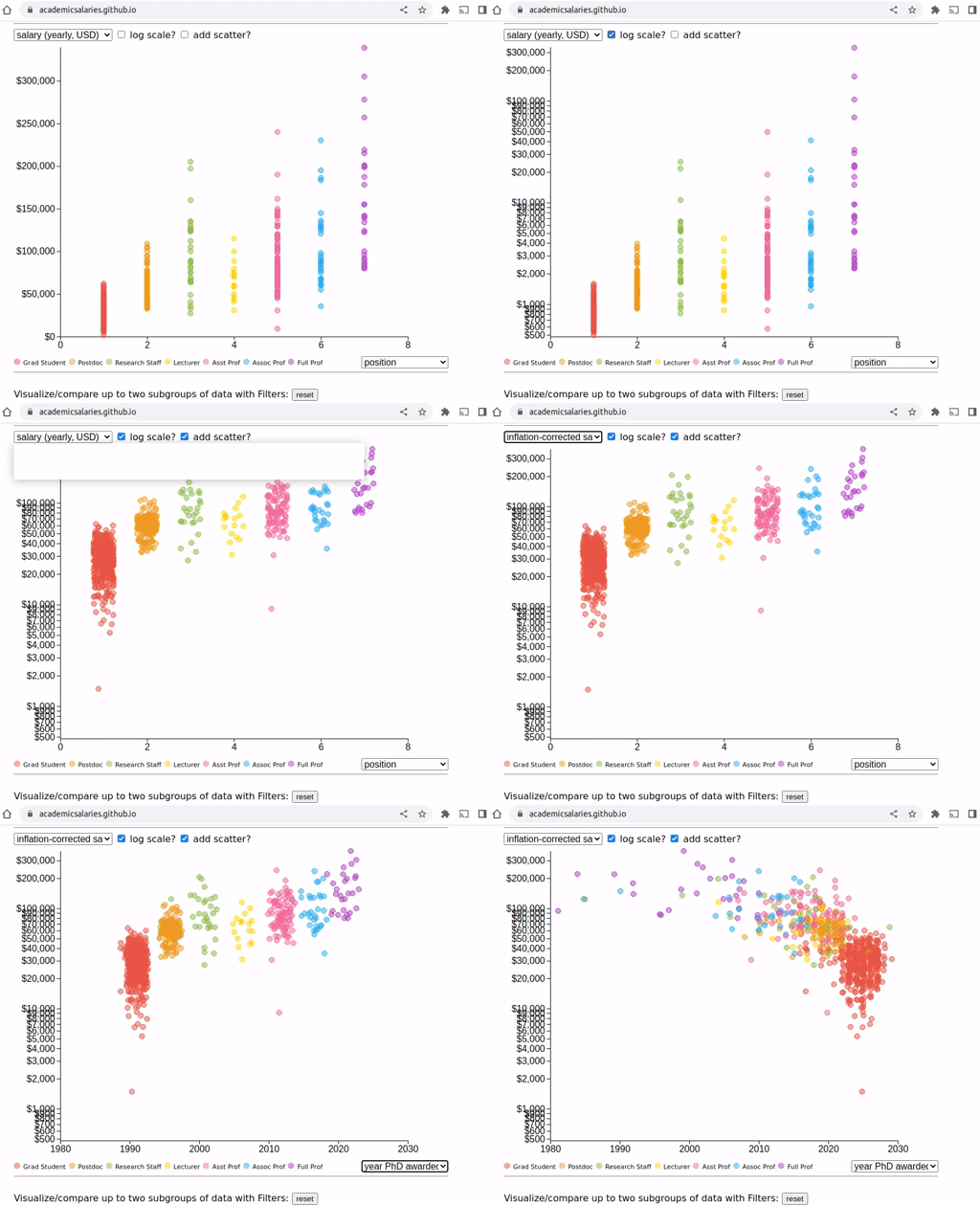
The inflation correction is used to re-adjust submitted salary data all to 2022 values. Most of the data I collected is from 2022, so the effect is small. But there is some data going back to 2010. What is interesting to visualize is: "inflation-corrected salary" vs "year (salary awarded)" and see if pay is keeping up with inflation
locodays t1_j2exf48 wrote
Graph looks blurry. Hard to read :(
pmocz OP t1_j2exikn wrote
I need to improve my screen-capture skills -- check out the website instead: http://academicsalaries.github.io/
Ravingraven21 t1_j2f69by wrote
Why are you using log scale?

pmocz OP t1_j2et8pc wrote
http://academicsalaries.github.io/
Check out the growing database/visualization at the link above, that is helping promote academic salary transparency.
The visualization uses D3 and the source-code and dataset are free at: https://github.com/academicsalaries/academicsalaries.github.io