Submitted by sinfulducking t3_z1ocxi in dataisbeautiful
Comments
sinfulducking OP t1_ixc0l1s wrote
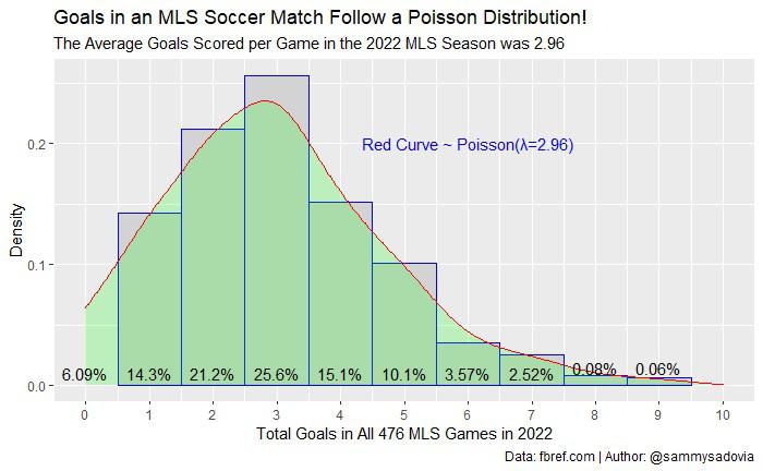
I’m showing how 476 random outputs from a Poisson distribution with lambda=2.96 would look, however I can see how this may likely not the best way to go about it. Do you think it adds anything useful to this plot, or is there something similar that would be better?
MasterMCD t1_ixc0pjo wrote
I still don’t understand how this would yield a continuous curve as you’ve indicated here
sinfulducking OP t1_ixc0xjc wrote
I used geom_density to compute a KDE and show a smoothed histogram.
MasterMCD t1_ixc12fl wrote
that makes more sense now
eric5014 t1_ixc8nj2 wrote
Instead of the curve, red horizontal lines in each column for the Poisson value for each number. That would be more accurate and indicate how close the real values are to it.
The Poisson distribution is exactly what we'd expect if goals were random occurrences and no extra time. So no surprise but a good example for anyone explaining Poisson.
sinfulducking OP t1_ixc0aue wrote
Data from fbref.com Made in Rstudio
Pls feel free to share as much criticism/critiques as you have. I’m trying to learn as much as possible.
PoddleMeister t1_ixc2gln wrote
Another way to present this is to show the percentiles of the actual goals scored against the percentiles of the poisson distribution. If it's a straight line, then your eyeballs at least can be happy that the distribution you've selected matches the observations at least.

MasterMCD t1_ixc061q wrote
Poisson is a discrete distribution…what exactly are you showing with the red curve?