Comments
msnf OP t1_iwwiixm wrote
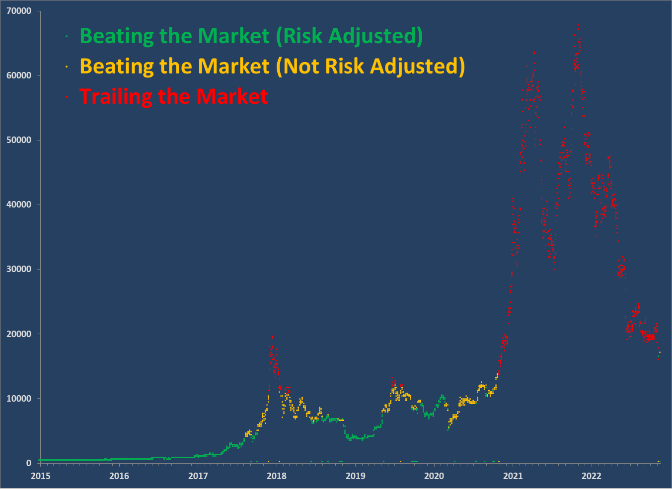
Because of its volatile price, Bitcoin's return depends heavily on the specific time and price you paid for it. This chart shows how that return compares to putting the equivalent amount in a S&P 500 fund (with dividends re-invested) like SPY or VOO.
As the chart shows, any bitcoin purchased for more than $13.5k is likely trailing the market in terms of total returns (these are shown in red).
Even below that, down to about $10k depending on purchase date, likely trailed the market on a risk-adjusted basis (orange points) - even if it provided greater total returns. That is, you would've made more money with less volatility by buying a leveraged S&P fund.
Those time points in green, generally with purchase prices under $10k, would've beat the market risk-adjusted. Risk is calculated using the Sharpe ratio and assuming a 2% safe annualized rate of return. Idiosyncratic risk, like lost keys or your exchange blowing up isn't part of this model.
The chart shows that bitcoin has now fallen so far that basically any purchase at the 2017, 2019 or post-covid peaks is now trailing market returns. Pretty much the entire covid run-up is now trailing market returns, at least on a risk-adjusted basis.
st4n13l t1_iwwkflg wrote
Thanks for this explanation! Very interesting for sure.
[deleted] t1_iwwh36t wrote
[deleted]
MassaHurmaaja t1_iwx1e29 wrote
I have still hard time understanding what is going on here. Does this show only Bitcoin return? Or does it compare to S&P500 and show the difference or what?
I see a graph (I assume Bitcoin price) that sometimes beats the market or beats the market or trails the market but no clear difference on how much it won the market or anything else for that matter.
Also is the left side the Price or S&P index or what?
Don't get me wrong I find your idea super interesting but man is it confusing to read.
91d3ac929583f2d9 t1_iwxddcg wrote
If you purchased Bitcoin sometime in the green, you’d be outperforming an S&P 500 index fund like SPY or VOO (assuming you reinvest the dividends)
If you purchased Bitcoin in the red, you would have been better off purchasing an S&P 500 index fund.
Yellow means “risk adjusted”, but it’s unclear exactly what OP means by that
GregBahm t1_iwxizlo wrote
This infographic took me a while to wrap my head around, but it was very interesting once I figured it out.
OneCuriousBrain t1_ix2pjoq wrote
Hey.. working on a similar thing. Could you help with sources of data? Apart from bitcoin price obviously.
[deleted] t1_iwwf44q wrote
[removed]
matertows t1_iwyhh54 wrote
Should have made a difference plot on the y axis so beating versus losing to the market will hover above and below zero

st4n13l t1_iwwg3su wrote
Do you mind explaining to us non-Finance background folks what we're looking at in layman's terms?