Submitted by reddevil131313 t3_yrio6y in dataisbeautiful
Comments
Paan1k t1_ivvlfzw wrote
I think the line is just linking all points.
PPG is the number of points divided by the total number of games, i.e. the average number of points for a game. For example, there are 38 matchs in Ligue 1, and 3 pts for a win, 1 for a draw, and 0 for a defeat. Paris has 93 pts at the end : 2.5 PPG.
cox_ph t1_ivtyy5d wrote
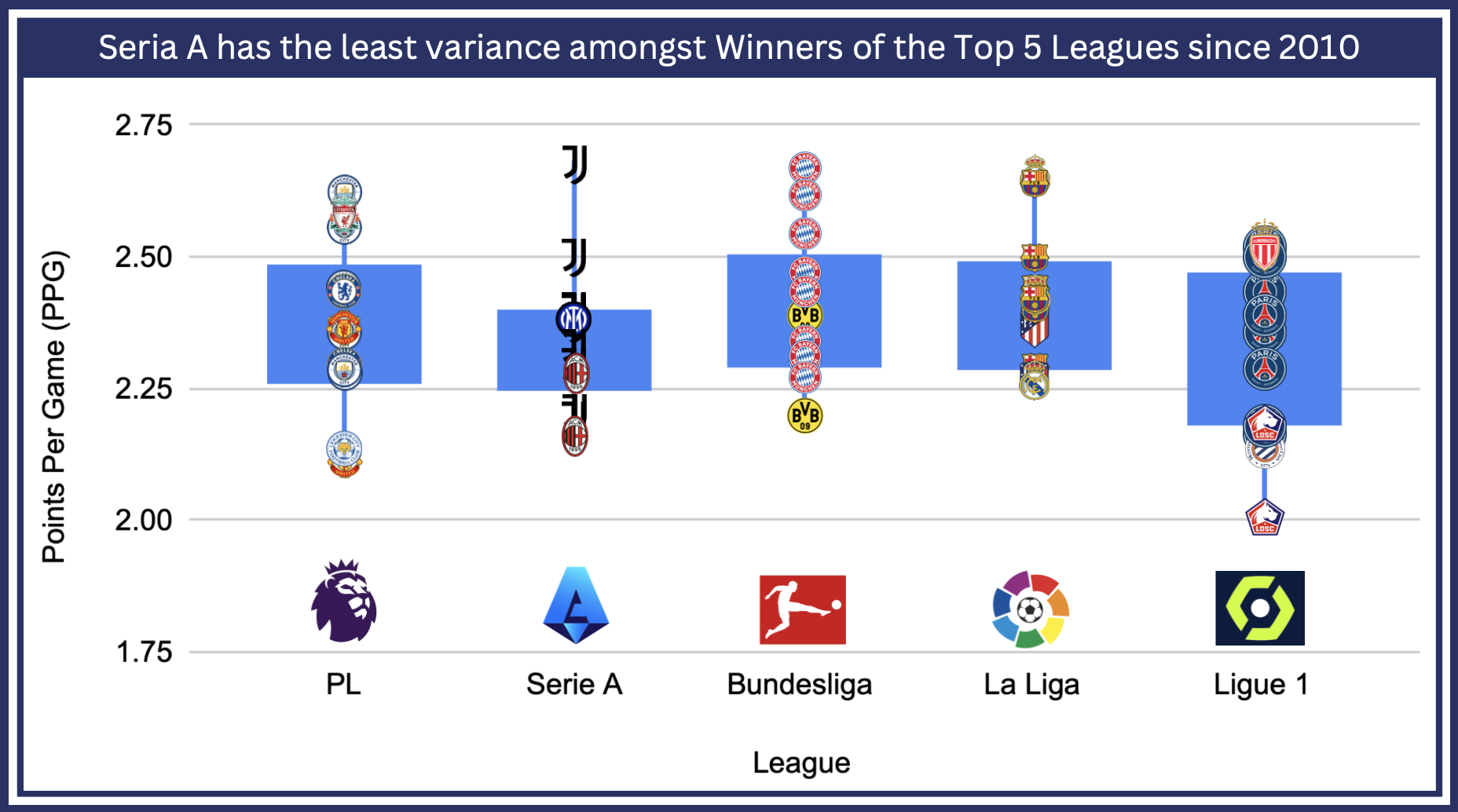
What is the blue bar? IQR? Confidence interval (and if so, is it 90%? 95% Are you assuming a normal distribution or something different)?
Also, this seems to go against the "Premier League is more balanced" or the "Ligue 1 is totally noncompetitive" narratives if the points per game for the leaders are similar (or if anything, slightly higher for the Premier League).
Grason20 t1_ivw50sj wrote
That's interquartile range, between 25% and 75% point of the values
PotentJelly13 t1_ivu89y7 wrote
Ehhh… Looks like Bundesliga has the least variance among winners seeing how they’ve had 2 teams and not 3 like Serie A. What is supposed to be exactly? What are the blue boxes? What does ppg have to do with variance of winners?
Fit_Run_6703 t1_ivwxc73 wrote
The different number of winners for a league has nothing to do with the variance. I think the person who posted it meant variance among the total points for the winning team of whatever year. Putting an icon of who the winning team was for that year visually just looks nice.
[deleted] t1_ivut86q wrote
[deleted]
pantaloonsofJUSTICE t1_ivyjoyf wrote
Points per game of the winning team is what is implied with the title and the use of the team seal as the point marker. If it isn’t points per game of the winners then it’s questionable what winning has to do with the graph at all.
Fit_Run_6703 t1_ivwxui8 wrote
This is super interesting. I've hear many people make the argument that leagues like the bundesliga or la liga aren't as competitive as the PL but I feel like if that were the case, it would be easier for the top teams in those leagues to accumulate more PPG because there'd be a larger supposed gap in quality from the top teams compared to the others, ergo less competitive league. This graph seems to disconfirm this hypothesis as the PPG of the top teams between the PL, bundesliga, and la liga are fairly similar.
reddevil131313 OP t1_ivts7ot wrote
Source: Google
Tools: Excel, Canva

ThisIsMyStonerAcount t1_ivtymse wrote
I don't understand what I'm looking at.
At first glance, it seems like the Bundesliga has the least amount of variation (it's always Bayern Munich and only 2x BVB), while the Serie A has at least 3 different winners.
I asume think the title does not match the graph (and you're not really talking about the variance of who wins the title). Also, there seem to be some sort of error bars here, but they're also weird (e.g. for the Serie A they go upwards a lot but apparently not downwards, while it's the other way around for Ligue 1. Or does the blue line indicate something else?
what does PPG actually mean? Is this only for the team winning the league in that year? Or over all games? I'm confused.