Submitted by OfficialWireGrind t3_z5ks0s in dataisbeautiful
Comments
bag_o_fetuses t1_ixwlapx wrote
i'd like to see a "unique words" per minute
barrycarter t1_ixwlyga wrote
I want Axel F and We Didn't Start The Fire :)
[deleted] t1_ixwmhg5 wrote
[removed]
Inevitable-Clue9840 t1_ixwmvgd wrote
Nice work, this is really cool!!!
thedean246 t1_ixwnx1u wrote
Yeah, that’s kinda what I was thinking. I feel like a lot of pop songs would be pretty low
thiosk t1_ixwornm wrote
No! You’ll destroy my new hit single “The” before it even leaves the station
OfficialWireGrind OP t1_ixwp1xq wrote
My initial impression about this is that it's heavily effected by the number of times the hook, chorus, etc is repeated.
OfficialWireGrind OP t1_ixwpgcq wrote
I'm looking at a chart like this right now. The number of unique words is in the range of 25%-50% of the total number, across the board.
Rare-Branch-8503 t1_ixwrjbm wrote
I like your creativity here but I don’t think this is an effective visualization for this data set. It’s very hard to read and gather any insights/conclusions. What question does this answer?
PM_ME_A_PLANE_TICKET t1_ixwsef9 wrote
OfficialWireGrind OP t1_ixwxsfb wrote
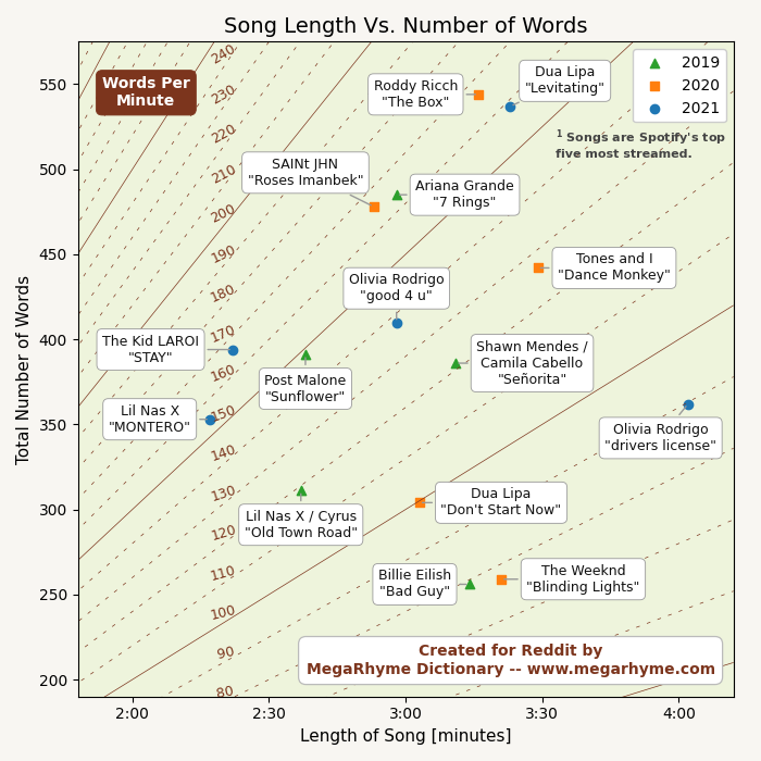
One thing I'm seeing is that there aren't a whole lot of songs above 170 words per minute (WPM). The songs "7 Rings," "Roses Imanbek," "The Box," "STAY," "Rich Flex," and "Levitating" are all in the range of 158-165. Kendrick Lamar's "N95" comes in around 210, but among 30 songs I've looked at, it's a bit of an outlier.
Another observation is that the highest WPM is more than twice that of the lowest. Comparing "N95" to Yahritza y Su Esencia's "Soy el Unico" increases the ratio to 3.6, and it's strongly reflected by a relatively broad range of vocal styles.
All of this is a fairly preliminary analysis though. I would imagine that if the input data is selected more thoughtfully, then patterns will emerge in the plot.
brucetopping t1_ixwz6kv wrote
Where is “rap god” on here?
DarreToBe t1_ixx2u1z wrote
Rap God released 9 years ago so isn't a top 5 spotify stream charts song from 2019, 2020 or 2021
king063 t1_ixx6bxq wrote
Most words in a song.
brucetopping t1_ixxadap wrote
Ah yeah totally. Just came to mind as a reference point for really fast words per minute
Segadamat t1_ixxpeiz wrote
257 words per minute at a 6.0666 min runtime. Considering the layout of this chart it would be up and to the right of everything listed on this chart.
brucetopping t1_ixxrcou wrote
Thank you! that’s what I figured. Amazing song.
impartialperpetuity t1_ixxwhrp wrote
I figured Rap God would be on there
aegisroark t1_ixycuac wrote
Super weird that you're doing a words per minute test on Olivia Rodrigo and Ariana grande. Post Malone almost makes sense. But you went straight pop with it. Super weird list that doesn't mean anything
JesusaurusRex666 t1_ixyie0y wrote
Or System of a Down
nemuro87 t1_ixyipm2 wrote
Here you go https://www.youtube.com/watch?v=3egre1kRvys
Not Rick Rolling, I promise.
-cookie_monster7 t1_ixyizoj wrote
Just read his comment or look at the graph and what it says. It's not his song selection.
jakubkonecki t1_ixyj2g0 wrote
I don't know any of those songs.
VikThorior t1_ixylboc wrote
From this answer, I understand that all you really care about is the distribution of WPM among top songs. So you don't need to show length and number of words on the plot. The best plot for this would be a simple histogram. You would be able to see the maximum and the ratio between highest and lowest. You would also be able to put more songs in the plot, using data from other years.
But what about the labels? you could ask. Indeed, with a histogram, the reader wouldn't be able to see which song is where on the plot. But what's greagt is that it's not the point of a plot.
If your goal is to show people the number of WPM for each song, you just show a table with all the values in it. That way, people can sort it in alphabetical order or by WPM value.
If you are interested in outliers, you can still show the name of the songs, because by definition, there are not many outliers, so you will have enough space to write their names.
Kdj2j2 t1_ixyw32h wrote
This. I want to see his discography on the chart. Please, u/officialwiregrind
[deleted] t1_ixz1k6i wrote
[removed]
srebew t1_ixz2n8v wrote
*limited to last three years and songs under 4:20 long
[deleted] t1_ixznn1s wrote
[removed]
OfficialWireGrind OP t1_ixzxwz3 wrote
Yes, well, one of the challenges with this is coming up with a good list.
OfficialWireGrind OP t1_ixzylbe wrote
It's the regular version.
EbMinor33 t1_iy0e5g9 wrote
I think one thing that seems unnecessary in this chart to me is the differentiation of year. One glance at 5 songs a year isn't nearly enough to make any conclusions. I think it might be better to focus on one or two years (without distinguishing between them) and include many more data points so you can see more overall WPM trends.
Majestic_Food_4190 t1_iy1yupw wrote
Are these arbitrarily chosen songs? Would also like to see if there's a relationship between wpm and bpm. Otherwise cool stuff

OfficialWireGrind OP t1_ixwkzkh wrote
The plot shows duration in minutes, total word count, and words per minute for a selection of 15 songs. The plot is done in the style of a topographic map, but with words per minute instead of elevation. The song selection is Spotify's top-5 most streamed songs for the years 2019, 2020, and 2021.
Sources: genius.com, azlyrics.com, musixmatch.com, en.wikipedia.org
Tools: Python, Matplotlib