Submitted by Dont____Panic t3_yocaon in dataisbeautiful
Comments
ThePandaRider t1_ives3l3 wrote
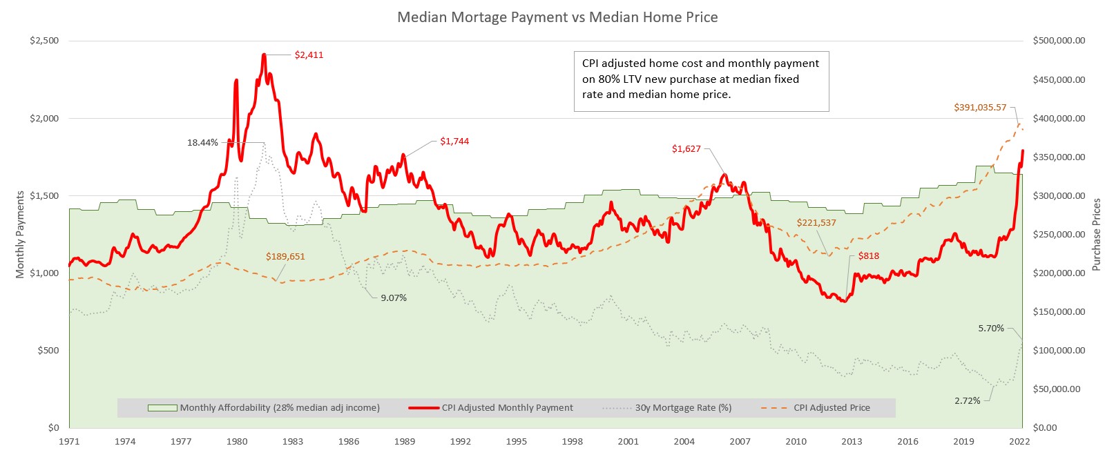
The average person will struggle making mortgage payments on the average house going forward. Keep in mind that only people who bought in the period where the red line is above the green shaded area are in trouble. Everyone who bought when the red line was below, which is most people, should be alright as long as they are on a fixed rate loan. When the orange dotted line crosses the green area housing is likely to be overvalued.
Dont____Panic OP t1_ivf1w9k wrote
When the red line is above the green, that just means the median person can’t afford the median house.
It seems to have been that way a lot in the 70s and 80s.
Another challenge people have today is down payments are higher than they were, so that’s an additional hit against affordability.
When the red line is above the green, it SHOULD put downward pressure on prices.
Dont____Panic OP t1_ixzvegw wrote
Looking back at this… the orange dotted line has no relation to the shaded area, they’re on different axis.
ThePandaRider t1_ixzwnz1 wrote
What do you imagine the 30yr mortgage is used to pay for?
Dont____Panic OP t1_ixzww69 wrote
Uh. The point is that one is on a different scale. To assign relevance of the green line to the other line would also say that the 1980s were cheap when everyone was struggling to get a mortgage.
They’re simply not that related.
ThePandaRider t1_ixzylti wrote
I know they are on a different scale. The scale is linear so it doesn't matter. Houses were cheap in the 80s, you can buy them with cash as well as a loan.
Dont____Panic OP t1_ixzz27d wrote
Correct. The green shaded area simply has no meaning regardless. :-)
ThePandaRider t1_iy009pg wrote
The orange line represents the purchasing price. The purchasing price combined with the 30yr mortgage rates are used to calculate the monthly payment, the red line. The monthly payment is related to the monthly affordability. How do you not see something so obvious?

Dont____Panic OP t1_ivdjr8v wrote
Made in Excel.
Data Sources are for UNITED STATES ONLY
Conclusion: Data shows that housing prices have risen to historically high levels (even by CPI adjustment) but the "monthly cost" of these mortgages remained within a narrow band from 1995 until 2021 and historically high monthly payments (inflation adjusted) for a mortgages occurred during the 1980s, although rapidly increasing rates in 2022 has also spiked mortgage payments.
Affordability of mortgage payments was quite good on a "monthly payments" basis in the USA until a few months ago.
However increasing purchase prices require higher down payments. This significantly affects "affordability" of mortgages, even when monthly payments are within reach of median income earners.