Submitted by rosetechnology t3_yl3uio in dataisbeautiful
Comments
SGT_Stabby t1_iuwax6l wrote
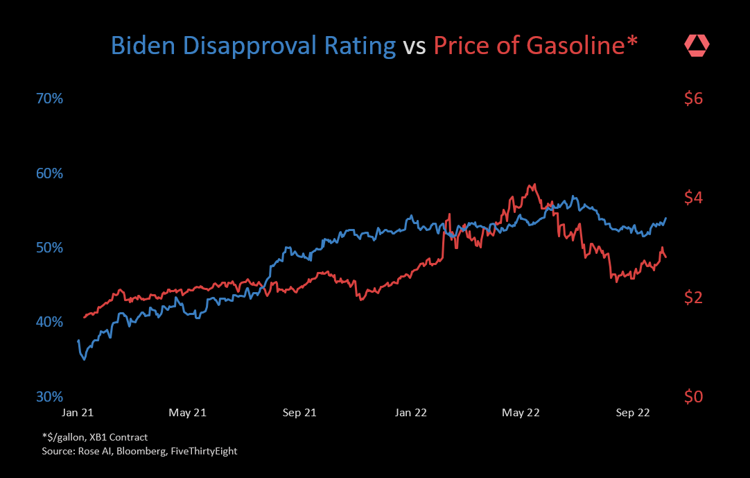
Neat graph. You could have matched either of those to anything. Now if we could all remember that correlation is not causation.
Imperial_Empirical t1_iuwo29v wrote
Add demand for hamburgers and guns per child and you have the most American statistics post seen here.
Any proof of statistical relation between what you've shown? That would be better then just overlaying two graphs.
DM_me_ur_tacos t1_iuwpoc6 wrote
Ransome62 t1_iuwq0yr wrote
If the USA kills democracy for cheaper gas, historically you guys will forever be one of the least intelligent groups of people to ever form a government in the history of the entire planet.
What's ridiculous is that I'm fairly certain nobody gives a shit and still think it's a great idea.
A good example would be the experiment where you put a small child in a room with a table.. on the table is one marshmallow. You tell the kid, if you can wait for 15 minutes and not eat the marshmallow, you can have 2... but if you eat it before, you only get one.
America is becoming the kid who just eats the one and then throws the table over and looses their mind when they don't get the other.
wwarnout t1_iuwqdph wrote
"spurious" is being kind.
Inevitable-Clue9840 t1_iuwtskd wrote
This is actually a nice-looking graph. Just not seeing why you put these 2 variables together :)
yumyumapollo t1_iuxkvj2 wrote
All this tells me is that his disapproval was going to grow regardless of gas, and the only thing that sped up the process was the withdrawal from Afghanistan.
The_Happiest_Man t1_iv3qj9i wrote
I like this visual, interesting to see the data even in absence of correlation.

rosetechnology OP t1_iuw9u89 wrote
Sources: Bloomberg, FiveThirtyEight
Generated using Rose AI