Comments
zest_of_a_lemon t1_itki9oq wrote
If you want a good /r/dataisbeautiful post, you should either post a screenshot in an interesting configuration of this tool or a gif transitioning between configurations that show the data well. This sub isn't the place for screenshots of data analysis tools, it's a place for data shown beautifully.
Ryrylonsdale OP t1_itkkhrl wrote
yeah the gif idea is a good one, I think i'll try that.
​
Thanks
MonsieurX t1_itmr54q wrote
Nice effort! You should make it editable by surfer users to get all the spots filled in :)
USSImplication t1_itokkwu wrote
Damn I'm just dipping my toes into data analysis and was thinking of doing something similar for my first project when I get there. I'm not familiar with Tableau yet but is there any way to toggle to Fahrenheit? It's a little odd to have wave height by feet and temperature in Celsius. Just my uneducated input.

Ryrylonsdale OP t1_itkfwen wrote
https://public.tableau.com/app/profile/ryan.lonsdale/viz/SurfTripPlanner/Dashboard2
​
This is my first real data project
​
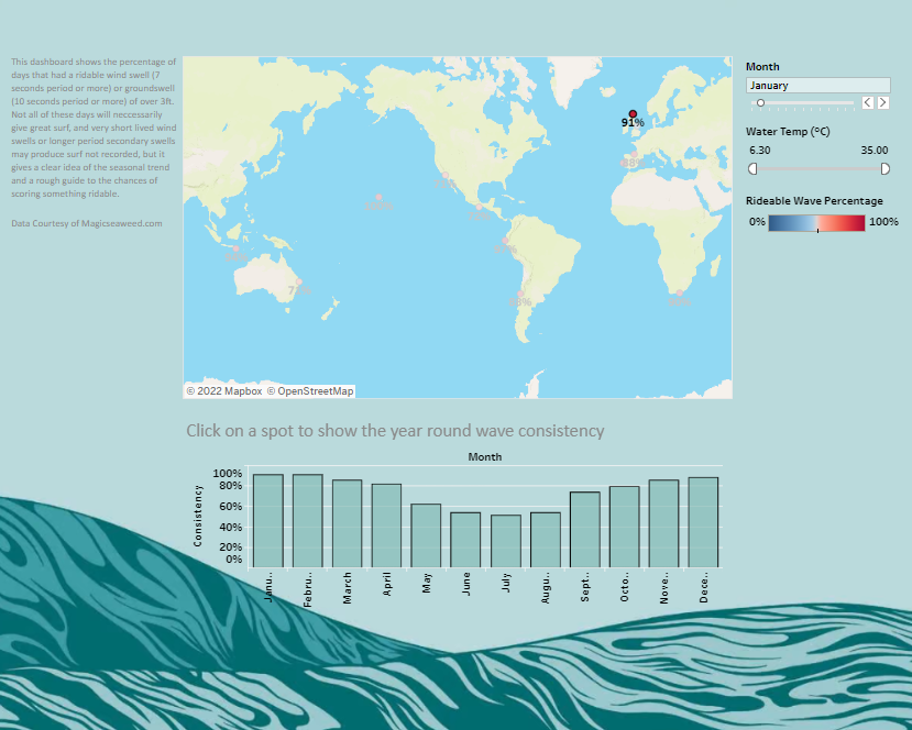
I created an interactive map that shows users surf spots around the world and their consistency based on 10 years of historic data collected by magicseaweed.com
When you click on a spot a menu will show, displaying the name of the spot, region and country, aswell as the water temperature and a link to the live forecast (courtesy of magicseaweed again). A bar chart will also show below the map showing a year round display of wave consistency.
The map is filterable by month and water temp, and the plan was the help surfers get an idea of which regions and spots would be ideal for their needs of a surf trip.
Constructive criticism is very welcome, as are any questions, I'd like to get better