Submitted by biantongfrom t3_yerc8h in dataisbeautiful
Comments
aannoonn2021 t1_itzg8r8 wrote
French press at home, espresso on the go. Both black, no sugar.
EscapeButton_ t1_itzi9qd wrote
Iced latte (with plant milk)! 🧋
BelAirGhetto t1_itzlmtw wrote
Cocoa, exclusively! Coffee is too much for me….
[deleted] t1_itzn8w2 wrote
[deleted]
Justme100001 t1_itzrrg1 wrote
I always ask my self when people order coffee to go: why not drink it when it's hot and brewed only seconds ago. Where and when are you going to drink it ? In your car, at your desk an half hour later ? This is coffee you know.
Just wondering...
hugseverycat t1_itzva3a wrote
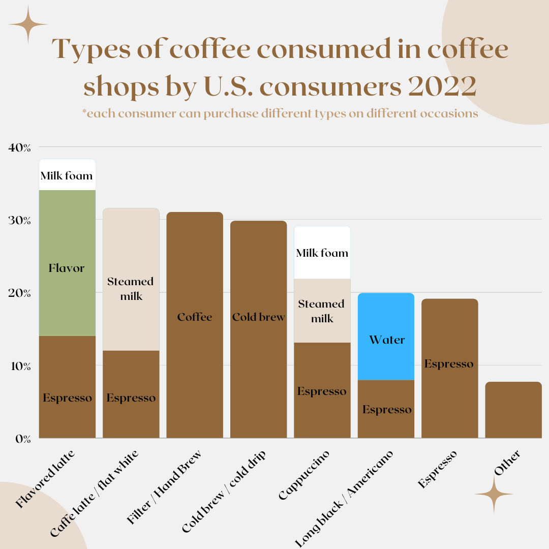
The vertical axis is weird. From the title you'd expect this to have something to do with how many drinks are ordered but I think it's actually the composition of the drink?
NeverDryTowels t1_itzvnsl wrote
Was going to come here and say the same! That really irks me.
biantongfrom OP t1_itzvrhq wrote
Its percentage of US consumers that buy that type, such as 40% of US consumers enjoy flavored lattes etc. haha
vancitygirl_88 t1_itzx6fu wrote
Flat white is a 2:1 espresso:milk ratio not the same as a latte which is 1:2
CryptoWard t1_iu0052w wrote
Confusing Graph, as it shows both preference as well as coffee composition.
For example Flat white is a double shot, where Latte and most cappuccinos are single shot espressos. You might wrongly compare bar sizes to compare espresso amounts, while one bar is smaller than the other, hence you should compare ratio I guess.
Just a bit sub-optimal
[deleted] t1_iu0562l wrote
[removed]
OneOverTwoEqualsZero t1_iu1vkgy wrote
That’s not at all what the title implies
truthismfollow t1_iuabg0l wrote
Not the best way to use a stacked bar chart as it is meant to show the composition of a particular category.
Breaking it down: X-axis shows coffee type and Y-axis shows consumption %
However, with the use of a stacked bar you are implying that the Y-axis is also showing % of ingredients used in each coffee type: So is long black/Americano ~12% water and 8% espresso? What is the remaining 80%?
TLDR: Incorrect chart type used but interesting info none the less!

biantongfrom OP t1_itzewuz wrote
Sauce: https://www-statista-com.libproxy1.nus.edu.sg/markets/415/consumer-goods-fmcg/
Made with Canva