Submitted by 321159 t3_y90ph4 in dataisbeautiful
Comments
Former_Star1081 t1_it2u4yy wrote
Not American but no not surprised.
They are pretty much on the same level now. USA just came from a higher point so they can reduce more.
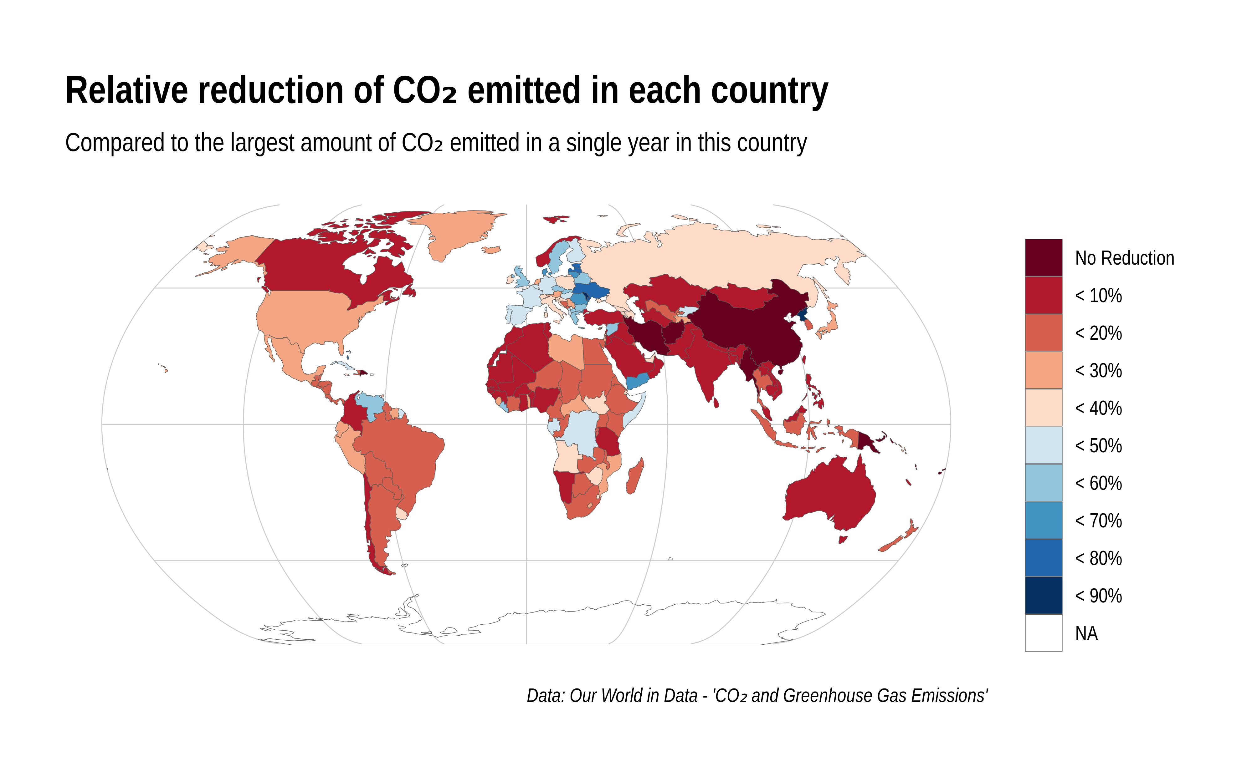
The chart can be a bit missleading if you dont read it cirrectly. Morocco, which is very red, is the only country which is on the 1.5° path but it is not shown in the chart.
YungPlugg t1_it2zsnn wrote
The area of Ontario my family is from just tore down a massive power plant and thousands of windmills have gone up over the past 15 years or so, so they’re on their way I think
El_G0rdo t1_it9y6wx wrote
The US has had a 30% reduction in like 15 years because of the shale natural gas boom in Texas and PA. While it’s still fossil fuel, it’s allowed us to basically completely get rid of coal power generators, which are orders of magnitude dirtier than combusting methane. Also renewables have helped a lot. Meanwhile, Canada’s recent fossil fuel boom has been from far sand bitumen, which is super dirty and heavy oil. So we kind of have been lucky that fracking has reduced overall emissions despite us not actually putting in that much effort (as an entire country) to reduce emissions
eh17368 t1_itaw73q wrote
Also because US had far more polluting industry than Canada thus the shift of polluting industries to developing world had far greater effect on reducing US than Canadian emissions
waitItsQuestionTime t1_it6usjc wrote
This data alone is meaningless. Lets omit 10000% more co2 so we can go back and be the greenest country?
321159 OP t1_it2umjq wrote
Countries with recent conflict and unrest (e.g. Syria, Venezuela, Yemen, Somalia) stand out with involunatrily reduced carbon emissions.
Also note that the most recent data is from 2020. So the great reduction of CO2 emissions in Ukraine can not be attributed to the invasion.
But the data is recent enought that the Covid pandemic has an impact on the visualization, with many countries increasing their emissions again in 2021.
CyHawkNerd t1_it2v61z wrote
Do you know the reasoning behind North Korea? I’m a bit surprised it’s not NA
321159 OP t1_it2wbov wrote
I do not know what is up with North Korea, but apparently their carbon output is reducing. If that is because of a shrinking economy or measures taken especially to reduce their emission I can not tell.
You can dig in to the data sources yourself here: https://github.com/owid/co2-data
stellarinterstitium t1_it2z0xd wrote
The reduction in terms of % is of limited use, because the baseline use for the red countries in absolute terms is far lower than the blue countries. On a per capita basis, the red countries are likely still far below the blue countries which show larger percentage reductions.
float16 t1_it4y91c wrote
Not a fan of your color map. Because you used a diverging color map, the least saturated colors, near 50%, isn't some intuitive reference value such as 0, and look too much like NA. You should have used a sequential color map.
321159 OP t1_it6sajk wrote
I tried that and I would tend to agree with you that in principle a sequential color map would be the preferrable choice. However the big advantage that a diverging scale gives, is that the extremes in either direction are highlighted which I think gives more immediate insight for this kind of data. You can immediately see which countries have not reduced their emission yet, but also which countries have reduced their emission a lot.
With a sequential map only one of the extremes would stand out.
SHDrivesOnTrack t1_it5tgwy wrote
So if I understand the way this chart is presented, the reduction in CO2 is based on the current year vs the peak year for a country, regardless of how long ago the peak occurred.
So based on that, it makes it hard to tell from this chart if the CO2 reduction is recent or a long term trend. Also, the chart doesn't state what year was used for the final point of comparison. If it was 2020, the data may be skewed due to all the work from home.
For example, CO2 in the UK peaked in the 70's based on a chart on this wikipedia page. https://en.wikipedia.org/wiki/Energy_in_the_United_Kingdom
I suspect if you dig into it, you may find that the biggest change in the last 40 years is that electrical generation using coal has been slowly replaced replaced by natural gas. This change was mainly driven by the economics of cheap natural gas due to the advent of fracking. Because coal is almost all carbon, almost all the emissions are CO2. Natural gas is made of both hydrogen and carbon, so about half of the exhaust is water vapor, and the other half is CO2. Combined cycle natural gas power plants are more efficient so you get more electricity as well.
On that wikipedia page I noted above, take a look at the "energy consumption by source" chart and notice how coal used to be 50% of the UKs energy, and now its just a sliver.
In the US, the shift away from coal is also happening, but not to the same extent. Similar charts on this wiki page. https://en.wikipedia.org/wiki/Energy_in_the_United_States
peter303_ t1_it5vzof wrote
The US has the largest absolute drop. That being the #1 or #2 total emitter this century.
[deleted] t1_it2ujsl wrote
[deleted]
TisButA-Zucc t1_it581mf wrote
Well yeah, Europe is pretty much the only ones who cares about doing something about it.
[deleted] t1_it65n22 wrote
[removed]

samx3i t1_it2u09m wrote
Any other Americans surprised to see Canada doing worse than us in this regard?