Comments
dptzippy OP t1_isyykeq wrote
lol did you visit me when I mentioned it in the past?
dptzippy OP t1_isyynjp wrote
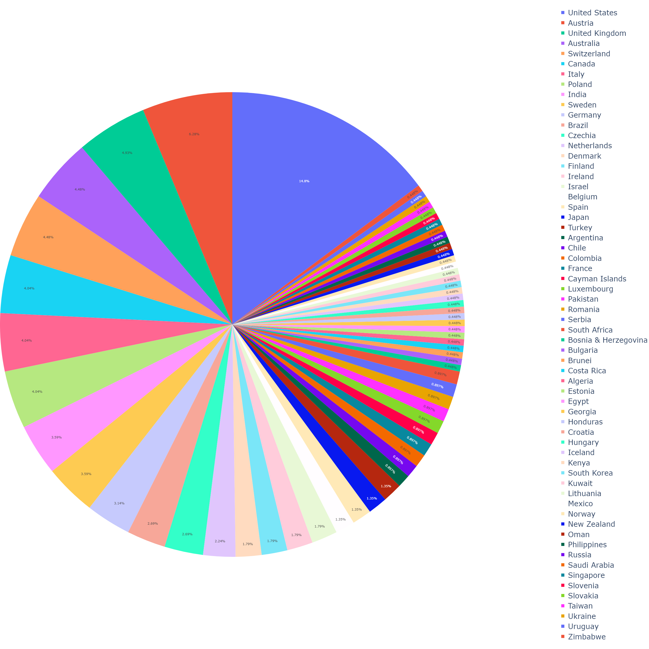
The source of the data is Google Analytics.
The graph was created using the Plotly library for Python3.
​
The data was collected over the span of a week, where all traffic to www.danielteberian.com was tracked and organized by country. I exported the data to a CSV, and used Python 3 to visualize it.
dptzippy OP t1_isyz36d wrote
I didn't even notice that, but now it bothers me. lol I will fix it whenever I decide to make another graph.
​
I agree. I have not worked with data in a while, and I am not well versed in using Plotly (yet). I will definitely read up on how to make the graph have its legend on the actual graph, rather than being off to the side. Thanks!
maugust09 t1_isyzo8g wrote
Happy to help!
[deleted] t1_isyzpyw wrote
[removed]
tilcica t1_isz18ws wrote
yup. im the one from slovenia
dptzippy OP t1_isz1ak9 wrote
My man!
CryptographerMain698 t1_isz1jnd wrote
It's nice to practice your skills but pie charts are in most cases a terrible choice for displaying data. Unless you have just a couple of groups.
I would rather look at a nicely formatted table than this chart.
Also if you are working with GA data, take a look at R, this package: https://code.markedmondson.me/googleAnalyticsR/index.html It's really powerful and simple to use. Also ggplot2 beats python libraries for data viz (just my opinion).
dptzippy OP t1_isz1o8p wrote
Thank you for your help. I really appreciate your advice. I will do some research into that R package. :)
jackdbd t1_isz1t5y wrote
Pie charts (and donut charts) are not ideal when you want to show more than 3-4 slices. A humble bar chart would be easier to read.
https://academy.datawrapper.de/article/127-what-to-consider-when-creating-a-pie-chart
CryptographerMain698 t1_isz2gwj wrote
No problem, the only tricky part is setting up your own GCP project (only necessary if you are pulling lots of data). Feel free to pm me if you decide to give it a try and I can help you set it up.
Birdy_Cephon_Altera t1_isz5h0q wrote
Pie charts and area charts can work well when there are two, three, four different data choices. Once you start to get above that, you can end up with tons of teeny slices like this, where it isn't possible to make a reasonable comparison between any two slices without having to look at the numbers.
One thing you could do is group them together into larger slices, so that all of the North America slices are the same general color and grouped together (maybe US a slight different shade of the same color from Canada), and group all of Europe together, etc. That way it doesn't end up looking like someone spilled a big box of crayons on the floor, and the colors have meaning.
frankjohnsen t1_isz6vnk wrote
can't tell absolutely anything from this chart

tilcica t1_isyyhln wrote
look mom, i'm a statistic :D