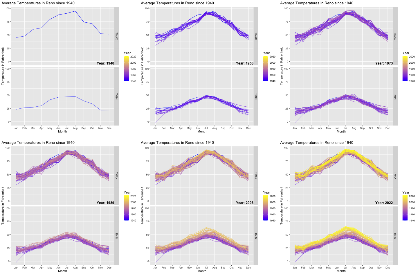
Submitted by EmotionalBaby9423 t3_y45lqv in dataisbeautiful
Comments
BotScutters t1_iscuixg wrote
It's pretty hard to actually detect the change over time because of the way new lines obscure the old. Does it come across more clearly if you make the lines somewhat transparent?
EmotionalBaby9423 OP t1_iscvu87 wrote
I unsuccessfully attempted to find a good formula to keep things transparent enough. Especially for TMAX the difference at this scale is fairly low outside of summer months.
The changes become a little more evident when grouping by decades and binning by seasons, but those make no sense to animate. Feel free to check out https://www.reddit.com/r/Reno/comments/y3obr5/a_little_more_reno_weather_data/?utm_source=share&utm_medium=ios_app&utm_name=iossmf for some other visualizations around this.
ChaosBoi1341 t1_isd0sts wrote
Do they have the ability to queue?
[deleted] t1_isd17t9 wrote
Good point. I was predicting far worse from Reddit, but so far it seems we might have squeaked out clean. I guess nutjobs (on both sides) don't follow data science, lol.
yeah-yeah_irl t1_isdoa2w wrote
Honest question, does anyone really deny climate change? Isn’t the big debate about the causes of climate change?
RSpringbok t1_isds9ix wrote
Yes. They queue anon.
ctl-alt-replete t1_isduoe0 wrote
The highs didn’t get higher, but the lows got higher. Why is that?
EmotionalBaby9423 OP t1_isduzof wrote
Great question!
I assume a good chunk of that is about urban heat island effects. Reno has experienced quite a bit of growth during this period, and I believe the climate station is at the airport, which is right where a lot of the city expanded towards and beyond.
Wouldn’t know what else it could be though let me know if you find other good explanations (:
Exam-Artistic t1_isdyg3y wrote
I mean this plot doesn’t do much justice showing there is a significant rise in temp
IndependentStudio332 t1_ise1otk wrote
T max started noticeably rising mid-2000s while T min rise was mid-80s.
peppi0304 t1_iserzqc wrote
UHI ia strongest in summer nights.
KevinDean4599 t1_ises92m wrote
seems like fewer people do not than they did 5 years ago.
[deleted] t1_isf27xu wrote
[removed]
[deleted] t1_islq5ls wrote
[removed]

EmotionalBaby9423 OP t1_isc9jog wrote
R3: Plot is build entirely in RStudio. I pulled the data from the Global Historical Climate Network Daily (ghcn-d) dataset using the rnoaa package. Then just playing around with ggplot and gganimate packages and voila :)