Submitted by meller12_3 t3_y14hwm in dataisbeautiful
Comments
meller12_3 OP t1_irvcll1 wrote
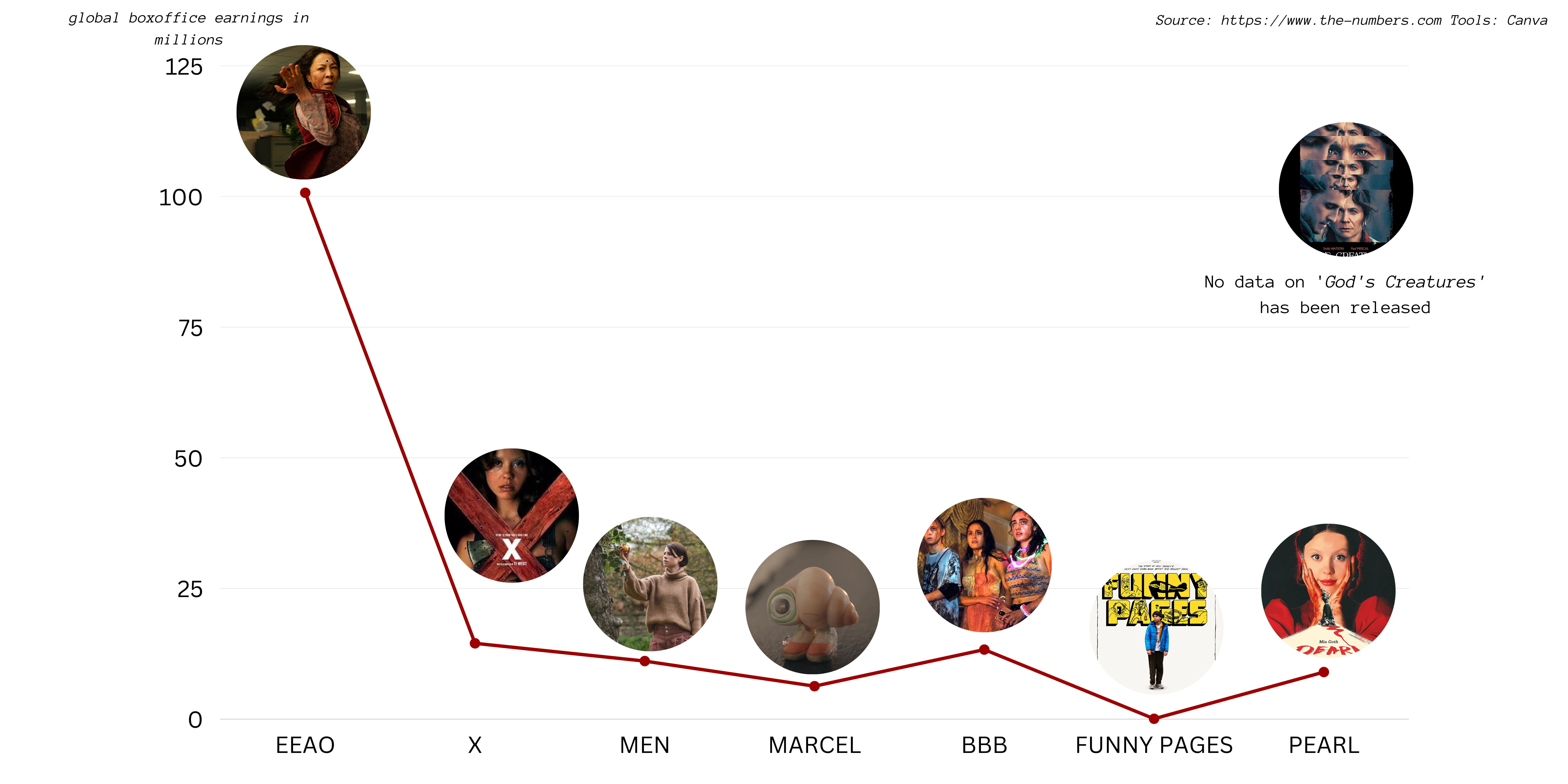
I used a line graph since I ordered the movies in chronological order, so over time it shows that A24 movies were bringing in less and less box office success
Tordoix t1_irvtwk3 wrote
Still interpolation between two points in your graph makes no sense since they are discrete (i.e. there is no 'in between' two movies). A line graph always interpolates between the datapoints suggesting there are continuous values in between the datapoints, so the usage here does not make much sense. You can still see the decrease in box office success in a bar chart.
If you wanted to show the decrease in box office earnings over time then you could just plot the box office earnings of A24 over time and maybe colorize the contributions of each movie or something like that, if that data is available of course.
[deleted] t1_irvnyuw wrote
It's not apparent that the entries are ordered chronologically. Also, why not include other A24 films?
Sarnadas t1_irvurfg wrote
This is a terrible chart, eek. Data is not beautiful.
Mason11987 t1_irwixzm wrote
Line chart makes no sense here as there is no "in between" EEAO and X.
Should have used a bar chart.
[deleted] t1_irzn3kc wrote
[removed]
[deleted] t1_irzxvxu wrote
[removed]
Retnuh3k t1_is0yax6 wrote
“How to not make a graph: 101”
meller12_3 OP t1_irvbvob wrote
Source: https://www.the-numbers.com
Tools: Canva

EspritFort t1_irvchei wrote
Best not connect datapoints into a continuous graph if the connection doesn't mean anything. These things are not on a cardinal scale.
In that case columns are usually more appropriate than a graph.