Submitted by [deleted] t3_y064pq in dataisbeautiful
Comments
[deleted] OP t1_irqbh3a wrote
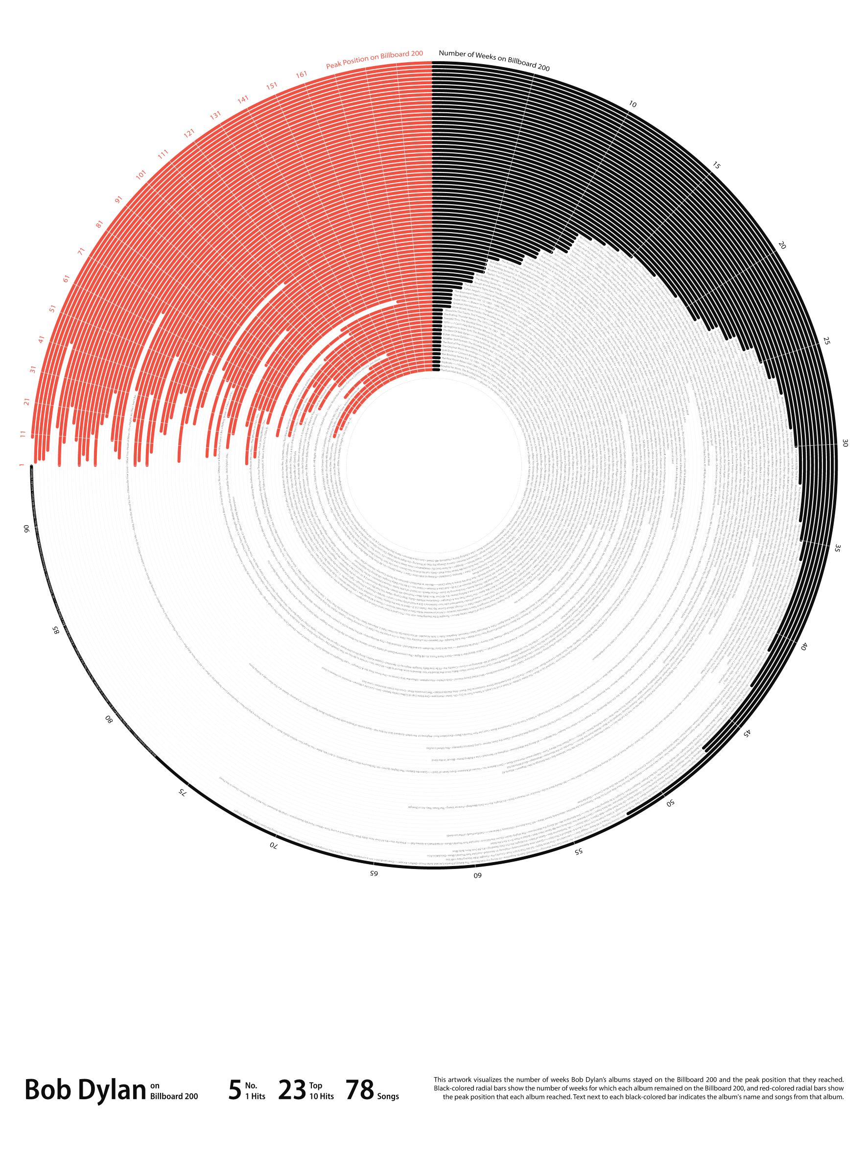
Thanks for the feedback! I will give mirror bars a try soon. For this chart, I wanted to imitate a vinyl record, sort of 😃
korakagazz t1_irqktwj wrote
This looks really beautiful, yes. But I barely understand any of it
karmacarmelon t1_irql0du wrote
It looks interesting, but the resolution is way too low
Wlng-Man t1_irqphvd wrote
It makes more sense when you realize that red occupies 1/4 and black 3/4. ...for some reason.
sanctuaryofdesign t1_irr045n wrote
Neat and novel way to visualize artist performance! I am curious to see other artists in comparison to see the kind of different stories it can tell.
[deleted] OP t1_irs297v wrote
That's on my mind, to do something similar with other artists. I will have to find time though, this one was very time-consuming.
[deleted] OP t1_irs2q9d wrote
Unfortunately, I have never attended Bob Dylan's concert.
[deleted] OP t1_irs2thm wrote
Thanks for the feedback. I will figure out a way to create and upload high-resolution files in future.
[deleted] OP t1_irs37yg wrote
I have attempted to explain the visualization at the bottom right section of the graphic. The goal was to experiment with non-traditional designs, with some sort of poster as the end result, by making some trade-offs on the functionality side.
[deleted] OP t1_irs3ae1 wrote
That was purely for aesthetics, to break the symmetry.
[deleted] OP t1_irs3ef4 wrote
>I have attempted to explain the visualization at the bottom right section of the graphic. You will have to look at the zoomed image on your browser though.
korakagazz t1_irs5lwz wrote
Yup. It definitely looks really cool, like a vinyl. I am guessing you were aiming for that
xqqq_me t1_irsaen1 wrote
IMO you should have a 'click to transition' into a bar chart. So the spinning record moves into a more classically read format. Sell them the sizzle to feed them the steak.
40for60 t1_irsmrjj wrote
needs another layer that shows years, Bob has 60 years on the charts.
[deleted] OP t1_irsx3qx wrote
That's correct, I was aiming for it to look like vinyl.
[deleted] OP t1_irsxap6 wrote
Thanks for the feedback! I have another chart in progress, which focuses on years.
[deleted] OP t1_irsxld1 wrote
Thanks for the feedback! I used Illustrator for this one, which only produces static images. It will be worth exploring other tools or libraries to achieve such an interaction.
ColinTheMonster t1_irtklgd wrote
It's obviously not perfect, but it's a really neat idea and it looks polished. Just some growing pains with the format. +1
[deleted] OP t1_irtl0rc wrote
Agreed! Learning every day 🙂
[deleted] OP t1_irupz01 wrote
I thought polar bars are those which extend inside out. It's hard these days, with so many chart types names are getting confusing.
the_druon t1_irwiba3 wrote
I don’t really know. It just feels like the data is “pointing” in the polar direction. Cool plot!

[deleted] OP t1_irq7vib wrote
Goal: Create a data visualization showing Bob Dylan's most popular albums in a poster format. In this context, popularity refers to appearing on Billboard 200.
Tool(s) used for data visualization: Adobe Illustrator
Tool(s) used for data prep: Excel and PowerQuery
Data gathered from the following sources: https://www.kaggle.com/datasets/snapcrack/the-billboard-200-acoustic-data; https://www.kaggle.com/datasets/snapcrack/the-billboard-200-acoustic-data; https://www.billboard.com/artist/bob-dylan/chart-history/tlp/; https://en.wikipedia.org/wiki/Bob_Dylan_discography