Submitted by [deleted] t3_y064pq in dataisbeautiful
Comments
[deleted] OP t1_irs37yg wrote
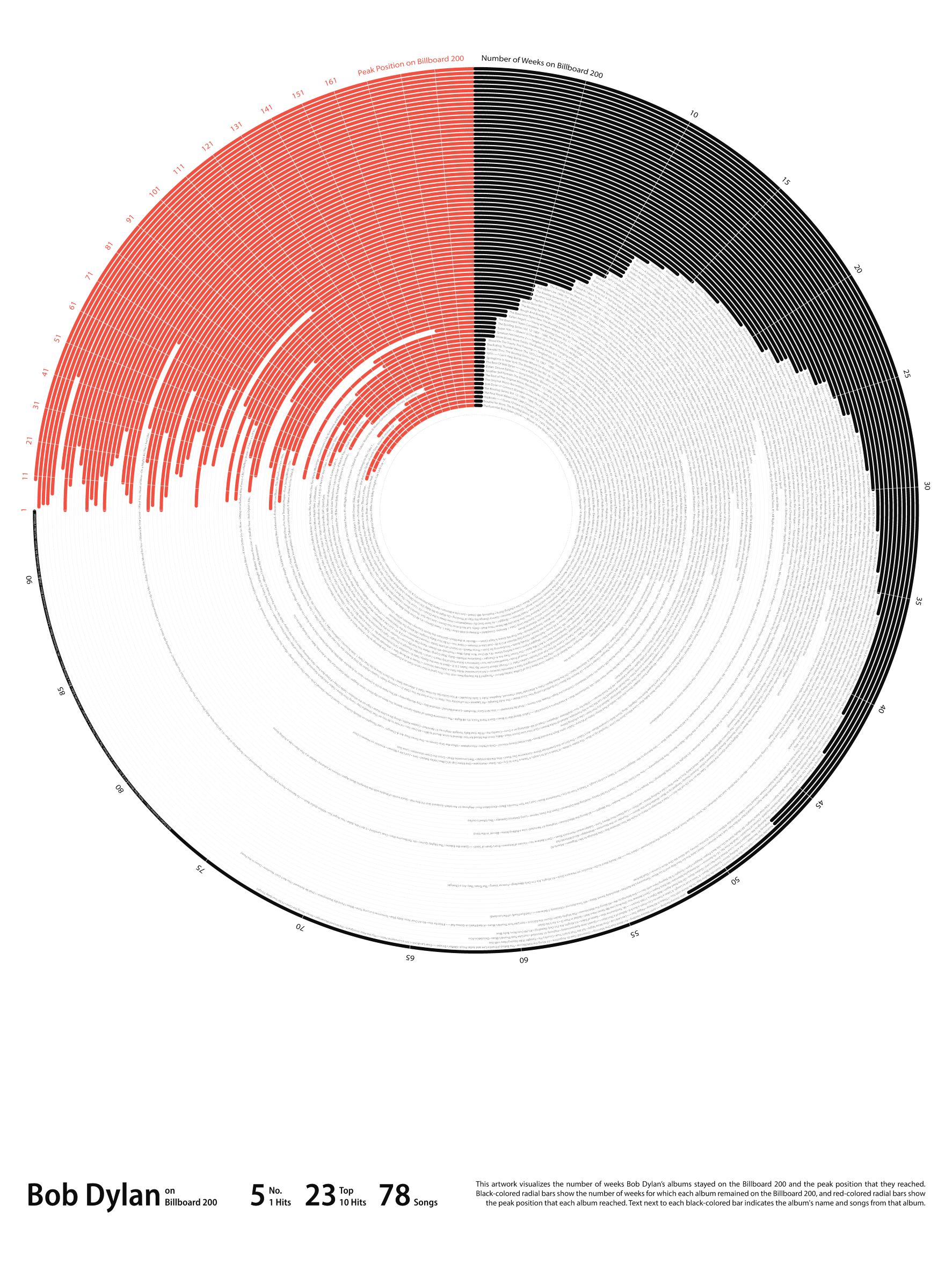
I have attempted to explain the visualization at the bottom right section of the graphic. The goal was to experiment with non-traditional designs, with some sort of poster as the end result, by making some trade-offs on the functionality side.
korakagazz t1_irs5lwz wrote
Yup. It definitely looks really cool, like a vinyl. I am guessing you were aiming for that
[deleted] OP t1_irsx3qx wrote
That's correct, I was aiming for it to look like vinyl.
xqqq_me t1_irsaen1 wrote
IMO you should have a 'click to transition' into a bar chart. So the spinning record moves into a more classically read format. Sell them the sizzle to feed them the steak.
[deleted] OP t1_irsxld1 wrote
Thanks for the feedback! I used Illustrator for this one, which only produces static images. It will be worth exploring other tools or libraries to achieve such an interaction.
Wlng-Man t1_irqphvd wrote
It makes more sense when you realize that red occupies 1/4 and black 3/4. ...for some reason.
[deleted] OP t1_irs3ef4 wrote
>I have attempted to explain the visualization at the bottom right section of the graphic. You will have to look at the zoomed image on your browser though.
TimmyH1 t1_irqafyl wrote
Too many lines for the data to be readable in this format. A mirror bar might be better for readability. Would also help make the trends more visible.
Also it looks like these are ranked by weeks on chart. It would be better to order by release date.
[deleted] OP t1_irqbh3a wrote
Thanks for the feedback! I will give mirror bars a try soon. For this chart, I wanted to imitate a vinyl record, sort of 😃
groovy604 t1_irqe968 wrote
I dont have microscopes for eyes (yet) so whats going on inside the circle
[deleted] OP t1_irq7vib wrote
Goal: Create a data visualization showing Bob Dylan's most popular albums in a poster format. In this context, popularity refers to appearing on Billboard 200.
Tool(s) used for data visualization: Adobe Illustrator
Tool(s) used for data prep: Excel and PowerQuery
Data gathered from the following sources: https://www.kaggle.com/datasets/snapcrack/the-billboard-200-acoustic-data; https://www.kaggle.com/datasets/snapcrack/the-billboard-200-acoustic-data; https://www.billboard.com/artist/bob-dylan/chart-history/tlp/; https://en.wikipedia.org/wiki/Bob_Dylan_discography
[deleted] OP t1_irqw0lk wrote
[deleted]
[deleted] OP t1_irs2q9d wrote
Unfortunately, I have never attended Bob Dylan's concert.
karmacarmelon t1_irql0du wrote
It looks interesting, but the resolution is way too low
[deleted] OP t1_irs2thm wrote
Thanks for the feedback. I will figure out a way to create and upload high-resolution files in future.
sanctuaryofdesign t1_irr045n wrote
Neat and novel way to visualize artist performance! I am curious to see other artists in comparison to see the kind of different stories it can tell.
[deleted] OP t1_irs297v wrote
That's on my mind, to do something similar with other artists. I will have to find time though, this one was very time-consuming.
xqqq_me t1_irsaopd wrote
Bit off topic and I'm not sure if it's (still) true, but a long time ago I heard a rumor that KISS sold more records than Dylan
(shiver)
ColinTheMonster t1_irtklgd wrote
It's obviously not perfect, but it's a really neat idea and it looks polished. Just some growing pains with the format. +1
[deleted] OP t1_irtl0rc wrote
Agreed! Learning every day 🙂
the_druon t1_irtyug8 wrote
I dig the vinyl-shaped plot— creative way to show multiple data types in a coherent way. But wouldn’t these bars be better described as “polar”, rather than “radial”?

korakagazz t1_irqktwj wrote
This looks really beautiful, yes. But I barely understand any of it