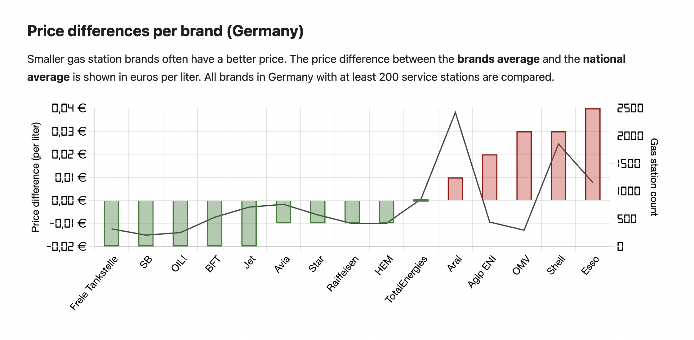
Submitted by wann-tanken t3_xzhicq in dataisbeautiful
Comments
wann-tanken OP t1_irmagdz wrote
Thanks for your feedback. Will try to make the different axises more clear next time.
Bars = Price difference (left axis)
Line = Station count (right axis)
FailedTuring t1_irmg0pi wrote
Just some constructive criticism:
Line charts are generally used when there is some kind of progression or internal order between the values on the x-axis. Like when plotting time series for instance.
Here the choice of lines causes the viewer to look for an order or grouping that doesn't exist because the brands are nominal data.
wann-tanken OP t1_irmgu6b wrote
Thank you, will look into it
chris-tier t1_irmjh14 wrote
That is not a beautiful display at all. So I guess it fits this sub perfectly!
Mando_Brando t1_irmk608 wrote
Was pretty clear imo.
buttaviaconto t1_irn17cv wrote
Confusing, it would me more intuitive putting the station count on the x axis, and the brand names on the bars
Kukuth t1_irn1ppu wrote
While I agree with your first part, the price difference is not subjective since every single gas station has to report their prices every time they change it and that information is publicly available. So the difference between average price at any given time and the individual prices is relevant information.
HiFiGuy197 t1_irneb5c wrote
I think this could be plotted better on an X and Y chart with x being the number of stations and Y being the gas price differential (with 0 being in the middle) and then you label the data points with company names.
Is there any difference with regionals, is this before taxes (regional taxes differ?) etc. Would a brand operating in more urban areas have higher rents, etc.?
imaginary_num6er t1_irnthks wrote
It is not even alphabetical either. At least that way the line graph can correlate the prices increasing in alphabetical order
DigitalTomcat t1_irszrwt wrote
I would use something different from a line to indicate number of stores. A darker color or a fatter bar. Or a second bar below the first (growing in the opposite way). Your conclusion seems OK, but why are there a couple of small companies in the expensive range? What other variable drives that? Are these only in big cities? Do they advertise more than others? Does being foreign owned make a difference? This is where data science can go thru a huge number of variables and find the most influential ones. And the for the rest of your research paper (haha) does the pattern hold true in other countries? What about time—does the relation change when costs are high/low, stable/changing? You could write a master’s degree dissertation on this. Also would look good in an interview.

[deleted] t1_irm7gbc wrote
[removed]