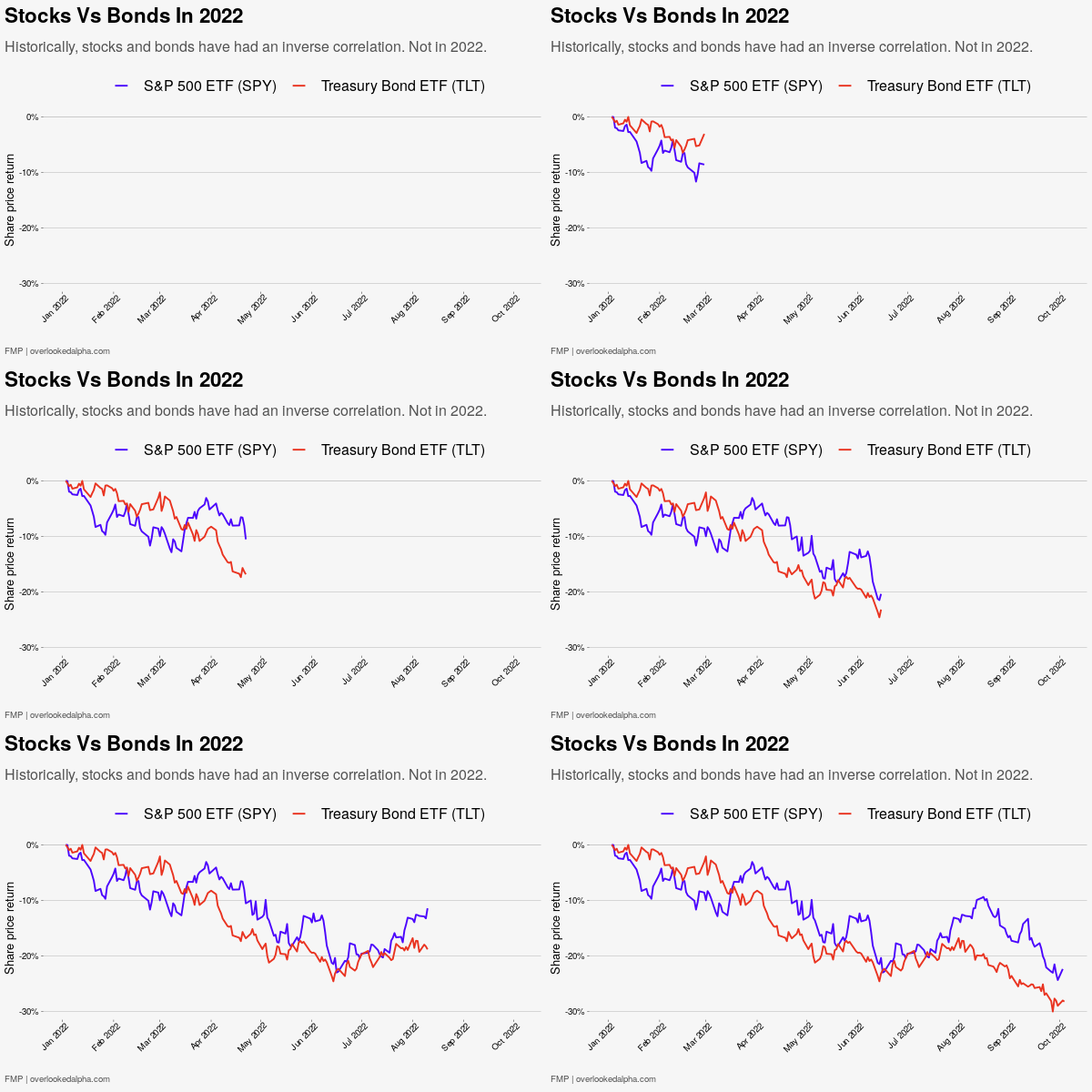
Submitted by OverlookedAlpha t3_xvsuvg in dataisbeautiful
Comments
OverlookedAlpha OP t1_ir31aa9 wrote
Thanks for the feedback.
[deleted] t1_ir375tl wrote
[deleted]
soldiernerd t1_ir3e55m wrote
Looping just as it gets to the end (idk if the OP did that or reddit does that) makes it impossible to actually analyze
OverlookedAlpha OP t1_ir3kst6 wrote
The looping is really annoying. I turned loop off so I think it's Reddit doing it.
soldiernerd t1_ir3n7sy wrote
probably because all of them loop here it seems
OverlookedAlpha OP t1_ir41gpl wrote
I just found you can stop the loop by right clicking on the chart then untick 'loop'!
Bulky_Researcher226 t1_ir45gm0 wrote
Cool to see that you’re open to feedback. I’d also have more years to add data to your juxtaposition
[deleted] t1_ir4u3yy wrote
[removed]
Stepawayfrmthkyboard t1_ir6o8mt wrote
Everything floats loops down here
F8Tempter t1_irbgzfn wrote
autoloop is OK for other meme subs, but not so much for DIB
lucky_ducker t1_ir3aawp wrote
I would like to see this with a more intermediate bond index fund like AGG or BND. Very few investors would consider TLT - which is US Treasuries with maturities of 20+ years - to be a suitable proxy for "bond funds."
OverlookedAlpha OP t1_ir3co7g wrote
Fair enough, here's the chart with AGG and BND https://imgur.com/3nuf9P9
JupiterWalk t1_ir3ok32 wrote
I read a lot of unappreciative comments around here. I just wanted to let you know this is great and thank you for sharing. Continue to improve upon constructive feedback :)
OverlookedAlpha OP t1_ir3tfmd wrote
That's very nice, thankyou!
Bulky_Researcher226 t1_ir459sa wrote
Why animate it…
knowitstime t1_ir3xgnx wrote
damn you people are critical
Deto t1_ir43m23 wrote
Very rare to see posts here that aren't mostly greeted by critical comments. The sub should be called "RoastMyPlot", IMO!
ScaleLongjumping3606 t1_ir3zdjx wrote
My theory: People who look at data graphs on Reddit are often on the spectrum for OCD / autism and nuanced diplomacy is not our strong suit. Some people’s brains are just trained to find the flaws in everything.
BobMcFail t1_ir49wt7 wrote
Nice amateur psychology you got going on there or hear me out.
People who subscribe to a subreddit that is about displaying data in a beautiful are passionate about it because it is part of their job/hobby and are critical because this isn’t just r/data
857477458 t1_ir5oav5 wrote
Regardless of whether or not that's true having a mental illness isn't an excuse to be a jerk.
OverlookedAlpha OP t1_ir2uc2w wrote
Data source: Financial Modelling Prep.
Visualisation: Overlookedalpha.com with R
[deleted] t1_ir2zfhi wrote
[removed]
RotisserieChicken007 t1_ir3e736 wrote
Not very interesting or convincing without showing some of the previous years with inverse correlation.
That's like saying "Most Mongolian pears (imaginary fruit) are red but this one is yellow, and then only showing a yellow one."
Apprehensive-Ad-5009 t1_ir3nc1k wrote
I think it's showing that your bonds aren't safer.
F8Tempter t1_irbgps0 wrote
typically fed is lowering rates to offset a recession.
This year we get recession with rising rates.
Trixxr t1_ir4j7j2 wrote
So if stocks are falling, so are bonds, despite the inverse correlation? Hmmmmmm
857477458 t1_ir5et5w wrote
There's nothing very confusing happening here. The Fed wants to destroy wealth to reduce inflation via the wealth effect. To that end they are raising rates and selling bonds. The graph you see is exactly as planned.
maplebacon8792 t1_ir3iut3 wrote
The title couldn’t be more boring but the data actually represents something really interesting

salaciousoly t1_ir2zslp wrote
Two things:
Why is this animated? I don’t see that adding any value.
Why does every x-axis label call the data out as 2022? You already did that in the title.