Submitted by CharcoalCharts t3_xtz5ac in dataisbeautiful
Comments
Senepicmar t1_iqsw6bk wrote
is this broken? Neat visual, but can't see anything of value here, or any actual data
talkhead420 t1_iqsy50s wrote
Looks cool but not helping me understand much
european_hodler t1_iqtcm1k wrote
Can you do something useful with it? This looks like an example dataset with no purpose other than showing what the package can do.
Arganthonios_Silver t1_iqv3i7p wrote
nevilleaga t1_iqvfu3t wrote
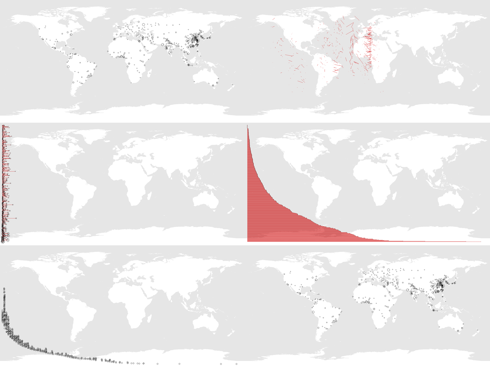
give me a scale on the x axis, please. of the 4000 cities, what is the furthest distance to an ocean? 1,500 miles?
CharcoalCharts OP t1_iqw3pkw wrote
You are correct. https://imgur.com/a/xFLGHqp
The longest distances are roughly 5-6% of the way around the earth. As seen in the animation.

CharcoalCharts OP t1_iqsrkn4 wrote
Tools: R. Data: R package datasets (World Bank, Coastline)
It is interesting that the distribution is multimodal. Obviously, the most common position is close to the coast, but there are a few other humps. This animation shows 500 cities, but it holds similar for a larger set: https://imgur.com/a/8APH6Zd