Submitted by tomaskutac t3_126v9pi in dataisbeautiful
Comments
ChiefDisbelief t1_jeb2pcb wrote
Of course not! Socialism for the rich, feudalism for the poor! Bootstraps!
fertilecatfis t1_jeb3puh wrote
I feel like I've seen the size of different bank failures represented in this sub 15 times in the last month and its different everytime.
tilapios t1_jeb4jw8 wrote
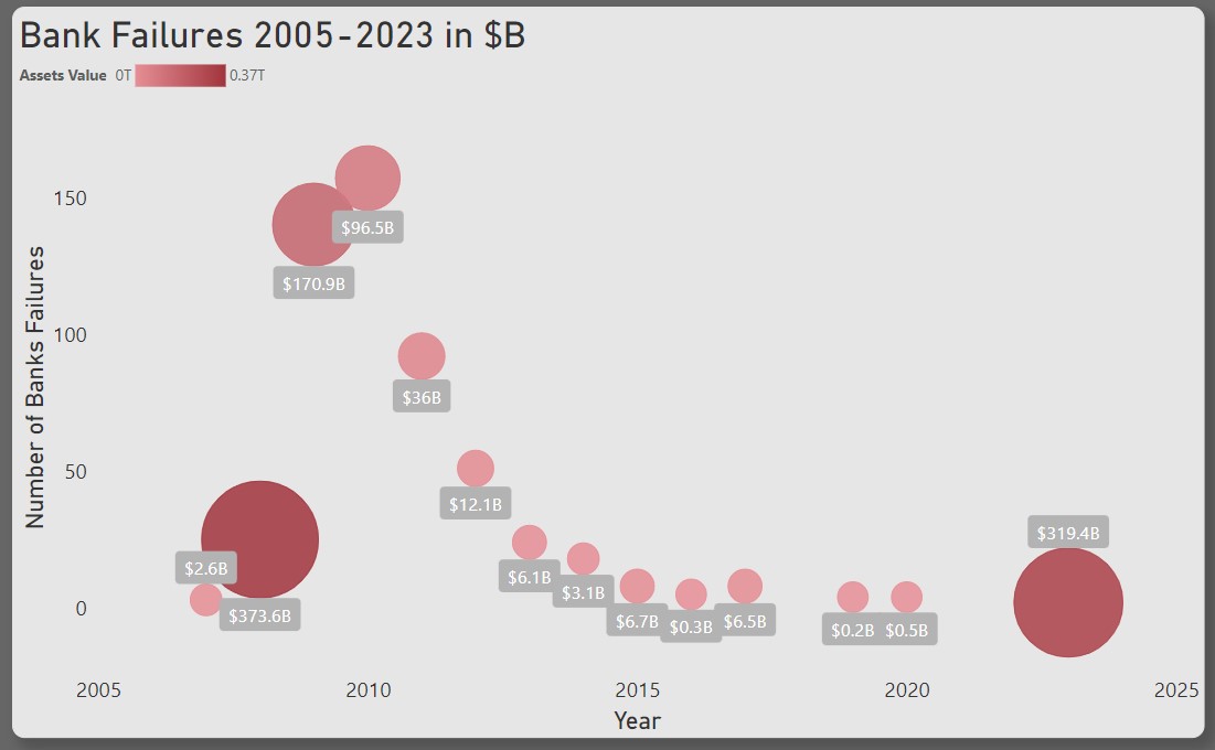
The marker size and marker color are duplicating the same information. I would get rid of the color scale since it's harder to read than the size.
tomaskutac OP t1_jeb5vbt wrote
This is a beauty of data visualization, you can tell the same story many different ways.🙂
ntfh_uk t1_jeb66pq wrote
The banking system is essentially fine as long as you trust it and are happy to leave most of your money in it. As soon as you don't you discover that they are all over leveraged and you can't all get all of your money out. It is a system that gave up the gold standard back in 1970 (or 71) where money was backed by gold and now relies on a system of faith to ensure it works. So for the love of mankind, please don't be worried!
[deleted] t1_jeb69gl wrote
[removed]
fertilecatfis t1_jeb6lb8 wrote
From what I've seen theyre just telling different stories, but im not informed enough to know which ones to believe.
_Ali_b t1_jeb9nsu wrote
What does radius represents of?
tomaskutac OP t1_jeb9r6p wrote
For me the story is quite simple, there were failure of few big banks with big value of assets and then in next years followed with failures of many smaller banks. I am not expert for this area, it could be that banks are closely connected or failure of big banks led to lower trust in banks generally and this led to money outflow which finally caused banks failures. No we see similar failure of big banks and my question is if it is probable that similar pattern will follow...
tomaskutac OP t1_jeba4iv wrote
Thank you for your comment. I was thinking that color changing with the size will underline logic of visualization. But I understand it can bring also confusion...
tomaskutac OP t1_jebaj66 wrote
Size of assets of banks that failure it specific year. After failure of few big banks, failure of many small banks followed.
_Ali_b t1_jebaufg wrote
Interesting chart, I kinda programmed a chart like this but it represents significant earthquakes.
tomaskutac OP t1_jebb3bq wrote
Is it available online?
_Ali_b t1_jebb9rk wrote
No it's on my github, I can send it to you in private if you're interested.
tomaskutac OP t1_jebds70 wrote
Yes, please.
boomchakaboom t1_jebjr80 wrote
Yup. This is a reckoning fifty years in the making. Every policymaker, with the exception of Volcker in raising rates in '82 and Clinton and Gingrich managing budget surpluses , has pursued policies that just kick the can down the road.
Kesshh t1_jebn9br wrote
Worry? No. Stupid institutions that do stupid things should fail.
anoziraguy9687 t1_jebqrmm wrote
Fucking hell that is so true. Millionaires and billionaires get to gamble with the economy constantly and every 10 to 20 years we’ve been the ones to pay the price when the gamble fails to pay off.
kmbxyz t1_jebv6ap wrote
They should. But when they do, the people who made the decisions often come out unscathed, and the problems transfer to other people.
For example, when SVB was failing. Top executives sold their shares and paid out large bonuses to staff during the months before the collapse. Then when the collapse happened, the bank simply dissolved and the FDIC picked up the bill. The institution failed, but the people who ran it into the ground didn't.
kmbxyz t1_jebvvfy wrote
I think we should be worried about bank failures because the impact can cost the government greatly and can ultimately make life a lot more difficult for the little people.
I pulled the majority of my money of my bank when SVB crashed. I might not have needed to, but it feels better to be prepared.
[deleted] t1_jec2oqj wrote
If we are the banks, no. The government will bail us out every single time no questions asked. If we are human people, yes. Because fuck us.
thehourglasses t1_jedgi93 wrote
Honestly, this would look way better plotted as assets value vs. time. No one cares how many banks fail, just how much damage was done in real terms. The number of failures is extraneous and makes the chart look unnecessarily complicated. Simple is (almost) always better.
thehourglasses t1_jedgmy6 wrote
tink tink BOOM
thehourglasses t1_jedgvqb wrote
Odd. You mention how a bank failure hurts everyone yet admit to actively contributing to the problem.
tomaskutac OP t1_jedhiys wrote
Message of this visualization is that failure of few big banks was followed by failures of many banks. Without number of banks message will be incomplete. Any suggestions how to cover these three dimensions in one visualization? Time, Value and number of banks.
thehourglasses t1_jedjky8 wrote
Fair enough.
Dual axis line graph with total assets on x1 and # of failures on x2, either 2 different colors for the lines or solid and dashed. Y remains as time.
Busy-Mode-8336 t1_jedjrbq wrote
Well, we pretty much let the few remaining banks turn into a cartel, so yeah.
That much power in a few hands never tends to end well.

tomaskutac OP t1_jeb0f6h wrote
Source: https://banks.data.fdic.gov/explore/failures
Tool: Microsoft Power BI