Submitted by Premise_Data t3_11zybdn in dataisbeautiful
Comments
[deleted] t1_jdetc5l wrote
[deleted]
Waltzing_Mniotilta t1_jdetic8 wrote
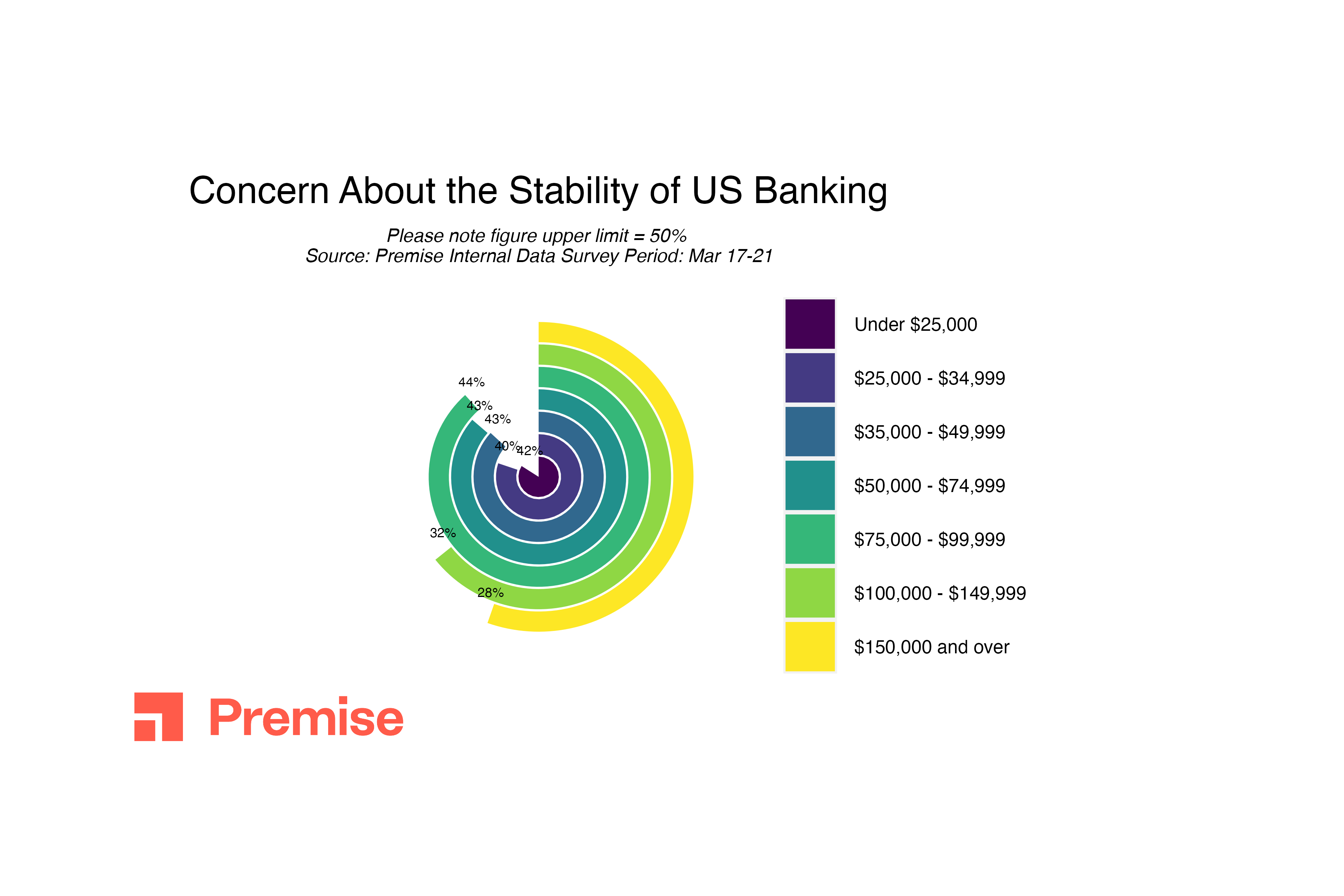
I know it wouldn't be as pretty a diagram, but I would be so much happier of the 28% yellow curve was closer to 1/4 of a circle, and the 44% green arc was closer to 1/2.
[deleted] t1_jdetjd2 wrote
[removed]
JPAnalyst t1_jdeto8j wrote
What am I looking at?
A full circle is 50%? Why? What are the dollar values? Their account balance? Their HH income?
The reader needs to work way to hard to interpret this.
pugwalker t1_jdeuq5x wrote
This feels like data viz rage bait. A simple table or bar would be so much easier to understand.
SpaceZombied t1_jdewtb2 wrote
Data is beautiful, but not when it is presented this way. A full circle is 100% not 50%.
JPAnalyst t1_jdexa7h wrote
The 42% feels like a lot less than the 32% visually. This is the worst visualization I’ve seen all week. I’m normally not critical when it’s a person, but this appears to be some organization/company. This is a lesson...many lessons on what not to do.
GRANDxADMIRALxTHRAWN t1_jdey19q wrote
So the wealthiest people are least concerned? Figures.
[deleted] t1_jdez0q4 wrote
[removed]
Key_Strategy_8526 t1_jdeztqs wrote
You went through that much trouble to present the information in an entirely incoherent manner and you were proud enough to stick your company logo on it.
​
Is the information your presenting suggesting that 42% of people with less than 15K are "very concerned" about bank stability and as the wealth level increase people become less concerned?
What's this shit about a 50% upper limit? That's not how pie charts or circles in general work. IDK, y'all really shit the bed on this graph.
CeruleanDragon1 t1_jdh8vq7 wrote
Cool visualization. Awful execution. I think it’s be more useful if a full circle was 100% and if the percentages were in a table in the corner of the image. Also some lines that mark roughly every 10% would be nice.

Premise_Data OP t1_jderurw wrote
Contributors in 135 countries around the world work with Premise to share their opinion and collect field data on a variety of topics using its smart-phone app.
These data were collected between March 17-21 from 1,978 respondents in the US. Premise used stratified sampling of its opt-in panel members, along with post stratification weighting on age, gender, region, and education to construct a representative sample.
Tool: R (ggplot2 & gganimate)
Source: Premise internal survey data