Comments
[deleted] t1_jbi9u9p wrote
[removed]
mnbull4you t1_jbi7852 wrote
Could you make the font smaller?
MrBookman_LibraryCop OP t1_jbi7vkm wrote
Hmmm I don't think I can go into the negatives so sorry but no
bellingman t1_jbi8mwp wrote
Saying "there is a difference" without giving the amount is maddeningly incomplete.
You should also include possible confounding variables that were not controlled for.
MrBookman_LibraryCop OP t1_jbibu72 wrote
I don't know what those variables would be so it's difficult to include them
bellingman t1_jbidmh7 wrote
What about the first part of the question--what IS the difference?
MrBookman_LibraryCop OP t1_jbie3er wrote
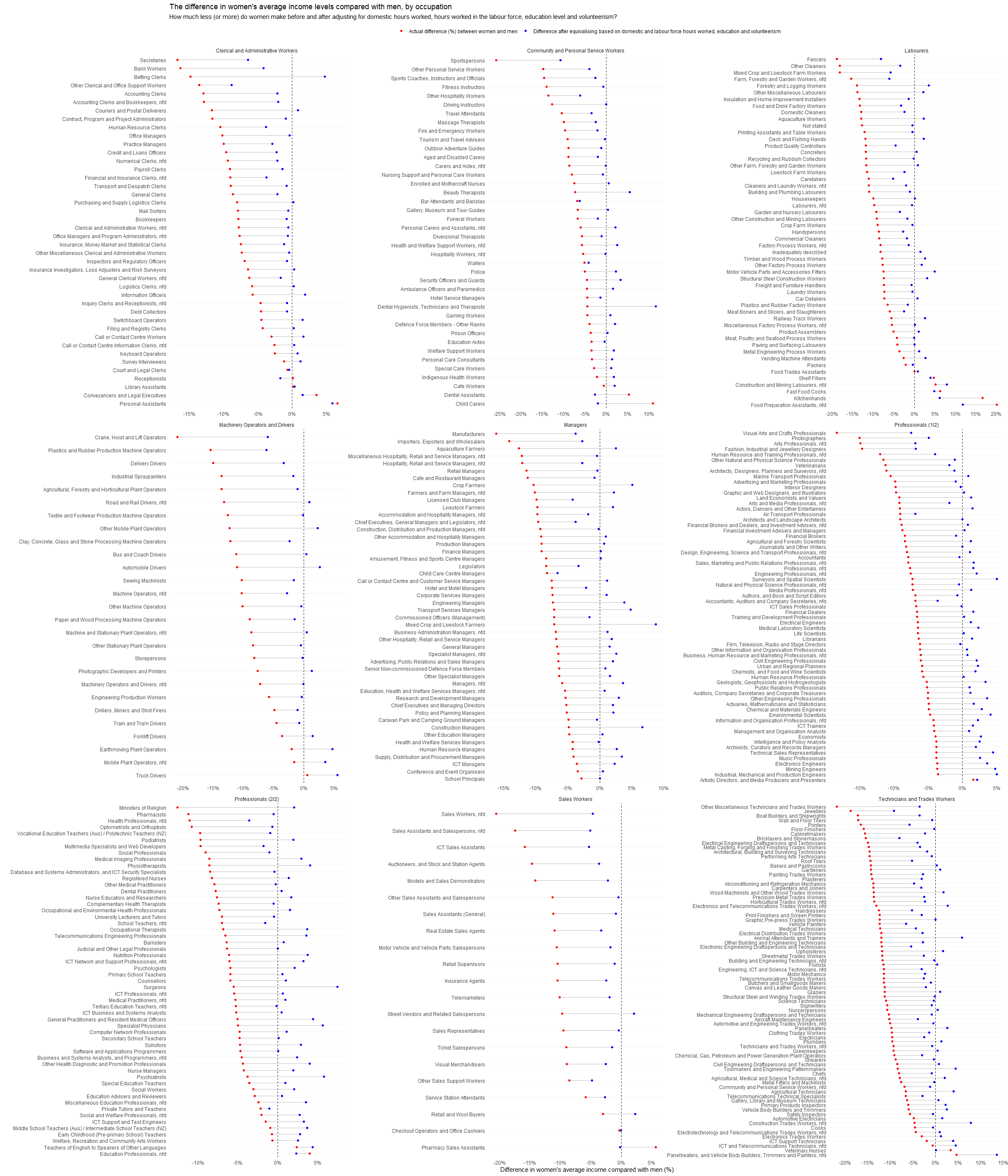
I thought the x axis would help with that. On average, it's about 2% after equivalising
bellingman t1_jbige1d wrote
A possible graph title:
Actual Gender Wage Gap is Only 2% (Or possibly zero, being within the margin of error)
That 2% number is the end result of the entire exercise, and should have been front and center.
MrBookman_LibraryCop OP t1_jbi6ajh wrote
I ran a linear regression model to estimate the % difference in income levels between men and women by occupation based on the variables listed in the next paragraph. The model also includes Unpaid domestic work, but it was insignificant. I then used the model to predict the difference in income levels if all independent variables were equal - this is the equivalised difference in the chart (in blue).
Data used for the graph and linear model are from the Australian 2021 Census of Population and Housing. They are Total personal income (weekly), Occupation at the 4-digit ANZSCO level, Unpaid child care, Level of highest educational attainment, Hours worked and Volunteer Status.
Note that the model has an intercept of -0.018 which is highly significant (p < 6.08e-07), suggesting that there remains a structural difference in mean income levels after accounting for the factors listed above; even if domestic duties, hours worked etc. were all the same, there would still be a difference in income levels due to other factors.
Plot generated in R using ggplot2
WaterstarRunner t1_jbi92ks wrote
Can you explain the domestic hours worked and the correction for it?
MrBookman_LibraryCop OP t1_jbibska wrote
That's unpaid work done in the home, which women usually do more often so may negatively impact participation
WaterstarRunner t1_jbidfq5 wrote
That's what I assumed, but was more curious about the correction methodology.
Given the presumably high inverse correlation between hours worked and domestic hours worked, I'd assume that there's a risk of double-correction.
However it'd be awesome to see whether the impact of domestic hours worked has a bigger impact in certain job types over others, based on "uncounted working hours" which typically accompany higher paid roles.
[deleted] t1_jbpw6vh wrote
[deleted]
toastyroasties7 t1_jbpwau5 wrote
Surely you have simultaneity issues doing that since the number of hours worked are chosen based on wages.
bellingman t1_jbi8hl1 wrote
Averages please? Ideally weighted by population size?
For each group, and overall? Thanks in advance.
ibeerianhamhock t1_jbichoh wrote
Sounds interesting, but it is painful to try to read and digest. I think even if you just break it up a bit, that would be a good start.
bellingman t1_jbifpnb wrote
The lines are a little misleading, because it looks like a "range". And the visual weight is hugely below zero, so it appears to show that the wage gap is hugely negative.
Separating the "equivalized" numbers into their own chart would make clear that they dance pretty evenly around both sides of zero.
(Exactly how close to zero, we are evidently supposed to guess, as you mysteriously did not include the overall average!?)
MrBookman_LibraryCop OP t1_jbijd4u wrote
The unadjusted one is about 3% on average, so you can't state it's close to zero without mentioning the participation issue
jtravers887 t1_jbj7gmf wrote
What's the data source?
Remember when the first comment below a viz was a link to the data source? The good ol' days...
Crystal_Bearer t1_jbm7ubv wrote
People need to upvote the source to have it appear on top. Alternatively, I suppose you could sort the oldest ones to the top.
jtravers887 t1_jbofwcj wrote
thanks! unfortunately the OP hasn't linked to the data, even in their oldest comment. :(
Crystal_Bearer t1_jbp2rg2 wrote
Darn it… well, it was worth a try!
MrBookman_LibraryCop OP t1_jbljg3r wrote
It's in my top level comment
[deleted] t1_jbi8eg3 wrote
[deleted]
[deleted] t1_jbm6jwd wrote
So red is the observed difference and blue the observed difference after it has been adjusted?
Is linear regression the right analysis?
How did you determine which adjustment factors to use and the weight to assign to them?
BiChiSquare t1_jbis80i wrote
Someone needs to forward this to J. Peterson.
MrBookman_LibraryCop OP t1_jbljirl wrote
He would misinterpret it like apparently many others do

WaterAirFireEarth t1_jbi8fmd wrote
I mean the data seems meaningful, but honestly it is certainly not beautiful to me.