Submitted by gcappaert t3_11lm8lk in dataisbeautiful
Comments
DodgerWalker t1_jbdei46 wrote
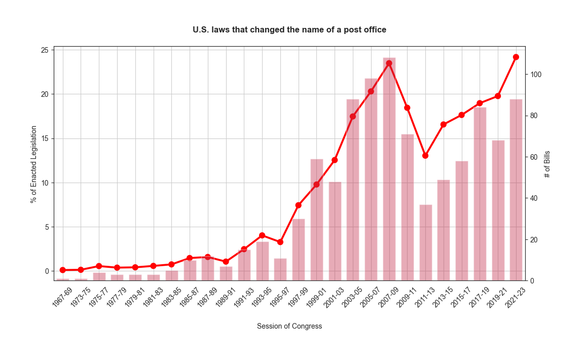
Is the bar graph the raw number and the line graph the percentage or is it the other way around? A legend would be helpful.
myspicename t1_jbdh1n1 wrote
Useless without knowing if post office counts stayed stable or up and down over time.
miclugo t1_jbf90yi wrote
It looks like these are honorary renamings, usually after some locally famous person (they don't affect anything about the actual mail, they usually just put up a plaque at the post office) and they are occasionally controversial.
[deleted] t1_jbfciiv wrote
[removed]
gcappaert OP t1_jbfdhts wrote
These are post office renamings. The buildings already existed
[deleted] t1_jbfdjwi wrote
[removed]
myspicename t1_jbfdztn wrote
But if they are making up the same percentage of overall buildings because the amount of buildings is rising too that would be a lot different than if the increase is on a stable denominator.
gcappaert OP t1_jbfghsx wrote
It's a percentage of enacted legislation, not a percentage of post offices. I think I made the axis labels too small!
myspicename t1_jbfhg90 wrote
My comment is about data usefulness and applicability, not about visualization.
gcappaert OP t1_jbfmm63 wrote
Line graph is the percentage. You're right! I should have used a legend or different color. Thank you!

gcappaert OP t1_jbd579i wrote
Tools: Pandas and matplotlib
Source: USPS list of dedicated post offices, https://www.govtrack.us/congress/bills/statistics