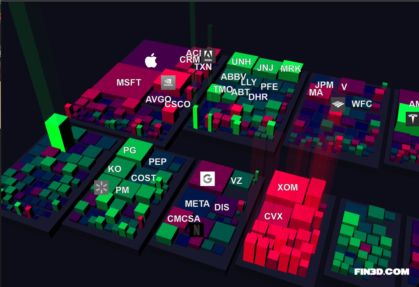
Submitted by Rockclimber88 t3_11k5rk8 in dataisbeautiful
Comments
Perfect_Toe7670 t1_jb5vahg wrote
Looks cool, but I like numbers
Rockclimber88 OP t1_jb5vtmt wrote
Check out the website, the current version is showing numbers. Temporarily the logos are hidden due to transitioning from HTML elements to Canvas
[deleted] t1_jb5wzyo wrote
[removed]
_Jag0ff t1_jb630qt wrote
I see Dennis got a job at Fin3D after getting busted for insider trading at Jurassic Park.
Bootrear t1_jb647l1 wrote
Not another UNIX system!
Rockclimber88 OP t1_jb64nvi wrote
He's my best guy, with admin access to everything.
PictureOfHealth t1_jb66jfi wrote
So...what is the third dimension representing?? The area of the company is usually market cap and the color is performance. What's the height represent?
Rockclimber88 OP t1_jb68hjs wrote
The height is the price difference in percentage from the last market close. The green bars are gains and the red ones losses.
PictureOfHealth t1_jb72857 wrote
Then, what is color?!
[deleted] t1_jb72slv wrote
[removed]

Rockclimber88 OP t1_jb5sode wrote
The chart is a browser-based tool I'm working on called Fin3D https://fin3d.com
Price data is coming from Yahoo Finance API i.e. https://query2.finance.yahoo.com/v10/finance/quoteSummary/TSLA?formatted=false&modules=price
Tools used: Three.js https://github.com/mrdoob/three.js/