Comments
subset1 OP t1_jakb9l1 wrote
Noted.
How come? I feel like I tend to see "power laws" looking like this, when I Google it.
phdoofus t1_jakdn7m wrote
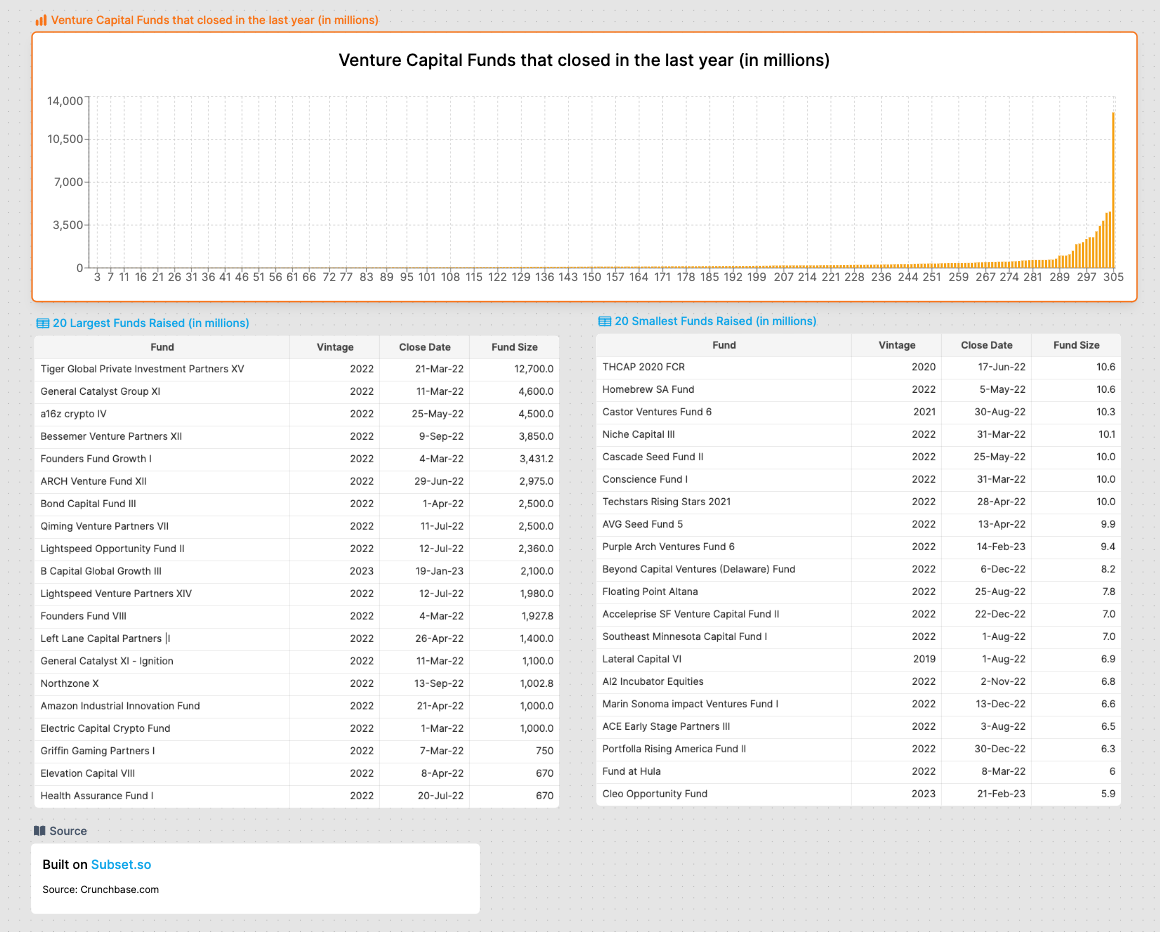
Showing power law data on a linear axis can result in most of your data literally being invisible except for a couple of data points.
subset1 OP t1_jake0ge wrote
Ah I see what you're saying, although that was kind of the point I wanted to portray: that most of the funds are on the left and look minuscule compared to the few on the right.
And also that's why I posted the two grids for the bottom 20 and the top 20 since I thought it wasn't very helpful to show all 305 funds.
Thanks for the feedback though :)
kompootor t1_jalfo7j wrote
The graph's x-axis is just the funds sorted in order of their values, right? That fact that that's not the kind of x-axis that you can label and draw points on should indicate to you that the visualization is not ideal.
I think in your title assertion you're confusing "power law" with the "long tail". To verify this relationship you will need an actual x-y plot. The way to get there, from what you are describing, is with binning.
As others have pointed out something like a power law should be on a log-scale graph. When you do bins in an example like this you definitely want to try putting it on a log-log graph. But if you're not sure what you're looking for or demonstrating, you should output both log- and linear-scale graphs for your viewer.
subset1 OP t1_jak7ifp wrote
Where or how you got the data: Crunchbase.com and Sec.gov using Form D
The tool used to generate the visual: Subset.so (an easy to use spreadsheet on a canvas tool)
tinker_tailor_soldie t1_jamxwda wrote
This is fascinating u/subset1

phdoofus t1_jak9cwg wrote
Pro tip, show power laws using a logarithmic axis