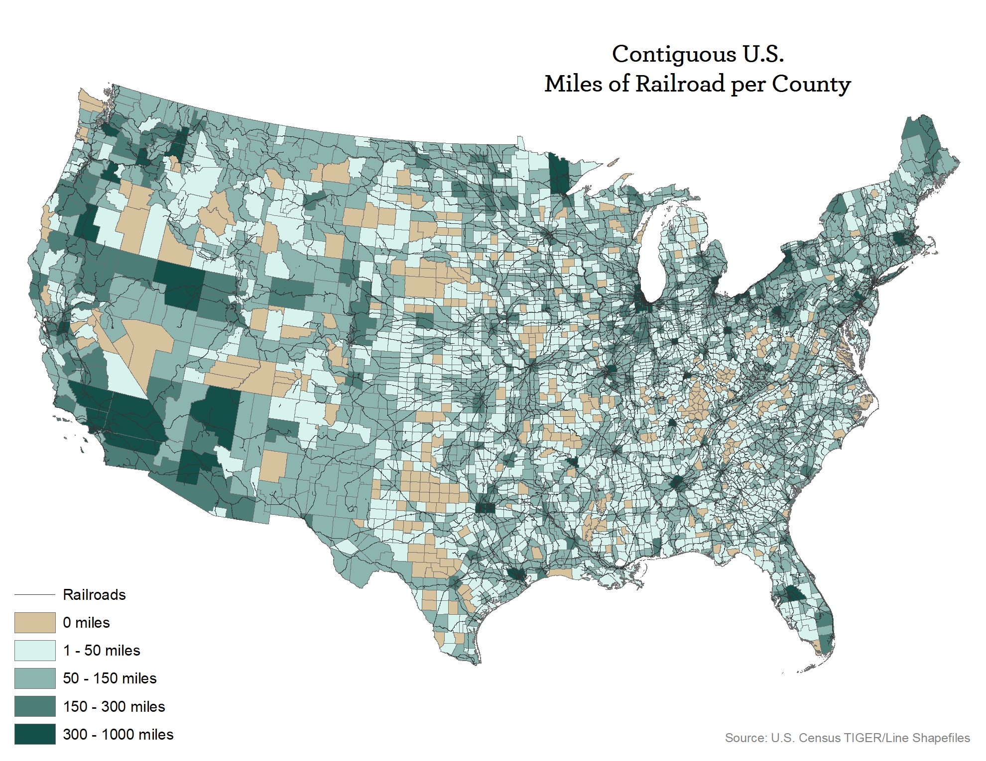
Submitted by BRENNEJM t3_11da9xm in dataisbeautiful
Comments
Kesshh t1_ja7q6sb wrote
That’s an interesting way to present the data.
First thing popped into my head is how railways have slope limit both uphill and downhill. To traverse a slope will require way more rails to loop and/or zigzags. So rails in mountainous region will have significantly more miles to cover the same distance between two points than in a flat region. I wonder if there’s enough data to change the measure from plain miles to actual distance covered. That would make an interesting comparison.
Less_Tennis5174524 t1_ja7r0rx wrote
Doesn't this favor larger regions?
davi8631 t1_ja7rkoy wrote
So there's more train rails(meaning a higher chance of derailment) in more populated regions? Sounds like a recipe for disaster
okram2k t1_ja8bg0x wrote
Yes. There's several counties in the southwest that have next to nothing in them but because a railroad crosses them they are counted as dark green.
oopsie-mybad t1_ja8tcdj wrote
Needs to be normalized as a ratio of miles to relative county size.
backgamemon t1_ja95wze wrote
Yes that is how trains work (they bring stuff from place to place, aka where the people live)
eastfan9 t1_jaasi3m wrote
Former Southside Chicago resident here. Can confirm the absurd amount of tracks we have in Chicagoland

BRENNEJM OP t1_ja7f8ev wrote
Source: Census TIGER/Line Data
Tools: ArcGIS
Top 5 Counties:
Cook County, Illinois - 999.9 miles
San Bernardino County, California - 895.9 miles
St. Louis County, Minnesota - 631.0 miles
Franklin County, Ohio - 604.0 miles
Wayne County, Michigan - 575.5 miles