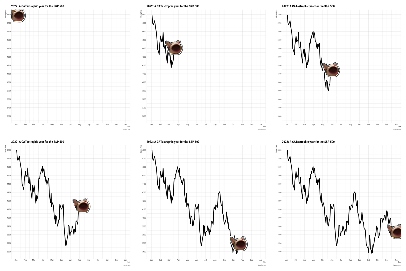
Submitted by kwantitative t3_113vmej in dataisbeautiful
Comments
featherwolf t1_j8shflc wrote
Something tells me they'll be alright.
[deleted] t1_j8slpfi wrote
[removed]
ravenpuff1178 t1_j8t7zem wrote
While depressing, you chose a paw-sitively adorable way to show the numbers.
set_em_off t1_j8v5qud wrote
Now check Congress and where they stand collectively on their investment portfolios over this same time period.
foomachoo t1_j8vie07 wrote
On a phone, it’s really hard to read the axis labels. Is this going to zero or zoomed in?
If you made this a png we could pinch and zoom. As a video we can’t zoom.
So it’s really hard to get the necessary data to be viewed this way.
KristofferSeemann t1_j8y5d6a wrote
Hi u/kwantitative, great chart.
I was wondering if the content in the link below is the full cookbook on how to make something like the above? I know a little R, so just wondering if I could actually do this.
Would it be possible to add one more line, so two lines are moving simultaniously?
Thanks a lot.
K
[deleted] t1_j991t0t wrote
You really made a stupid animation? What’s next a tic toc video of you dancing the information to us?

kwantitative OP t1_j8shayn wrote
This image is generated in R, using a combination of ggcats, gganimate, and tidyquant packages.
Data is sourced via API from Yahoo Finance.
Source code: https://www.kwanlin.com/gallery/a-catastrophic-year/