Submitted by infegy t3_112bhbp in dataisbeautiful
Comments
MarcTullyCicero t1_j8j9jjk wrote
I have no idea what this visualization is telling me.
joejimbobjones t1_j8jdmfa wrote
This is terrible. It's not clear where the nodes are for many of the acts and the connections are confusingly busy. It looks lovely me it was auto-generated without any optimization.
TotalTyp t1_j8lxg24 wrote
lol you should have seen when i made something like this for a data viz course. Was about correlating youtube tags and it was a complete mess.
CAguy209 t1_j8lxn6y wrote
This time data is confusing
welkinator t1_j8j8max wrote
All roads lead to Pink Floyd
sKY--alex t1_j8j9z0z wrote
This but for modern rap would be interesting
fortnitefunnies3 t1_j8k99kz wrote
My favorite band, Stevie Wonder
Ok_Elk_4333 t1_j8m94e3 wrote
Data is beautiful, the representation isn’t
[deleted] t1_j8kzo5d wrote
[removed]
leopardspotte t1_j8lingc wrote
I'm happy for you, or sorry that happened.
Yeangster t1_j8llgb0 wrote
Seems like hip hop is underrepresented in your sample. Many major acts are on the periphery. Wu Tang clan is connected only to Rage Against the Machine and on the other end from the other rappers who seem to only be connected with each other through Eminem.
[deleted] t1_j8lw8fy wrote
[removed]
[deleted] t1_j8lxbqe wrote
[deleted]
shadowylurking t1_j8myr5s wrote
Super interesting! thanks for posting this
myceliyumyum t1_j8qrknt wrote
Probably the worst data visualization I’ve ever seen
infegy OP t1_j8j1819 wrote
Data
The data used in this visualization comes from Infegy, a consumer intelligence platform that gathers, analyzes, and presents information from billions of social media posts. The list of bands was obtained from a publicly available source on GitHub.
Visualization
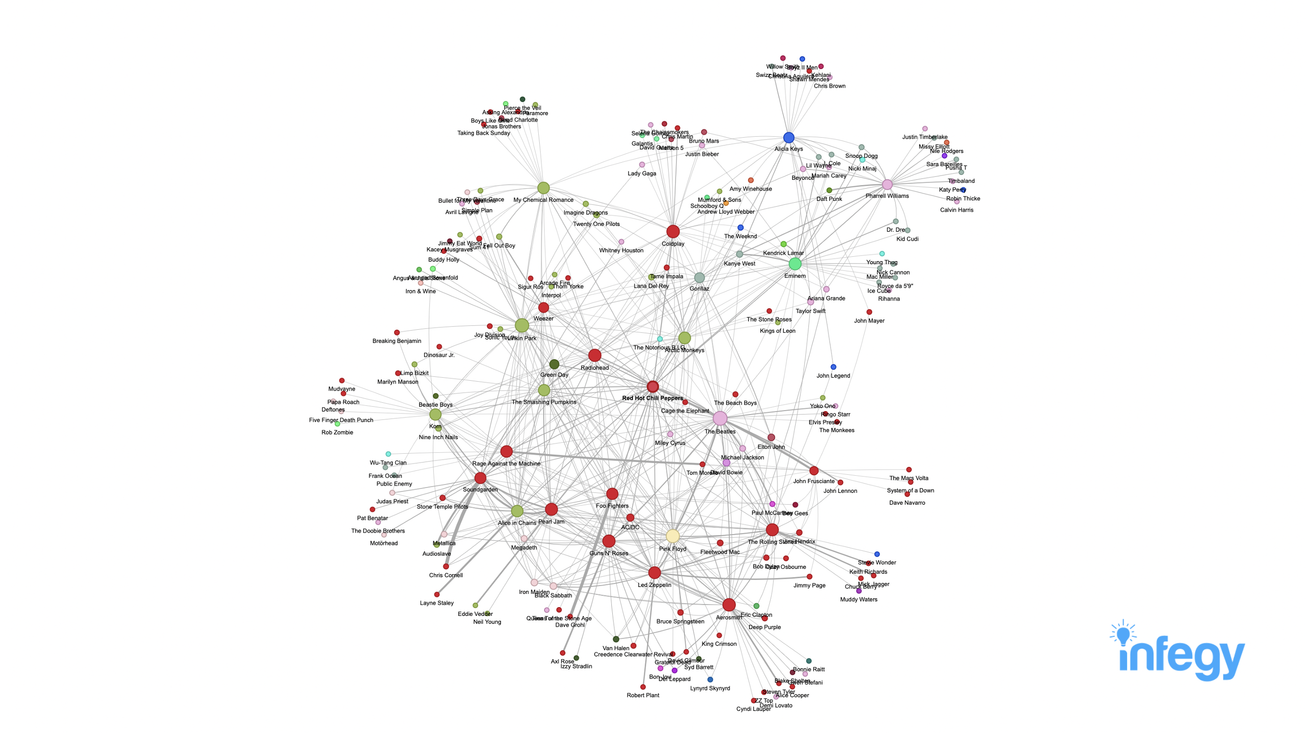
The process of the visualization involves searching for posts about the Red Hot Chili Peppers (RHCP) and analyzing the data to find the top 50 bands mentioned in these posts. For each of these 50 bands, the process is repeated to find the other bands they are connected with. The connection between two bands is represented by an edge, and the strength of the edge reflects how often they are mentioned together.
The results show that The Beatles are at the center of all the connections, confirming their strong influence. Additionally, the data reveals that the Rock cluster is separated from the Alternative and Pop clusters.
Tools
The tools used for this visualization include Python and its libraries Pandas and PyVis.

redditor1101 t1_j8j7p93 wrote
No key to describe what node colors and sizes represent, and edge thickness