Submitted by chickenparmo t3_10zspuw in dataisbeautiful
Comments
st4n13l t1_j85adi7 wrote
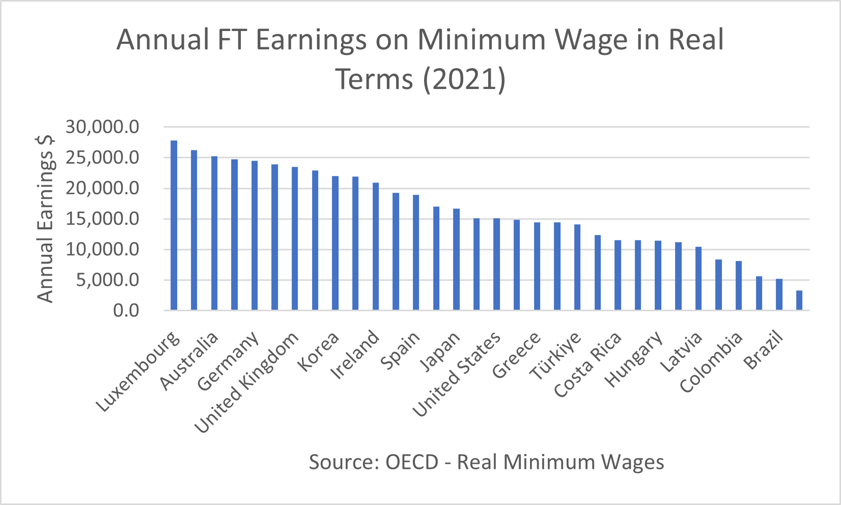
Are the dollars here USD, AUD, CAD, etc? I don't want to assume USD when you may be reporting based on your local currency.
slowmadmax t1_j87da4m wrote
A horizontal bar chart would make labels easier to read and also bring enough space for all of them to be on the chart. Also, colors could be used for each continent to help navigate the chart.
chickenparmo OP t1_j84v89x wrote
Source: https://stats.oecd.org/index.aspx?DataSetCode=RMW
Tools used: Excel
Note: Not every OECD country had data available in the OECD portal, so some are missing from this graph
LanewayRat t1_j85rxdw wrote
So there was data with no label on the portal? Find that hard to believe when I followed the link.
If you are only giving data for selected countries you say “for selected countries” and don’t show unlabelled data.

41942319 t1_j851vu6 wrote
Only half your data points are labelled