Submitted by whatweshouldcallyou t3_10y6stf in dataisbeautiful
Comments
phdoofus t1_j7xqp7k wrote
A more interesting chart would be 'which language do you use' vs 'which language would you rather be using'. One of the national DOE labs computes something like this and the clear winner was Rust.
askLubich t1_j7zxher wrote
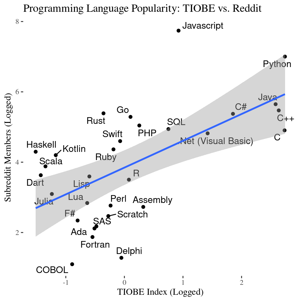
I'd have used actual logarithmic scales, because I don't think it's clear to everyone what you mean by "Logged".
That way one could directly read off numbers without having to guess which base you used. Depending on personal background, people would assume bases e, 10 or even 2.
Personally I find the regression line a bit pointless (what do we learn from it?) and I absolutely hate the grey shaded areas around it. Truth is, OP has no idea about the underlying distribution and the grey band fakes a level of sophistication that just isn't there.
whatweshouldcallyou OP t1_j7wbxwe wrote
Data Sources:
I collected membership numbers for the major subreddits for each programming language. TIOBE index is here: https://www.tiobe.com/tiobe-index/
Tools:
R, ggplot
Note I logged both scales due to the distributions.
idontrespectyou345 t1_j7wg5sf wrote
Whats the gray shading?
[deleted] t1_j7wgh3i wrote
[removed]
Mentalfloss1 t1_j7xltva wrote
I wonder why Cache didn’t appear. The worlds most popular medical software is based in Cache as are some big deal non-medical systems. https://www.epic.com/epic/post/healthcare-mapping-milky-way-5-things-didnt-know-epics-tech
lyfemetre t1_j7wgz3u wrote
Very interesting, might be helpful to focus on learning the more popular languages

leftoverinspiration t1_j7yj0wh wrote
When a log-log scatter plot fails to reveal a correlation, you can always draw a nice blue line on it.