Comments
Cough_Geek OP t1_j7lnor5 wrote
Interesting - do you have some image to share which resembles cough's scalogram, just out of curiosity?
On_The_Contrary_24 t1_j7lp5j6 wrote
Hard to find a solid link that isn’t paywalled (most peer reviewed work is). You can google “x-ray spectroscopy z-pinch film UNR” and check out images. Won’t look as pretty as yours, our film was black and white.
Cough_Geek OP t1_j7ly8ck wrote
Thanks for sharing, will take a look!
On_The_Contrary_24 t1_j7lzhmc wrote
I did some more digging, NASA has a nice little website that if you scroll down you can see some nice spectra: https://imagine.gsfc.nasa.gov/educators/lessons/xray_spectra/background-spectroscopy.html
imnotreel t1_j7ndzve wrote
>DataIsBeautiful is for visualizations that effectively convey information. Aesthetics are an important part of information visualization, but pretty pictures are not the sole aim of this subreddit.
Meanwhile in r/dataisbeautiful : a random scalogram of a cough audio recording with no title, no axes labels, no color bar, big ass empty margins and zero annotations or description what so ever gets hundreds of upvotes ...
Cough_Geek OP t1_j7p8vdh wrote
I appreciate your feedback very much - as work on cough analysis continues, all following interesting visuals will come addressing your points!
mizinamo t1_j7ljef0 wrote
Is the "lonely" supposed to be "lowly"?
(Since you seem to be contrasting it with "rich".)
Cough_Geek OP t1_j7lltw5 wrote
Good one haha! For a cough, that is lonely and rich - it is likely just a matter of time for another one to appear; then they are counted and depicted as cough bursts!
michiganfan101 t1_j7ndyq0 wrote
Ooh pretty colors. Doesn't mean anything since nothing is labeled, but I suppose you could try to sell it to a modern art museum
Judge_gerg t1_j7lufk6 wrote
Every time I shift my focus to a different part of this image, the periphery looks like it's shrinking. So much so, that I had to check if it was a GIF or a video.
Cough_Geek OP t1_j7lw16x wrote
Impressive effect, I agree! Better be aware of those coughs and their dynamics irl before it gets worse!
Cough_Geek OP t1_j7kucf7 wrote
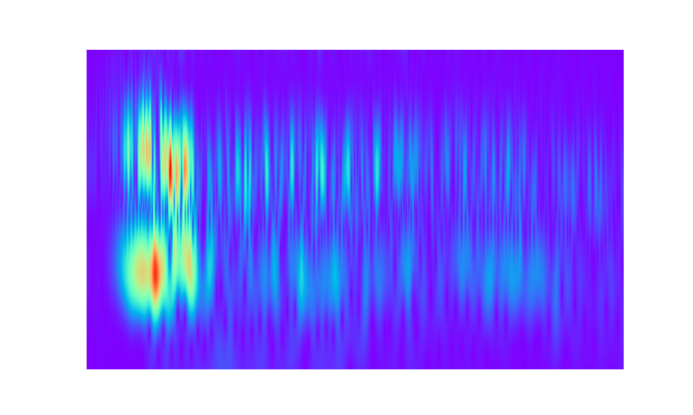
[OC] audio collected through a smartphone cough monitoring application. Audio to visual scalogram generated in R (wavelet transform), decomposing the signal into frequencies. Purple background allows to see where the explosive peak of a cough sound happens, with the vocal phase of a cough following as trailing bright spots.
joev714 t1_j7lseby wrote
It most likely doesn’t matter, but which wavelet did you use
Cough_Geek OP t1_j7lylto wrote
Thanks for this great question - complex-valued Mexican hat mother wavelet here, used this implementation of synchrosqueezing: https://github.com/OverLordGoldDragon/ssqueezepy
mrbrambles t1_j7mble9 wrote
What is your goal in processing? I used to do a lot of image processing with wavelets, so curious on how much is applicable knowledge here. In images, edge/feature detection and smoothing are some of the main goals.
cyan-pink-duckling t1_j7nmi4r wrote
For starters, this can be an efficient way to set up voice activation. Sound signals are generally temporally compact, and somewhat sparse in Mexican hat basis.
Baixst t1_j7m7fav wrote
I would like to see some labels on both axis, especially the time-axis. I found the scalogram to be problematic for audiosignal that are a few seconds long.
Cough_Geek OP t1_j7ma19d wrote
Agree with labels, that would look more professional, in this case - thought of sharing it as a piece of art. By the way - thanks so much for giving an elaborate reply on the differences in colours - very much appreciate that!
mrbrambles t1_j7mat01 wrote
Why not a Fourier transform? I’m many years out of practice but is a wavelet transform just for computational speed or are you specifically trying to accentuate certain qualities?
Edit read your other reply - nice
Financial-Jicama6619 t1_j7lwoqs wrote
Am I the only one who sees this moving? Coulda swore I was watching a video…
Cough_Geek OP t1_j7lxkf2 wrote
This is so cool! There was another user mentioning the same effect!
Financial-Jicama6619 t1_j7lxuui wrote
I just remembered I did microdose today so maybe that might be part of it 😅
moorsmith t1_j7lyjsj wrote
u/Cough_Geek do they come in any other colours?
Cough_Geek OP t1_j7lzs66 wrote
To tell you the truth - coughs are super colourful! Usually people are not used to pay attention to cough in general, and this is about to change big time! And in regards to the visual - another example in different colours here: https://ibb.co/7VXJm79
moorsmith t1_j7mfar7 wrote
very cool!
iuliancirco t1_j7kvrwo wrote
Pretty looking thing. Do the different colors mean anything?
Frunzli t1_j7kx38z wrote
I believe that color represents loudness, he X axis time and Y frequeny.
[deleted] t1_j7m0ise wrote
[removed]
Baixst t1_j7m6rfx wrote
The scalorgram shows the power distribution over time and frequency of a given signal. So in a sense you can say that the colors represente how strongly a frequency (y-axis) is present at a point in time (x-axis).
koobcam_boy t1_j7kwbwt wrote
Very interesting…
[deleted] t1_j7luynx wrote
[removed]
[deleted] t1_j7ly02g wrote
[removed]
[deleted] t1_j7mnefi wrote
[removed]
SolTarot t1_j7nm669 wrote
Looks like a big dick and balls

On_The_Contrary_24 t1_j7lmrg8 wrote
This looks exactly like some of my x-Ray spectroscopy data I studied in graduate school. Uncanny. Take a line out of this using ImageJ and analyze it!