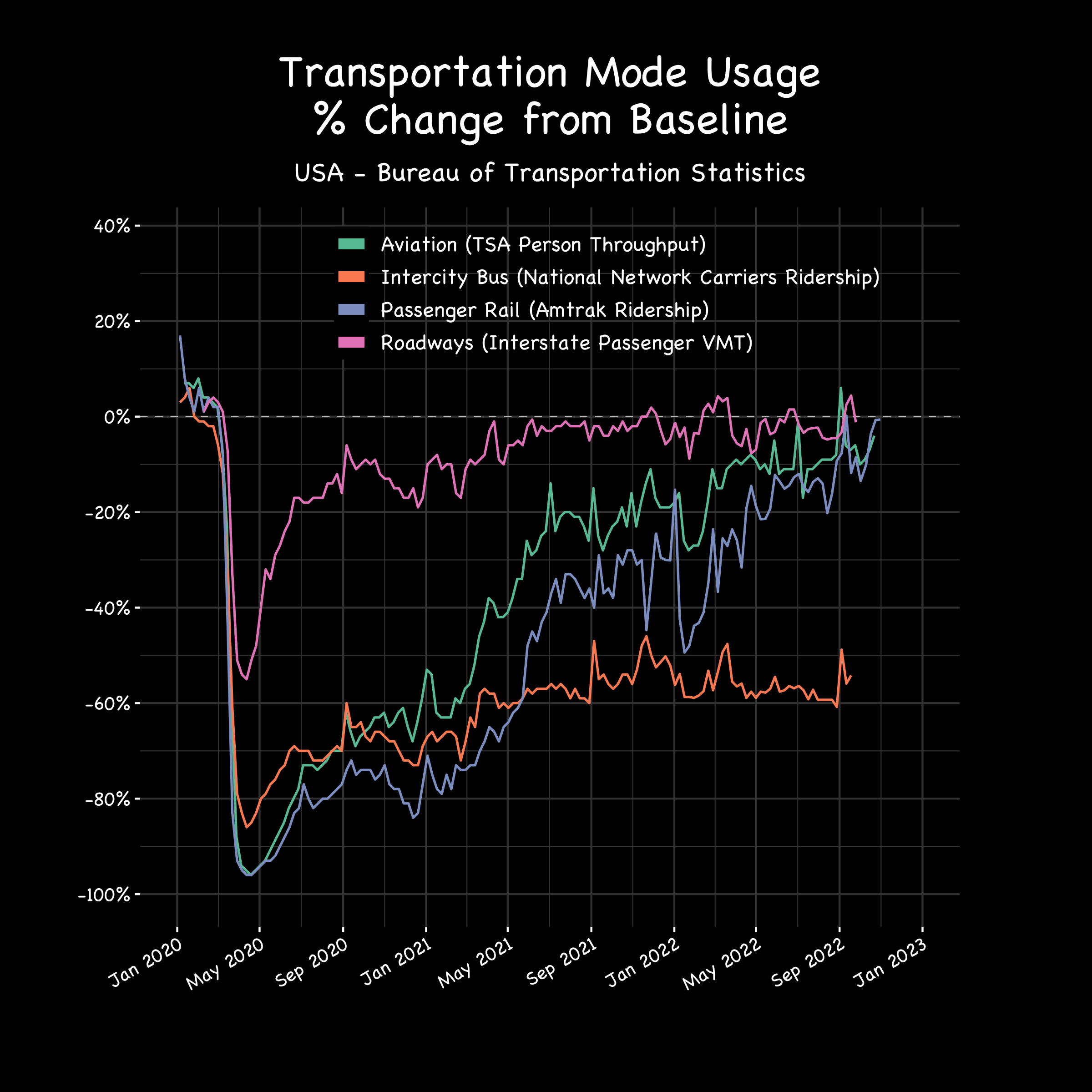
Submitted by takeasecond t3_10uyugy in dataisbeautiful
Comments
solarmelange t1_j7evuf9 wrote
While the busses weren't running, people still needed to get to work. So they got a shitty car. Most of those cars still work.
Zathrus1 t1_j7exfce wrote
These are intercity buses though (Greyhound, Megabus, etc), not intracity ones. The people who used them weren’t doing a daily commute.
There may be some truth to your answer still, but it’s not quite that simple.
icelandichorsey t1_j7ghkzd wrote
Yeah that's a good point. Wonder if someone in the know will comment on this eventually.
ar243 t1_j7etrax wrote
People finally realized riding the bus sucks.
dildo-looking_cactus t1_j7g6kuf wrote
Ska, ska! Go back to spending thousands of dollars on transportation just to avoid a possible mild discomfort.
ar243 t1_j7gfv8k wrote
Sorry I don't speak peasant
dildo-looking_cactus t1_j7ghq08 wrote
Lmao imagine thinking commuting with a car makes you noble or something
[deleted] t1_j7gj0n0 wrote
[removed]
[deleted] t1_j7ftnsz wrote
[removed]
navywater t1_j7epj3d wrote
Seems like people see public transport as vectors of infection so it took them longer to recover. Although i am surprised that aviation and rail have recovered 100% but bus ridership is still down 60%
vtTownie t1_j7g9hrw wrote
It’s intercity bus transit so my expectation would be some of the infection risk but more likely that people had more spending money and could use other means of travel.
Chance-Ad4773 t1_j7fy3sh wrote
I wonder how many municipal bus systems dropped less profitable routes because of low ridership during the pandemic?
takeasecond OP t1_j7elssa wrote
This data comes from the US BTS and the graphic was made with R
ApotheosizedBum t1_j7f96jd wrote
I think I get it from context, but the pink and the orange are difficult to tell apart. Maybe yellow or something?
mohd212 t1_j7ffoso wrote
They look fine on my phone, pink is at the top and orange is closer to the bottom and they barely intersect at all.
icelandichorsey t1_j7eqlvm wrote
Actually a good graphic. Could have also maybe added annotations at the bottom of the trough and perhaps the most recent values. But pretty good already 😊
hh10k t1_j7f8ax8 wrote
What does intercity bus mean? Busses between cities, not within a city?
itijara t1_j7fg0oc wrote
Yes. Buses like Greyhound, Peter Pan, and Shortline.
ZeBoyceman t1_j7ffuoc wrote
Good graph but of all available fonts why did you choose comic Sans? I can't upvote you (but I want to!)
Chance-Ad4773 t1_j7fxwd5 wrote
I heard it's good for dyslexic people
ExocetC3I t1_j7fp97u wrote
These types of charts tend to be more readable when using a moving average for daily data. A 7-day trailing MA smooths out the spikes and dips from day of week effects, though does mask specific events like holidays. Ultimately applying a MA makes them much more readable and easier to observe actual longer term trends.
rosebudlightsaber t1_j7eos27 wrote
Woulda thought covid effects would have had a larger trough.
Edit: wider/longer time
DataMan62 t1_j7jh3ej wrote
A lot of Southern states pretended there was no pandemic because Republicans politicized science as a bad thing to believe if you’re a Republican.
rosebudlightsaber t1_j7jjh65 wrote
I think you’re exactly right.. I would love to see this chart broken down by states (I know that’s an entire different undertaking), but yeah… States or even demographically.
icelandichorsey t1_j7eqex0 wrote
How do you mean? At the bottom some modes were like - 90 to - 95%
DataMan62 t1_j7jgw9m wrote
Rose edited it to say wider. Not deeper.
icelandichorsey t1_j7jj71x wrote
Wow you downvoted me for asking a polite clarification? Nice...
trumpstupid t1_j7f23ws wrote
Please indicate in the post title that this is in the US. There are Reddit users outside of the US.
hiphippo65 t1_j7fka9a wrote
Guess people outside the US can’t read because it clearly labels the source at the top
trumpstupid t1_j7flcjb wrote
The post title, not the chart
socialmeritwarrior t1_j7fs7xp wrote
If it's % Change from Baseline, why do literally none of the lines start at the baseline?
DataMan62 t1_j7jgkk8 wrote
Cars do! Amtrak was up almost 20%. They had a good Jan 2020. The others were less than 10% above baseline.
socialmeritwarrior t1_j7jhjbv wrote
But what's the baseline? Nothing in the presented data states that. If you aren't showing the baseline on the graph itself, you need to explicitly state what it is and neither was done here.
DataMan62 t1_j7jk4o6 wrote
Good question. I am disappointed in the extreme lack of definition and explanation on almost all the graphs in this group.
But baseline means the average daily ridership. Maybe that’s averaged over the years by month, week, day of week or calendar date. But however the baseline is determined, any given day is almost guaranteed to be at least a little different from the baseline. All of the curves start within 20% of baseline. All but one within 10%. That is normal.
PhilRubdiez t1_j7g8vme wrote
Could be that the baseline is in March 2020. That’s about when all of the lockdowns and panic really started. It also is about where all modes cross 0%.

icelandichorsey t1_j7eqhla wrote
The buses is curious. Wonder what has happened there as it's probably something in addition to the pandemic effect.