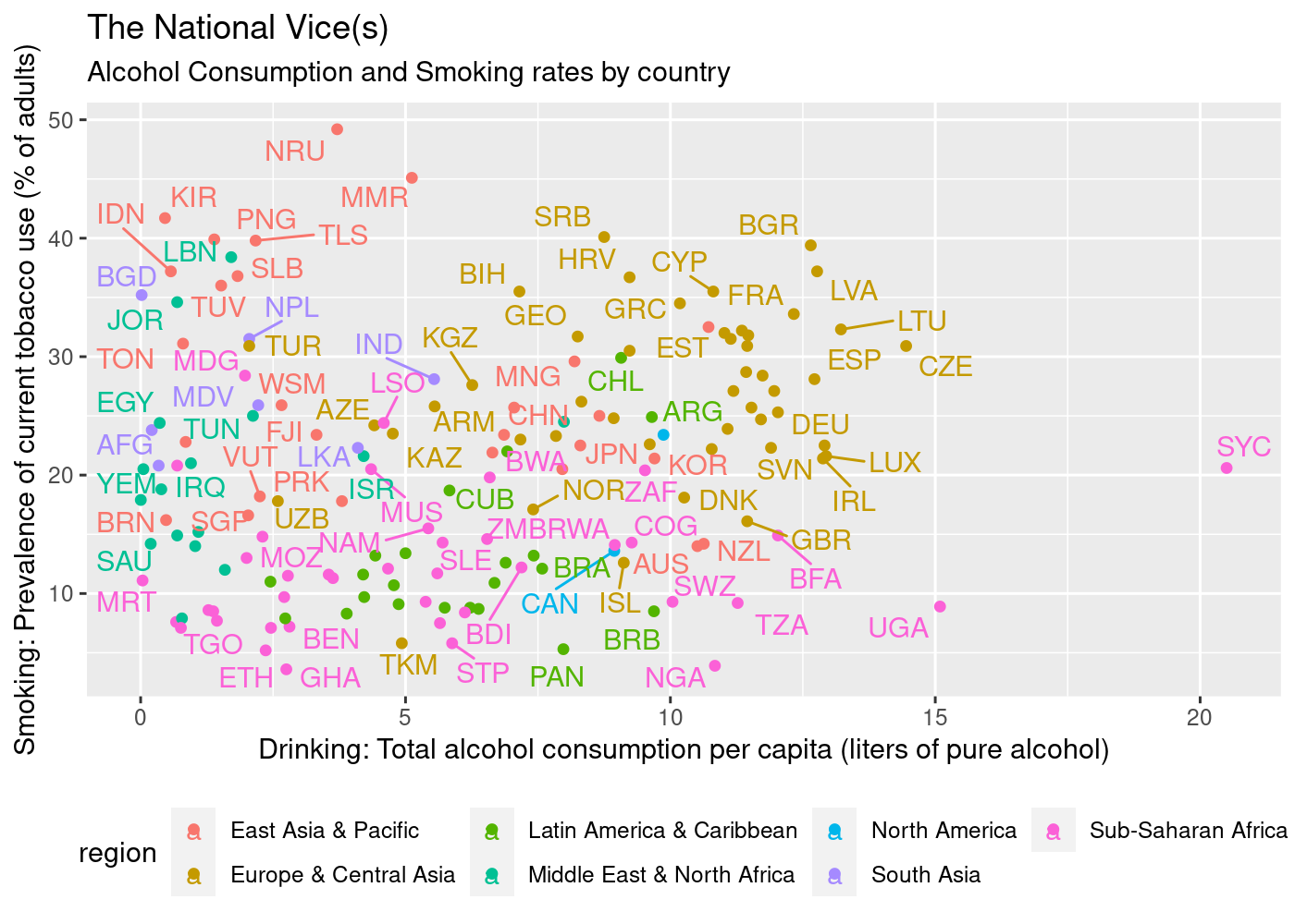
Submitted by whatweshouldcallyou t3_10s2l7g in dataisbeautiful
Comments
[deleted] t1_j6z2w6l wrote
[removed]
rogert2 t1_j6z375v wrote
Embedding the names in the graph makes it very hard to take in the data.
SlayerOfDougs t1_j6z3agm wrote
I'm unsure where you are from, so this is a US perspective.
First I like the data
If you are going to use North America, I would choose to use Central America and not latin America.
Mexico would be part of both which is slightly confusing
michael_bgood t1_j6z3dxd wrote
Maybe numbers and legend would work
whatweshouldcallyou OP t1_j6z3j2f wrote
Fair point. Regions can be tricky. I used the region variable from the countrycodes::codelist.
Need_A_Vacation_2022 t1_j6z4kxy wrote
I’ll probably know it as soon as you say it, but who is SYC?
[deleted] t1_j6z57z6 wrote
[deleted] t1_j6z582u wrote
[deleted] t1_j6z603s wrote
[deleted] t1_j6z63og wrote
[deleted] t1_j6z854a wrote
Cruzbb88 t1_j6z8wiv wrote
Seychelles, it's a small island nation off the cost of the middle Eastern part of Africa.
phdoofus t1_j6zakfg wrote
You'd have been better off doing this as a colored map. This is pretty damned unreadable
NarcissusLovesEcho t1_j6zbwji wrote
It's hard to plot two dimensions in a map. Maybe two separate maps, one for etoh and one for smoking?
kgunnar t1_j6zc9uj wrote
I wonder if the fact that it’s so tourism oriented brings up the alcohol figure, as they probably serve a large number of drinks to tourists. So the tourist consumption goes into the numerator but the tourist population doesn’t go into the denominator.
Need_A_Vacation_2022 t1_j6zck4d wrote
Thank you! I used to collect stamps; that’s the last time I recall hearing of the Seychelles
Cruzbb88 t1_j6zcow6 wrote
Seeing how the islands population in 2021 was 99,258 and the amount of visitors they received in 2019 was 428 thousand I would say probably... Most definitely.
Edit: scratch that alcohol is just a very large part of their culture and most people home brew and on top of that it's very cheep to buy.
phdoofus t1_j6zd7ul wrote
You assign a color based on two end points, e.g. red/blue with an intensity based on what your coordinates are
kgunnar t1_j6zdblh wrote
It’s hard to know for sure since there’s no citation for the data source. If it’s strictly based on self-reporting then the latter makes sense.
NarcissusLovesEcho t1_j6zgyo7 wrote
But that's just one dimension, red to blue. That works if you're measuring one thing. But how do you use this for two separate measures (i.e., two dimensions)?
phdoofus t1_j6zmsx9 wrote
Red on one dimension, blue on the other. You go white to pure red, and white to pure blue depending on where you are in the data's bounding box. So basically each country on a map gets a color based on
x * Red + y * blue
Something like that
magicwombat5 t1_j6ztcvs wrote
So we get a nice lavender, but not in France.
KaramelKatze t1_j70g3nr wrote
I cant help but feel our colorblind friends might not approve of this
phdoofus t1_j70lmii wrote
Well the OP's graph isn't much better in that regard
bentdaisy t1_j71wf3b wrote
Scatterplots are usually used to show the relationship between two variables. In this case, it doesn’t look like there’s much of a relationship which tells you another kind of graph might be better.
[deleted] t1_j73jkfm wrote
[removed]

whatweshouldcallyou OP t1_j6z2lvv wrote
Data: World Bank Data through WDI package
Tools: R, ggplot