Submitted by VRmusicpro t3_10odh0b in baltimore
Comments
STrRedWolf t1_j6epjxs wrote
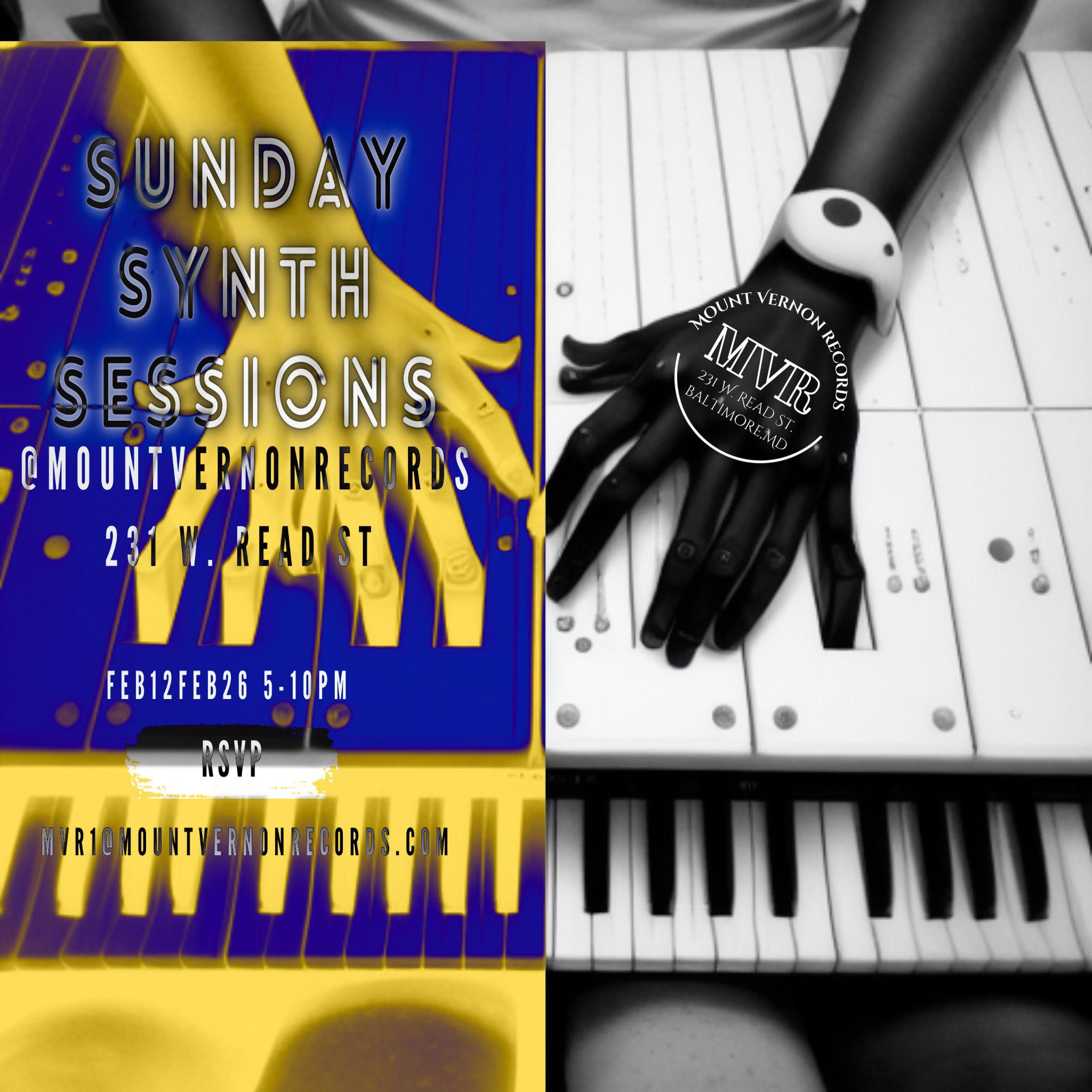
The ad design gathers my attention for other reasons.
GattMourley t1_j6fh67x wrote
Incorrect keys, mangled hands? I smell Midjourney AI.
STrRedWolf t1_j6fjfxu wrote
Probably used as an initial base and then heavily photomodded.
Still, my interest lies in the mangled hands... for... reasons. ;3
iuddwi t1_j6ewfig wrote
It’s an illegible mess.
SpaghettiOsPolicy t1_j6izkvo wrote
I thought the more illegible a music poster is, the "cooler" it's supposed to be. I see them all the time and have trouble deciphering what's going on. Just look at any of the posters hung on the streets in Hampden or at Ottobar
[deleted] t1_j6fh3gp wrote
[deleted]

groovevault22 t1_j6e0wr8 wrote
Awesome!