Submitted by plantboy97 t3_122qfo8 in Washington
Comments
plantboy97 OP t1_jdramsw wrote
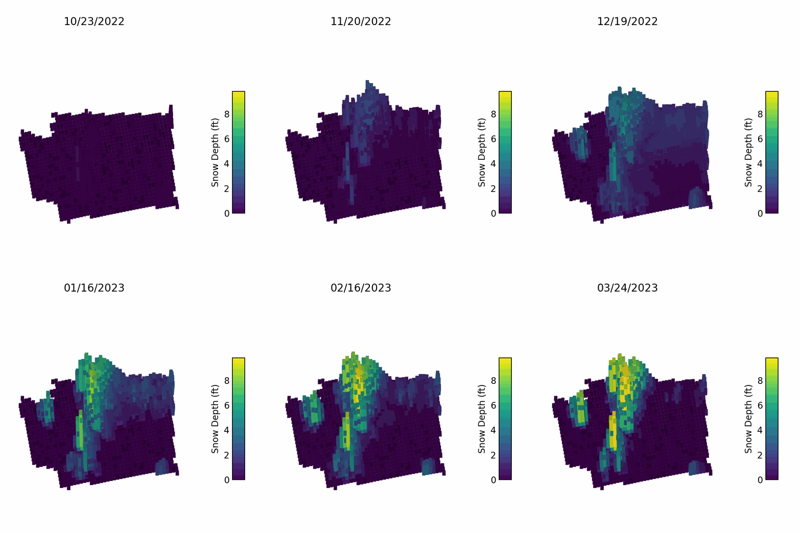
Thank you! Yeah it's definitely a trade-off with the 3d plot blocking some of the points from view, I just think its worth it to see the snow height as an actual height that's rising
warmweathermike t1_jdrbhn9 wrote
This seems like it might disregard much of Eastern Washington. I'm pretty sure there's more snow than indicated, up in areas like Mt Spokane.
rosesandpiglets t1_jdrby0l wrote
Nah it seems about right, Mt. spokane gets like 100 less inches a year than Snoqualmie and like 250 less inches than Stevens.
The Cascades definitely pull out waaaay more moisture
warmweathermike t1_jdrcxa2 wrote
This shows it like it has less than 2ft of snow ever. That doesn't seem right to me is all. When I've driven around up there on the mountain roads at elevation, there's definitely more that 3 or 4 ft of snow up there that I've had to dig myself out of.
rosesandpiglets t1_jdrdcb5 wrote
I’m definitely reading the colors as more in the 4 foot range, I think the issue is the colors are not super distinguishable below 5 feet
lexstory t1_jdrdvud wrote
Cool representation. Edward Tufte fanboy here, so any qualitative visual draws me like a moth to a flame.
aspiringkiller t1_jdredh6 wrote
I thought this was in r/minecraft at first
Poorbilly_Deaminase t1_jdrfsyc wrote
I love viridis
inkswamp t1_jdrli64 wrote
Really cool. Should consider posting this to r/dataisbeautiful
jhawkweapon t1_jdrmmqz wrote
Yes, OP! PLEASE do this. This really is beautiful data.
Thanks for posting
plantboy97 OP t1_jdrp7o1 wrote
I did and a lot of people hated on me! Even though it was my first ever post lol
Nashful_Buddhist t1_jdrsbim wrote
Color only would work better rather than trying to make this 3D for no reason. 3D charts often occlude or distort the data to the point of not being clear, especially if the user can't rotate or manipulate the chart.
hockey_stick t1_jdrvu7w wrote
I'd crosspost these (WA and the other states you've created maps for) to /r/Maps and /r/MapPorn as well.
plantboy97 OP t1_jdrwp0l wrote
nice will do! hopefully they don’t roast me like dataisbeautiful lmao
JustSomeBadAdvice t1_jds3u72 wrote
Also consider freezing the final frame for like 15 seconds so the loop doesn't prevent people from seeing it.
plantboy97 OP t1_jds6w4n wrote
Dedpoolpicachew t1_jdsc524 wrote
Good snow pack means less water problems in the summer. Nice to see it’s not too bad despite the atmospheric rivers shifting south to Cali.
[deleted] t1_jdsdwj2 wrote
[removed]
Square_Ambassador301 t1_jdsny5w wrote
I thought it was cool to represent the depth with shape rather than just color, which is definitely visually clearer but not as interesting! Cool map OP
SleepySSB t1_jdtbn35 wrote
I love that it localizes itself right next to i5 🙃
adamr_ t1_jdu891x wrote
Yeah this shouldn’t be 3d

Dont_Ban_Me_Bros t1_jdra4h9 wrote
Great visualization of depth and time. Just a small recommendation: instead of bar graphs maybe just a map of the state with color changes in the areas identified by the bars. That way you can see where the activity is happening.