Comments
ya_boi_seabass OP t1_iun2g7d wrote
Halo copycat
Kalebxtentacion t1_iun33jm wrote
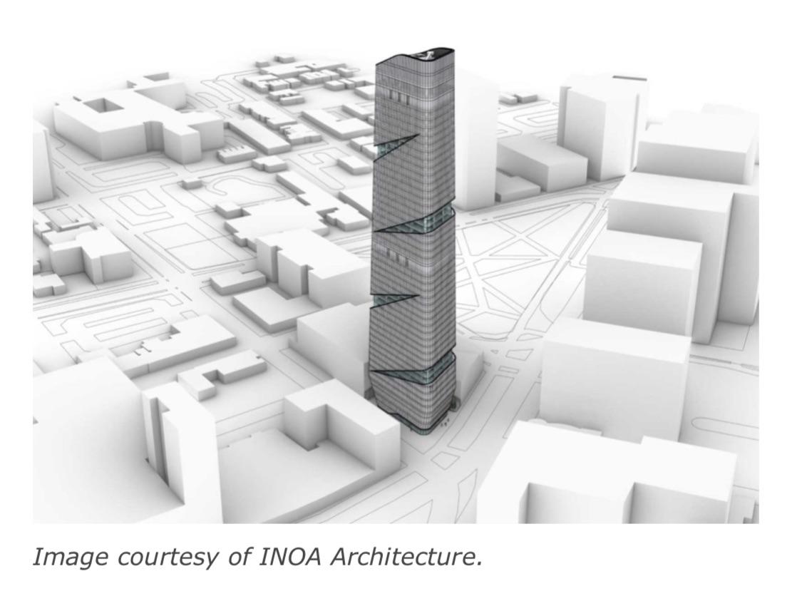
I mean it was design by the same architecture firm so if anything this is a cousin of the halo tower. Don’t really see how it’s a real problem with the design. The majority of the new prudential tower is glass and so is this tower and they sit in the same historic district. It amazes me how other bigger cities can build these nice tall glassy towers in the middle of historic buildings and they still look nice. One Vanderbilt is only seconds away from the Empire State Building yet it looks nothing like it and it doesn’t. I wouldn’t have a problem if they made this building facade look similar to one theater square or both Shaq towers but we need some diversity in the skyline. Not every new building has to be as iconic or similar to those that’s been in Newark for more than 30 years. Besides look at the area halo is being constructed in there’s literally no other building that looks like it or has the same facade as it.
ya_boi_seabass OP t1_iunukud wrote
Even so, they should be more creative with their designs
Kalebxtentacion t1_iunvc0i wrote
Not every design that gets thrown in Newark proposal board will change the game in how we design towers, there are going to be some hits and some miss.
bigjoe13 t1_iuow9io wrote
I don't like this design at all. Newark Skyline is beautiful with that art deco style. This is an American style that we should embrace
Kalebxtentacion t1_iupgsx3 wrote
I am pretty much cities like New York, Boston, Philadelphia, and maybe Chicago look more like an American city than Newark, since they have more art deco towers than we do and more modern towers than we do. I am not gonna lie I love our art deco style buildings there great and beautiful but it doesn’t mean we have to only build art deco moving forward in Newark. Our skyline should be diverse, Newark is a diverse city, imagine someone saying that Newark should only be black and we should embrace bring more black people to the city.
bigjoe13 t1_iupqia8 wrote
Damn Kaleb. You write so beautifully, it's hard to nail down where we disagree.
Kalebxtentacion t1_iupyyuq wrote
Thank you, one of my greatest skills
felsonj t1_iuo92zf wrote
At least it’s not a cookie cutter apartment building, which is more than can be said than most of the crap going up around the country, case in point a lot of what is being built in Harrison.
Id rather have 2-3 copies of something reasonably interesting than your standard balcony-and-PTAC marred facade.
The copycat issue is a problem we want to have.
dolomanc t1_iuo85wd wrote
I like it but it would be dope if they could get the windows to shape an NWK
Chelseafc5505 t1_iup2t1q wrote
Doesn't look anything like halo?
Personally, I like it. Including the stark contrast with surrounding buildings
It's a pretty key location too at the intersection of central and broad, which currently doesn't have a ton going on. If this tower can do for the immediate surrounding area, what Prudential has done for it's immediate surround area it'll be transformative.
It also starts to link already, and currently developing areas, around Pru/whole foods and NJPAC respectively.
Kalebxtentacion t1_iuph4y3 wrote
Facts, I feel like this tower closes the gap between midtown and downtown. Plus this area could use some more attention. The light rail and broad street station and minutes away, this part of downtown should be something like NYC midtown. I want different parts of downtown to feel and look different yet be connected at the same time
ya_boi_seabass OP t1_iumzu9l wrote
Something other then just glass, props to halo not having just a glass base

Kalebxtentacion t1_iun2bno wrote
What’s wrong with the current design?