Submitted by JohnnyTsunami312 t3_10pkm2v in MechanicalKeyboards
Comments
JohnnyTsunami312 OP t1_j6l5cwy wrote
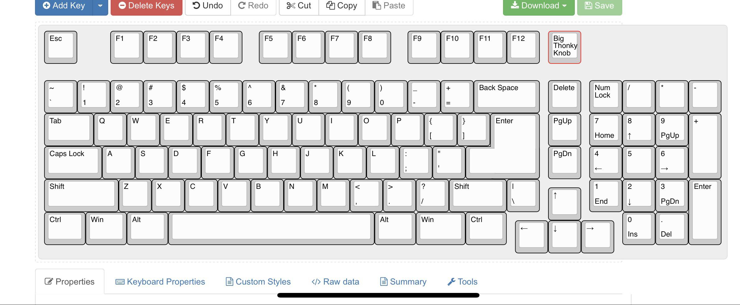
I don’t disagree but it was for the symmetry around the arrow keys. Some sets include 1.5u
v81 t1_j6mmakw wrote
Would 4 X 1u keys fit better?
Alt , App, Fn, Ctrl
sunfaller t1_j6l56od wrote
Your dream layout is Odin V2 with 1 more key above the arrow key.
JohnnyTsunami312 OP t1_j6ltkhq wrote
That’s pretty spot on. Could definitely make the Big enter work with the solderable Pcb
imlaggingsorry t1_j6le4q3 wrote
So pretty much a 1800/96 layout keyboard?
JohnnyTsunami312 OP t1_j6lvazp wrote
I’d describe it as an ANSISO 1875
daHavi t1_j6lf33o wrote
What program is this that you created the layout in?
JohnnyTsunami312 OP t1_j6lts7o wrote
Here you go: http://www.keyboard-layout-editor.com/
OrcswithForks t1_j6olyhk wrote
Love the location of the backslash. It was always there on keyboards I used growing up and I resisted moving away from a Zenith-brand IBM compatible with an AT connector to a PS/2 keyboard for a long time because I couldn't find one I liked that had the backslash in the right place. Eventually had to give up and accept the backslash atop the enter key, but I still don't' like it.
Nahassa t1_j6ot43v wrote
Big Ass Enter Key, because normal ISO and ANSI are just sooo hard to hit, so we just had to combine the two. ¯\_(ツ)_/¯
[deleted] t1_j6ljhdd wrote
[deleted]
Taowulf t1_j6ln20k wrote
I will have to settle for not quite perfect 1800s.
I do like a larger 0/Insert key on the keypad though.
Yoosulis t1_j6motg3 wrote
He added the cursed enter! I would approve if there weren’t a numpad Over I would give a 7 Love that enter! But I don’t have enough space for the numpad…
Hope you find this layout somewhere! And good luck trying to make it yourself!
pompeii11 t1_j6nliot wrote
Big Thonky Knob. I love it haha
MischiefArchitect t1_j6o95r5 wrote
ANSISO 1800
My only change would be the Delete and the Thonky key to be "Ins" (instead of delete) and "Del" (instead of Thonky)...
Edit: Plus points for BIGASS!
RocketMan_0815 t1_j6owqfm wrote
I want this as low profile ...
Mastabob5 t1_j6oz7m1 wrote
Many layouts similar to this that are readily available.
zerinsakech1 t1_j6p431h wrote
It’s fine except for the enter key and \ which I use too often in IT Help desk

[deleted] t1_j6kz3ow wrote
I don't think this is so bad... if you ignore that right Win key.