Submitted by Laneware_Keys t3_z4q0eg in MechanicalKeyboards
Comments
Laneware_Keys OP t1_ixt1kto wrote
Thanks for the feedback, and the support on the LW-67!
AkDoxx t1_ixswj91 wrote
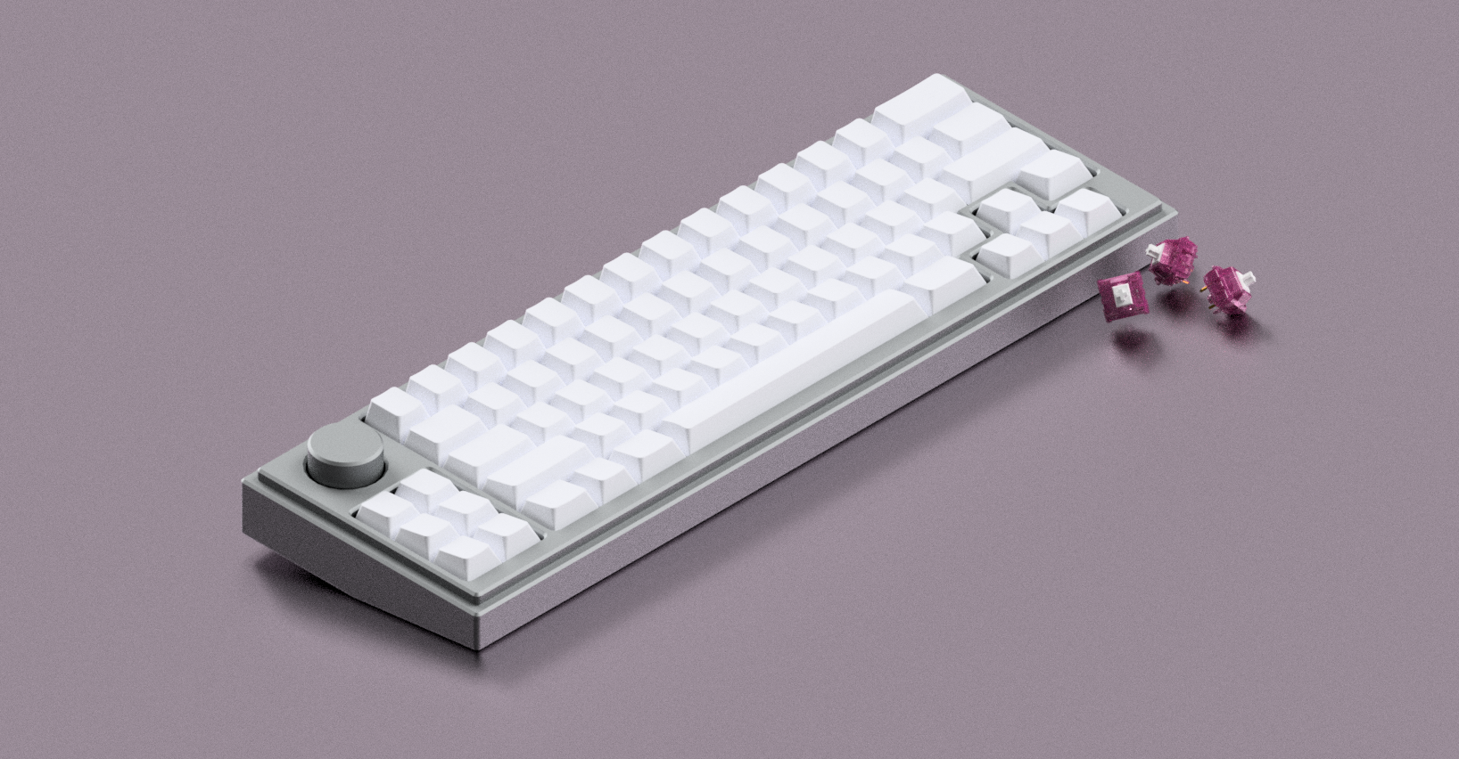
Arrows being on the inside of right shift is so cursed. I also hope that bottom row isn’t a fixed layout.
Laneware_Keys OP t1_ixt1j09 wrote
There is potential to offer more layouts on the bottom row based on feedback :D Would you preffer to see a 60% style layout instead of the arrows, or move them elsewhere?
j0shst3r t1_iy2xqgh wrote
I don't like those gaps on the right side or exploded layouts in general. Why I didn't get Keychron's Q65. Missed the point of compact layouts by bloating it with all that unused space. The EVO70 looked good but I didn't like the mounting style and low profile. Same reason with the other 65XTs.
I've been looking for a 60XT for so long. Sadly no one has made one, yet.
Imagine a BM60 layout with the arrows, ? and right shift but with the Kairo65's big knob and left macros. Maybe even split space? Split BS (top "\" and "del", bottom BS). Backlit keys? (I love my ASA Lavacaps)
​
EDIT: Those arrow keys are essential. They just need to be less cursed somehow. The knob and macro cluster looks so good but the arrows ruin it.
Laneware_Keys OP t1_ixs5d1c wrote
[deleted] t1_ixstxrj wrote
[deleted]
schittstack t1_ixtvbii wrote
You're looking for XT 65s.
AkDoxx t1_ixswerd wrote
There have been a decent amount.
fathergoose626 t1_ixsnp5v wrote
Very cool, unique too. Does this layout lack a right shift altogether? Obviously one can map stuff however one wants, but is the default rightshiftless? (I’m into the idea since I rarely use R shift anyway)
Edit: I see they layout on the IC page with R shift on the other side of the up arrow. Super cool design
Laneware_Keys OP t1_ixt1n8f wrote
Thanks! Considering offering a top with a blovker for the right shift as well, thoughts?
Yoosulis t1_ixu2ebm wrote
I saw dragon fruit switches,
I upvoted.
AutoModerator t1_ixs59ly wrote
I am a bot, and this action was performed automatically. Please contact the moderators of this subreddit if you have any questions or concerns.
Toasterdog54 t1_ixs89qc wrote
I like it, kind of like a quefrency65 but not split. Also big knob
Laneware_Keys OP t1_ixsb11g wrote
Thanks for the kind words!
Altr-Ego t1_ixt0kpq wrote
Clean
Laneware_Keys OP t1_ixt1c0i wrote
Thanks!
Alex_Hanlin t1_ixtkbvy wrote
if i hadn't bought the qk75 i'd honestly consider this fr
Laneware_Keys OP t1_ixu0uqa wrote
A keyboard for every day of the week 😉
Alex_Hanlin t1_ixuhfgy wrote
you do raise a fair point...
captainsuperfuc t1_ixtm0rb wrote
I nearly dropped 500 on the onyx last night, glad I didn't pull the trigger. I love this layout, but I'm not sold on the colors that have been revealed thus far. Hopefully, the 4th one is a winner. Would also love to see split spacebar support. Is the knob gonna be larger than the macro-1 / lw-67?
Laneware_Keys OP t1_ixtnlhe wrote
Thankyou for the feedback! I've added split spacebar support to the poll, it will likely be on the solder PCB only if it passes :)
captainsuperfuc t1_ixtux5o wrote
That's ok, I prefer solder anyways🤙
[deleted] t1_ixu0rwm wrote
[deleted]
RelationshipFuzzy797 t1_ixu5j3h wrote
will it have a wireless option?
Laneware_Keys OP t1_ixu69ki wrote
No current plan for a wireless option
RelationshipFuzzy797 t1_ixuxaj3 wrote
Ok:) thanks
[deleted] t1_ixu67d6 wrote
[deleted]
OriginalUsername-34 t1_ixuwa92 wrote
The arrow cluster looks so out of place inside the right shift. Would look much better as a 60% imo. Especially since you already have the LW-67, this just doesn't seem different enough in a good way to be worth it.
Laneware_Keys OP t1_ixwagtk wrote
Thankyou for the feedback! The arrow cluster has been added to the feedback poll :)
jaysreds t1_ixvdmeq wrote
Love the knob and function keys on the left! Looks great!
Laneware_Keys OP t1_ixwaah2 wrote
Thanks for the feedback!
sevr1n t1_ixw3818 wrote
it looks super slick so far! I love the interesting layout too, and also gotta love the knob!
Laneware_Keys OP t1_ixwaba1 wrote
Thankyou!
Puzzleheaded-Fly6835 t1_ixt30rx wrote
The most beautiful board I’ve ever seen. Been looking for one like this. How much will it cost?
Laneware_Keys OP t1_ixtckel wrote
We are aiming for $299 USD :)
Puzzleheaded-Fly6835 t1_ixt39ki wrote
Oh my gosh I just looked at the page. Lol.
Puzzleheaded-Fly6835 t1_ixt3cue wrote
Wait no that’s a different board
Puzzleheaded-Fly6835 t1_ixt3dw3 wrote
If it’s >300 I’ll buy 100%
M1ken1ke66 t1_ixtw2wd wrote
Could use a split spacebar
Laneware_Keys OP t1_ixu0q2r wrote
Thanks, it’s been added to the poll :)
ktrezzi t1_ixu69pj wrote
Some sort of LED underglow and it would be my dreamboard! Very nice, I will take a look at it anyways :)
Laneware_Keys OP t1_ixufcj0 wrote
LED is a part of the feedback poll, make sure to have your say 😄
ktrezzi t1_ixugun5 wrote
But "only" on RGB per key, something on the underside or wherever is what I would prefer for an endgame board :)

_benj t1_ixsqxuu wrote
This looks very nice! Except that I (I mean, Santa Claus…) literally just bought an LW-67 :)
It hasn’t even arrived! Good luck with the IC!