Comments
[deleted] t1_j68l12g wrote
[removed]
Nyterious t1_j68n4xe wrote
I love this, and I understand your mostly focused on graphic design (very nice Rolls Royce logo), but I humbly ask that you do more cute animal icons. If not as a fellow artist I understand though lol
papadjeef t1_j68p4ea wrote
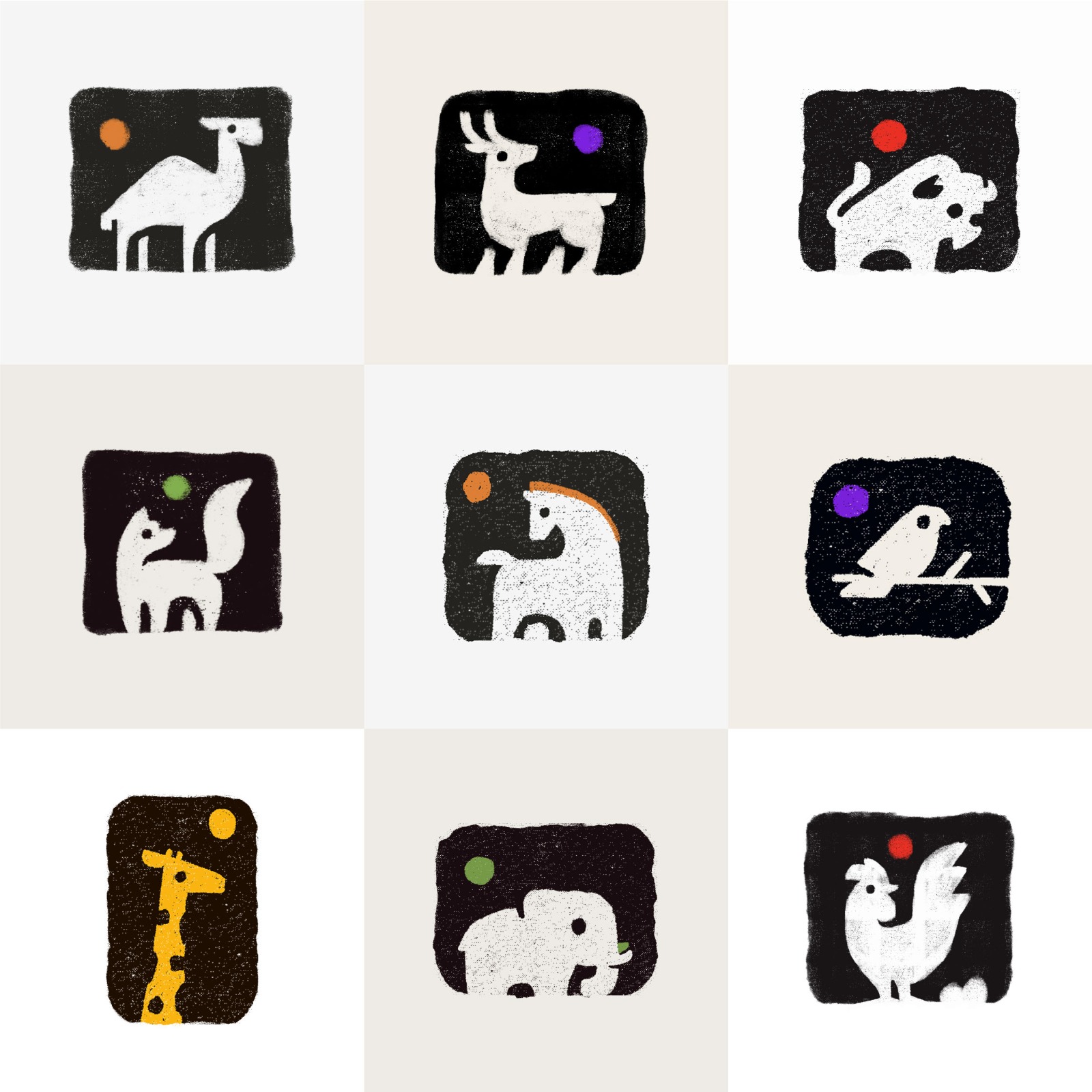
Fantastic composition! Masterful pallet selection and a great balance of following and breaking rules you've set for yourself. Really enjoyable and thoughtful.
This belongs in the nursery of the coolest kid ever.
Also, I would enthusiastically visit the zoo that used your icons.
Lost-Significance-98 t1_j69dp5p wrote
They are really nice images! You should highlight or fill all of the images with your colored dot. The horse and the giraffe are dope. I’d like to see something similar on all the other animals.
Tzery69 OP t1_j69hp65 wrote
I wish someone want that, I'm just a 17 year old boy who sketches using a PC mouse
Tzery69 OP t1_j69m6jx wrote
I agree that's something im better at, i will do as many!
I feel like its just practice I'm doing between lessons at school but i might make it something more large-scale and consistent!
Tzery69 OP t1_j69m83w wrote
good shout! I'll try that
[deleted] t1_j69obbw wrote
[removed]
Inconsequential-Fish t1_j69q2nb wrote
These are gorgeous and adorable! I love the black and white colour scheme with the pop of colour in the dot!
AsexualTeenager t1_j69uiqq wrote
these are so cool, do you mind if i use these on my phone or computer?
[deleted] t1_j69wued wrote
[removed]
CuriousHaven t1_j69zhp1 wrote
These are so cute! I love how you've used negative space to add details, while still keeping a lovely simplicity to the shapes. This would be an awesome illustration style for a picture book.
deHazze t1_j6a1dz7 wrote
These are absolutely stunning, keep it up!
maverickmax90 t1_j6a2grn wrote
Beautiful work . Felt so happy looking at this .
Nyterious t1_j6auwdr wrote
That'd be awesome, can't wait to see your future posts!
Moodylinguist t1_j6b377a wrote
It's beautiful! I love them💖✨
[deleted] t1_j6b9hx2 wrote
[removed]
papadjeef t1_j6bjwur wrote
Awesome. Make yourself a good portfolio and get into a good Fine Arts program at a university.
GroundbreakingBell56 t1_j6blfgd wrote
Cute animals like animal 🦔 🦓 🦒 crackers !
[deleted] t1_j6bxp2k wrote
[removed]
TheUmbraCat t1_j6c24by wrote
This isn't poison. This is extract of... LLAMA!
Corposjuh t1_j6c6zvd wrote
Nice icons. The dots being in different spots bothers me though
[deleted] t1_j6cakro wrote
[removed]
[deleted] t1_j6cd9jz wrote
[removed]
[deleted] t1_j6csy1z wrote
[removed]
[deleted] t1_j6iprud wrote
[deleted]

[deleted] t1_j68ebr4 wrote
[removed]