Comments
Stinky_Fartface t1_j5di3ac wrote
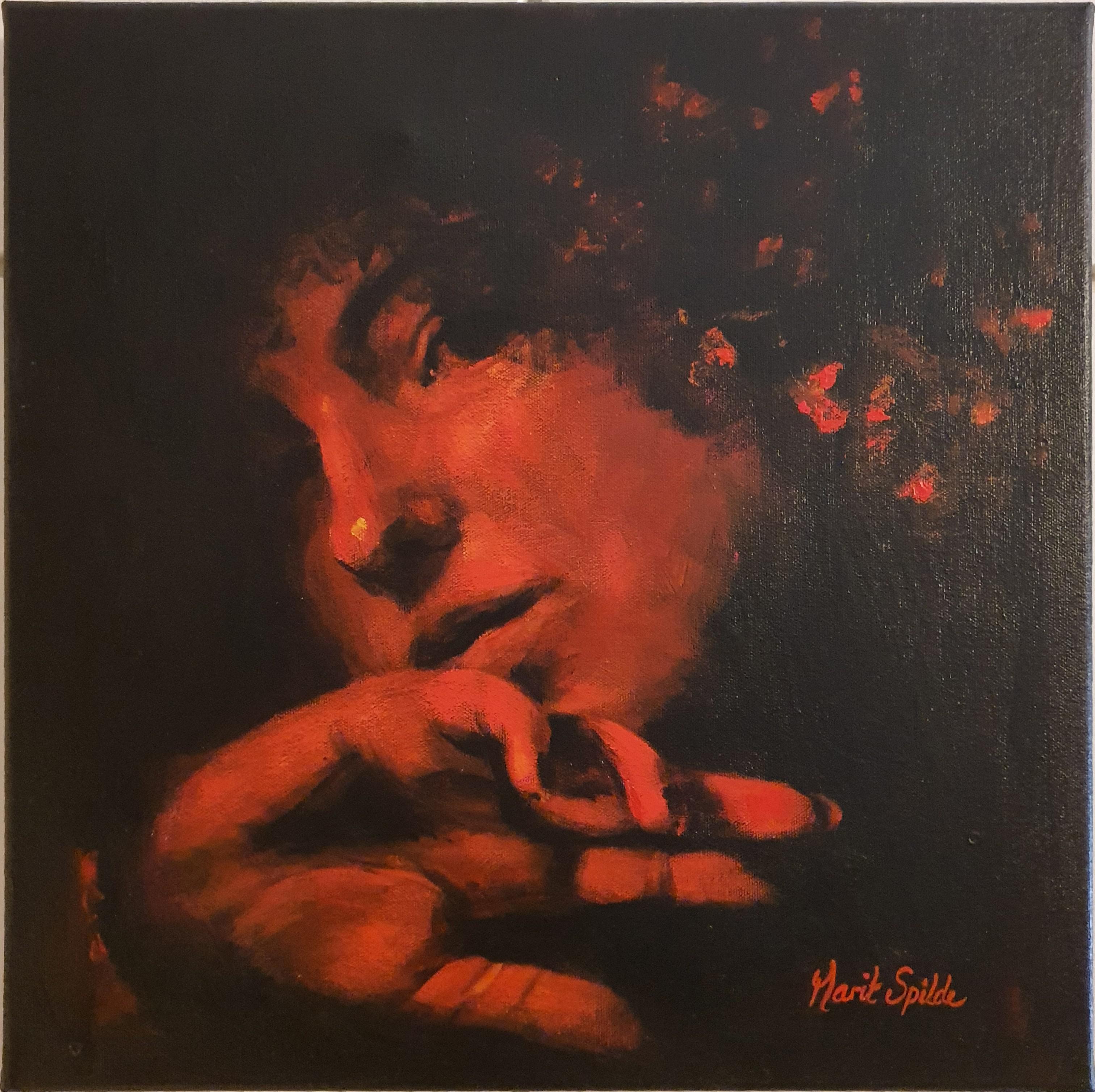
You paint well but your signature is distracting.
Lussipus OP t1_j5e8i21 wrote
It is. Was thinking about what to do with that.
artsbyamy t1_j5eeale wrote
I really like this, gives me motivation to paint portraits!
smolmeetstol t1_j5ehqgw wrote
this is beautiful! black and red is one of my favourite colour combinations, so entrancing x this takes an excellent understanding of values, i admire you greatly
peggysue_82 t1_j5ek7bi wrote
In the best way, this looks like vintage album art!
[deleted] t1_j5epiu7 wrote
[deleted]
VerboseJourney t1_j5fclwz wrote
Love the piece.
How long does something like this take?
Haven't tried my hand painting yet. Either way Thanks :)
Lussipus OP t1_j5fd1hc wrote
Thank you! This took 4 - 5 hours. For once I can answer that question because I did it in one day!
Lussipus OP t1_j5fe02p wrote
Unfortunately no one has ever taught me how to sign... but sometimes I don't like how the signature looks, like here. Is it ok to have two different signatures? And what if you as an artist suddenly just change it completely?
[deleted] t1_j5gaik7 wrote
[removed]
[deleted] t1_j5gdge6 wrote
[deleted]
[deleted] t1_j5ge2d4 wrote
[deleted]
Lussipus OP t1_j5geao3 wrote
Thanks, I did darken it so it's a little less visible, better than this at least. Usually there are more things happening in my paintings so it's easier. Always learning something new!
[deleted] t1_j5gergc wrote
[deleted]
Lussipus OP t1_j5gf40k wrote
I see, I'll keep that in mind in the future :) I've been a bit confused about the whole signature thing. Some are telling me to make it small and not easy to see, others tell me to make it as visible as possible, to highlight it.... Visible while still blending in sounds like a good idea!
Lussipus OP t1_j5gfk03 wrote
Thank you!!
[deleted] t1_j5gr9b2 wrote
[deleted]
VerboseJourney t1_j5i5516 wrote
thanks (:

[deleted] t1_j5d2cxk wrote
[removed]